Computers, Quilts & Privacy

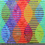
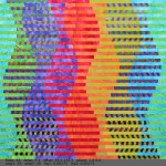
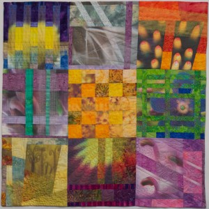
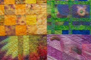
Quilts from my staybatical will be on exhibit at the Frame Gallery on the Carnegie Mellon campus October 24-November 3, 2013. The Frame Gallery is at 5200 Forbes Ave., Pittsburgh, PA 15213, on the corner of Forbes and Margaret Morrison.

Artist’s talk
Friday, November 1, 12:30-1:30 pm
STUDIO for Creative Inquiry, College of Fine Arts Room 111
Lunch provided, please RSVP to studio-info@andrew.cmu.edu.

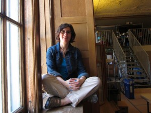
Join us for a talk by quilt artist Lorrie Faith Cranor. Lorrie is an Associate Professor of Computer Science and of Engineering and Public Policy at Carnegie Mellon University where she is director of the CyLab Usable Privacy and Security Laboratory (CUPS) and co-director of the MSIT-Privacy Engineering masters program. During the 2012-2013 academic year she spent her sabbatical as a fellow in the Frank-Ratchye STUDIO for Creative Inquiry at CMU where she worked on fiber arts projects that combine her interests in privacy and security, quilting, and computers. In this talk she will discuss these interests and how she combined them during her sabbatical. For directions or more information contact Marge Myers at 412-268-3451.

Opening Reception
Friday, October 25, 2-5:30 pm

Gallery Hours
Thursdays: Oct. 24 + 31, 5-9 pm
Fridays: Oct. 25 + Nov. 1, 2-7 pm
Saturdays: Oct. 26 + Nov. 2, Noon to 5 pm
Sundays: Oct. 27 + Nov. 3, Noon to 5 pm

Exhibit flier
Exhibit poster

Security Blanket

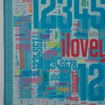
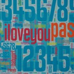
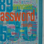
As I’ve been thinking about quilt ideas related to security and privacy during my staybatical at the STUDIO for Creative Inquiry all year, the title for this quilt was obvious: Security Blanket. Less obvious was the design of a quilt that would fit this title. Ultimately, I took inspiration from the research on the security and usability of text passwords that I’ve been working on with my students and colleagues. While this quilt started out as an art project inspired by my research, what I learned from creating it will likely influence my future password research.

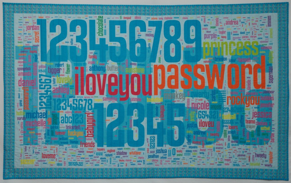
Security Blanket, machine quilted, digitally printed cotton fabric, 63.5″x39″

Our research group has collected tens of thousands of passwords created under controlled conditions as part of our research. Among other things, we have compared these passwords with the archives of stolen passwords that have been made public over the past few years. Perhaps the largest such archive consists of 32 million passwords stolen from social gaming website RockYou and made public in December 2009. These passwords are notably weak, having been created without the requirement to include digits or symbols or even avoid dictionary words. Security firm Imperva published an analysis of these passwords. More recent analyses of stolen passwords have found that passwords stolen in 2012 are pretty similar to those stolen in 2009.

The media had fun publishing the most common passwords from the RockYou breach. As with other breaches, password and 123456 figured prominently. But after you get past the obvious lazy choices, I find it fascinating to see what else people choose as passwords. These stolen passwords, personal secrets, offer glimpses into the collective consciousness of Internet users.

I asked my students to extract the 1000 most popular passwords from the RockYou data set and provide a list to me with frequency counts.  I then went through the list and sorted them into a number of thematic groups. I assigned a color to each group and entered the passwords with weights and colors into the Wordle online word cloud generator. I then saved the output as a PDF and edited it in Adobe Illustrator to rearrange them in a shape that I liked, with some pairs of words purposefully place in close proximity. I designed a border, and had the whole thing printed on one large sheet of fabric by Spoonflower. When the fabric arrived, I layered it with batting and quilted it. I bound it with matching fabric from Spoonflower that I designed.

Sorting 1000 passwords into thematic categories took a while. While a number of themes quickly emerged, many passwords could plausibly fall into multiple categories. I tried to put myself in the mindset of a RockYou user and imagine why they selected a password. Is justin the name of the user? Their significant other? Their son? Or are they a Justin Bieber fan? Is princess a nickname for their spouse or daughter? The name of their cat? Their dog? (It shows up frequently on lists of popular pet names and a recent surveyfound that the most common way of selecting a passord is using the name of a pet.) Is sexygirl self referential? What about daddysgirl? dreamergenius?

When I didn’t recognize a password I Googled it. Most of these unknown passwords turned out to be ways to express your love in different languages. For example, I learned that mahalkita means I love you in Tagalong. Love was a strong theme in any language; there seems to be something about creating a password that inspires people to declare their love.

Not surprisingly, the top 1000 passwords list includes a fair share of swear words, insults, and adult language. However, impolite passwords are much less prevalent than the more tender love-related words, appropriate for all audiences.

There are a couple dozen food-related words in the top 1000 passwords. The most popular is chocolate and most of the others are also sweets (and potentially nicknames for a significant other), but a few fruits and vegetables, and even chicken make their way to the top as well. Among fruits, banana appears in both singular and plural.

Animals are also popular. While felines appear on the password list in a number of forms and languages, monkey is by far the most popular animal, and the fourteenth most popular password. I can’t quite figure out why, and I don’t know whether or not this is related to the popularity of “banana.”

Fictional characters are also popular, especially cartoon characters. The twenty-fifth most popular password is tigger (which might also be on the list because it is a popular name for a cat). A number of super heroes and Disney princesses also make the list, as well as another cartoon cat, hellokitty. Real life celebrities also make the list, including several actors and singers. While at first I thought booboo might refer to the reality TV star Honey Boo Boo, I realized that the date of the password breach predates the launch of that TV show.

A number of passwords relate to the names of sports, sports teams, or athletes. Soccer-related passwords are particularly popular. There are several cities on the list that I’m guessing were selected as passwords because of their sports teams, especially soccer teams.

Besides the obvious lazy password password, and also PASSWORD, password1, and password2, some more clever (but nonetheless unoriginal) variations included secret and letmein. And I love that the 84th most popular password is whatever.

Some passwords puzzled me. Why would anyone select “lipgloss” as their password. Why not “lipstick” or “mascara”? Perhaps it refers to a 2007 song by Lil Mamma?  Why “moomoo”? Why “freedom”?

Even more popular than the word password were the numbers 123456, 12345, 123456789. Other numbers and keyboard patterns also appear frequently. When I laid out the 1000 passwords on the quilt, I scaled them all according to their popularity. The most popular number sequence was chosen by more than three times as many people as the next most common password and was so large that I decided to place it in the background behind the other passwords so that it wouldn’t overwhelm the composition.

I made a few mistakes when designing the quilt that I didn’t notice until I was quilting it (quilting this quilt provided an opportunity to reflect on all the passwords yet again as I stitched past them). One problem was that when I transferred the top 1000 password list to Microsoft Excel while categorizing the passwords, the spreadsheet program removed all the zeros at the beginning of passwords. As a result there are three passwords that are actually strings of zeros (5, 6, and 8 zeros) that are printed simply as 0. In addition there are three number strings that start with a 0 followed by other digits are printed without the leading 0. Another problem was that the color I selected for jesus, christian, angel, and a number of other religious words blended in with the background numbers when printed on fabric, making those words almost invisible (even though they showed up fine on my computer screen). I had carefully checked most of the colors I used against a Spoonflower color guide printed on fabric, but had inadvertently forgotten to check this particular color. I reprinted about half a dozen of these words in a darker color and sewed them onto the quilt like patches that one might add to repair a well-worn spot.

There are also some passwords that I colored according to one category, and upon further reflection I am convinced more likely were selected for a different reason and should be in a different category, but we’ll never know for sure. I invite viewers to discover the common themes represented by my color-coded categories and to speculate themselves about what users were thinking when they created these passwords. Zoom in on the thumbnail images above to see all of the smaller passwords in detail.

The colors, size, and format of this quilt were designed to be reminiscent of a baby quilt, which I imagine might become a security blanket. Like the passwords included in this piece, a security blanket offers comfort, but ultimately no real security.

Inspired!

I’m excited to finally reveal Interleave #6: Porto, which was presented to Ed Frank and Sarah Ratchye at a reception before the Grand Finale dinner of the Carnegie Mellon Inspire Innovation! fundraising campaign last night. I was commissioned to make this quilt to thank Ed for serving as chair of the Inspire Innovation! campaign. (The campaign was incredibly successful, raising well over the $1 billion goal. As a faculty member at a terrific university that has a much smaller endowment than most of our peer institutions, I really appreciate how this infusion of funds will benefit the university.)

I felt truly honored to be asked to make this gift, and somewhat nervous about whether I could produce something that would live up to expectations. Ed and Sarah are art collectors, and Sarah is herself an accomplished artist. The folks who approached me about making the gift were hoping for a piece that would represent the interplay of art and technology, consistent with the mission of the STUDIO. Having spent a good part of the past year working in the STUDIO, I am personally grateful to Ed and Sarah for their financial support of the STUDIO as well.

I did not have a lot of time to produce this quilt, and it involved a number of new techniques I hasn’t tried before. It all came together fairly well until the end. Last weekend I finished the binding, and when I put it up on my design wall for a photograph I realized the corners were not square. Really not square. It was a lovely rhomboid parallelogram. Because I have different prescriptions in each lens of my glasses, when I take my glasses off the world looks a bit un-square (which drives my OCD side nuts). But my glasses were on.  I checked the quilt corners against the grid on my cutting mat, and there was no denying it. The quilt was not square. This was the widest Interleave quilt in the series and I realized that the longer the strips, the more room there is for the fabric to stretch as I sew – and I hadn’t noticed until that point that there was actually quite a bit of skew. I pondered the problem over night and the next day ended up removing the binding and vertical borders so I could square it up. Fortunately, I had used Aurifil 50 weight thread for piecing, which made the un-piecing a snap (my new favorite (un)piecing thread – really nice thin thread with low lint that doesn’t break while sewing but so easy to rip out without tearing your fabric when the situation calls for it). I reattached the borders and the binding and finally could declare it finished.

I already wrote up a little artist’s statement, which the CMU advancement folks had a designer incorporate into a little booklet to accompany the quilt. I will just include the statement here for those of you who want to learn more about the quilt. I’ve also included some bonus images  so you can see how it was made.

Artist’s Statement

At first glance the Frank-Ratchye STUDIO for Creative Inquiry at Carnegie Mellon University appears like a good place for a computer science professor, but an odd place for a quilter. I am both a quilter and a CMU computer science and engineering professor who is spending my sabbatical as a fellow at the STUDIO.

While other faculty and students in the STUDIO spend the day creating new concepts from behind computer screens, I set up shop with an old sewing machine, an ironing blanket, a cutting mat and a huge pile of colorful fabric.  At the beginning of my fellowship, I smiled politely every time someone suggested ways of attaching the old sewing machine to a robotic arm, and spent days with needle and thread hand quilting colorful lines.

Hand quilting is a process that offers one a lot of time to think, and I did spend a lot of time thinking about the art and craft of quilting, and how I might use technology in my work. For most of my piecing and quilting, I use a sewing machine, which was fairly sophisticated technology when it was invented about 200 years ago. My most recently purchased sewing machine is actually called a “sewing computer” by its manufacturer, and it has some innovative features such as a sensor that can detect the speed at which the operator is moving a piece of fabric so that the machine can automatically adjust the speed at which the needle goes up and down.

I appreciate the added value that technology can bring to my art, enabling me to create in ways that would be difficult or impossible for me unassisted. But it is not my goal to use technology to eliminate the need for me to participate in the fabrication process. Part of my attraction to quilting and fiber arts is the tactile nature of the medium. For me, part of the fun is manipulating fabric and thread with my hands. I want to use technology to enhance my skills – let me sew straighter, faster, better – or, better yet, to let me create in ways I otherwise could not.

STUDIO director Golan Levin suggested the use of digital technology that was necessary for me to create this quilt. When I started my Interleave series of quilts, I sketched the quilt designs in pencil and did some design experimentation with scissors and paper. As I started to design the third quilt in the series, I began using Microsoft PowerPoint to sketch out some ideas involving sine waves. It was a tedious process as PowerPoint was really not the right tool for the job.

Golan saw what I was doing and suggested I write a program using an arts engineering toolkit called Processing to draw my design. As a computer scientist, I wasn’t previously familiar with Processing, which was developed by artists, for artists, and is taught in CMU’s undergraduate art classes. The program I wrote allowed me to generate the sorts of designs I had been struggling with, and it included sliders to allow me to experiment with sine waves of different frequencies and amplitudes. Using this program, I was able to rapidly iterate through large numbers of design possibilities before selecting one to actually fabricate. I did some engineering to figure out how to actually construct the quilt I designed, and then adapted my program to produce full-scale templates that I could print on paper and use to cut out my fabric.

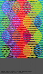
Each quilt in the Interleave series uses a variation on the technique I described, but each includes a new twist on the approach. For Interleave #6, the new twist was the inclusion of a photograph digitally printed on fabric. After considering a variety of photo ideas, I chose a photo I took in Porto, Portugal in 2009 while on a short trip with some of my colleagues to attend a meeting for the Carnegie Mellon Portugal program. Although I was there for less than three days, I managed to meet the Prime Minister José Sócrates as well as experience the city’s São João festival. Walking around the city, I took lots of pictures with my DSLR camera.
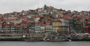
Porto is a wonderfully photogenic city, full of hundreds-of-years-old apartments with bright red-orange roofs. The city also has amazing staircases, some of which appear on maps as roads. The Duoro River runs through the city, with tall bridges stretching across it. The view of the Ribeira district from across the river is particularly spectacular, and affords a view of layer upon layer of buildings built into the steep hillside. It is a photo of this view that I selected for the Interleave #6 quilt.
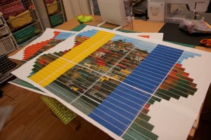
Full-scale paper prototype to check that everything was in order before printing the fabric.

Before printing the photo on fabric, I manipulated it in several ways, including increasing the color vibrancy and saturation. Additionally, I created three versions of the photo at varying degrees of pixilation. Then I used my Processing program to interleave the three versions in a sine wave formation and to leave space for splicing in batik fabrics. Next, I adjusted the end result so it could be printed on fabric complete with guides for cutting and splicing. Since I wasn’t entirely sure I had calculated everything properly, before having the fabric printed at spoonflower.com, I did a trial run with paper to reassure myself that it would work as I envisioned. When the fabric finally arrived in the mail I cut it up and sewed it back together, layered with a foundation grid, batting and backing fabric. The final touch was some hand embroidery for added texture and emphasis.
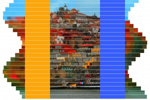
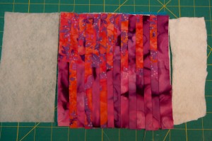
This was one of the two fabric panels I had printed to make this quilt. I removed the wide yellow and blue stripes and replaced them with batik fabric before making one-inch slices along the white lines.

The quilt is designed to show a view of Porto at various levels of focus, granularity, and abstraction. If you look at the quilt up close the pixelated sections appear mostly as abstract regions of color. On the other hand, you can see the un-pixelated sections most clearly, although they are rippled, as if reflected off water. The ripples are both a design choice, and an artifact of the medium – fabric stretches as it is sewn, so perfect alignment is difficult to achieve.

Step back from the quilt until you are too far away to see the un-pixelated sections clearly, and now the pixelated sections start coming into focus. Step back further and the larger pixelated sections convey meaning. The batik fabric sections appear as regions of color taken from the scene: the most abstract representation, color without meaningful shape. I began playing with pixelated images in my earlier quilts as I explored visual representations of privacy, and have continued to use this technique, even when privacy is not the main focus of a piece.
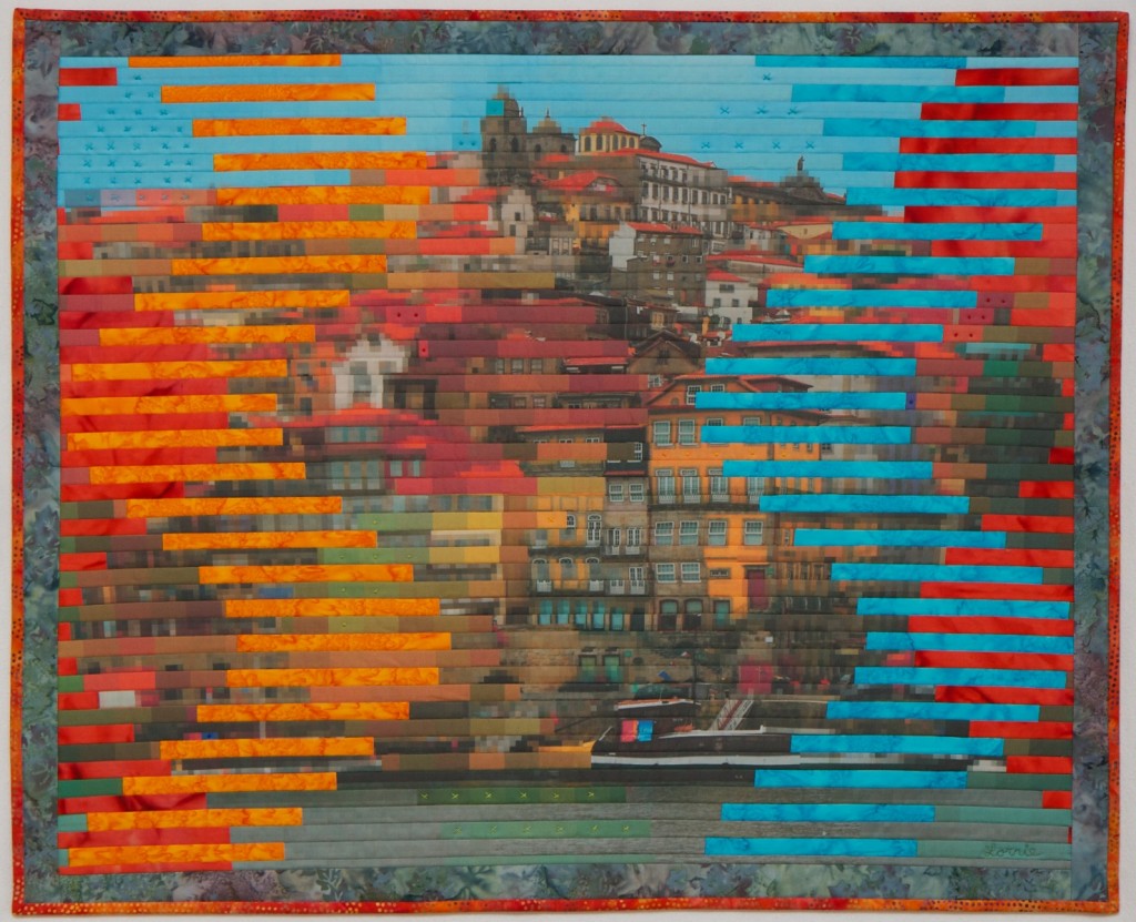
Interleave #6: Porto
25.5″x31.5″ digitally printed cotton and commercial batik fabric, machine pieced and quilted, hand embroidered with pearl cotton

 

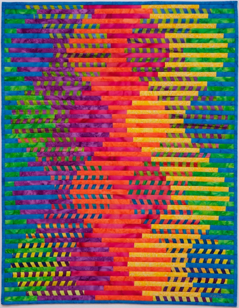
Sine of Spring

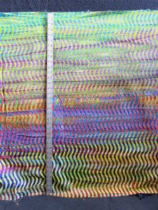
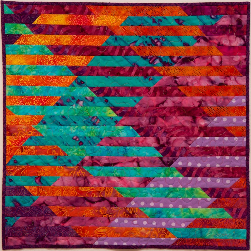
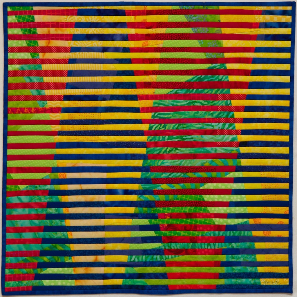
I was so pleased with the results of Interleave #3, that I decided to continue the series and see what else I could do to facilitate my quilt design with Processing. This time I started with some of the fabrics I wanted to use — a wonderful, colorful wavy batik fabric seemed perfect for a sine wave quilt. I matched the colors in this fabric with other fabrics in my collection, and not finding exactly the right shades, it was a good excuse to go fabric shopping.  I worked on the quilt design in Processing, but couldn’t figure out how to represent the multi-colored wavy fabric in a single hue. So I enhanced my Processing program so that I could input digital images and use them to create my interleaved designs. I took digital photographs of a bunch of my fabrics with a ruler next to them (for scale). I then experimented with using these digital images in my computer-generated designs.

The addition of digital images of fabric made my computer-generated interleave designs much more vibrant, and also allowed me to visualize the placement of fabric patterns. I had lots of fun playing with different designs.

I eventually selected a design and began the process of rendering it in fabric. I used a very similar approach as I used in Interleave #3, except this time I drew 64 pencil lines spaced a half-inch apart on a piece of white fabric and layered that foundation fabric over the batting. I then sewed the colored strips to the sandwich of white fabric, batting, and backing, aligning each strip to a pencil line. I was able to use just one pin as I positioned each strip. Not having to line up each strip with a ruler and pin it in place along the whole length of the strip saved a lot of time. By the time I finished this quilt I was able to position, piece, and press each strip within about four minutes. I did run into a few problems with some of my pencil lines that were not completely straight — the fabric stretches a bit when you draw on it with a pencil if you are not careful, causing some of the lines to curve. This inspired a not-yet-successful mission to find a commercial cotton fabric with precise half-inch or quarter-inch stripes that I could use as the foundation.

I enjoyed watching the pattern unfold as I worked on this quilt, and I love these colors, which remind me of spring flowers. This quilt celebrates Spring, which after several false starts, seems finally to have come to Pittsburgh.

Interleave #4: Sine of Spring
24″x31″ machine pieced and quilted commercial batik cotton fabric

Self Portrait

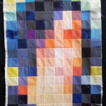
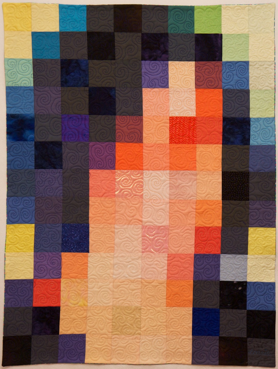
As part of my sabbatical project, I  have been continuing to contemplate ways to visualize privacy. My De-identificaiton quilt featured digitally-printed photos de-identified by their extreme magnification and by splicing them together with other fabric. Another approach to visual de-identification is pixelation. To pixelate an image, we superimpose a grid on the image and replace each cell with a color representing the average of all the pixels in that grid cell. Although pixelation has been shown to be highly vulnerable to automated re-identification, it is a widely used method of obscuring images to make them more difficult for humans to recognize.

I have long been intrigued by the Salvador Dali paintings, Lincoln in Dalivision (1977) and Gala Contemplating the Mediterranean Sea which at Twenty Meters Becomes the Portrait of Abraham Lincoln (Homage to Rothko) (1976), which in turn were inspired by Leon Harmon’s grey photomoasic of Abraham Lincoln (1973).

Recently, Ray J released the single “I Hit it First” with a pixelated photo on the album cover. The photo was quickly recognized as a 2010 photo of bikini-clad Kim Kardashian.

Original portrait

While working on my Big Bright Pixels quilt, people kept asking me whether there was a hidden picture or message. There wasn’t. But that did get me thinking about doing a pixel quilt with a hidden image. But what image should I pixelate? I had recently used a pixelated face in the logo I designed for the Privacy Engineering masters program, and a face seemed a natural choice given that faces are commonly pixelated to protect privacy in news photos. (Other body parts are also frequently pixelated, and I love the censorship towel, but I digress.) I settled on pixelating a face, and briefly considered using a face of a famous person before deciding to use my own face. I selected a blue-haired portrait, photographed by Chuck Cranor.

Pixelated portrait

Pixelated portrait

Pixelation can be done trivially with a computer using standard image processing software packages or by rolling your own. I started working on my pixelated quilt before I started programing in Processing, so I used Photoshop to pixelate a headshot of myself. The initial pixelation was nice, but I wanted something more colorful and also higher contrast so that the differences between colors would show up better when printed on fabric (digital printing on fabric tends to dull colors). I experimented with adjusting the contrast, brightness, and color settings in Photoshop until I came up with a brighter and more colorful pixelated image. This was the image I sent to Spoonflower for digital printing.

Pixelated portrait with high contrast and color manipulation

Pixelated portrait with high contrast and color manipulation

By the time the fabric arrived I had gotten busy with other quilts, and I was also a little disappointed in how the printed fabric looked, so I left the fabric sitting out on my table in the STUDIO for a while. I decided that the dulled digital print needed some more punch, so periodically I cut a fabric square to match a pixel in the fabric and pinned it in place. I cut some of these squares from translucent polyester organza, adding some vibrancy and shimmer to the pixels over which I layered them. I cut other squares from lace, commercial batiks, and printed fabrics that were more intense versions of the hues in the digital print. I ended up covering about 20% of the pixels with other fabric.

Back of quilt top with vertical lines sewed

Back of quilt top with vertical lines sewed

After a few months of staring at the pixels I finally decided to sew the quilt together. I used a shortcut technique to sew the quilt together without actually cutting apart the squares in the digital print. I folded the fabric along one of the vertical lines, catching the pinned squares in the fold, and stitched along the line with a quarter-inch seam allowance. I repeated this approach to sew all the vertical lines and pressed all the seam allowances to the side. Then I folded the fabric along one of the horizontal lines and repeated this process. The end result was a pieced quilt top that appeared to have been pieced out of 130 2.25″ squares (2.75″ with seam allowances). Theoretically this approach should have resulted in precisely pieced seams; however, some of the lines are actually slightly off and the rows and columns did not come out quite as square as I had hoped they would.

Pieced quilt top

Pieced quilt top

I layered the quilt top over batting and backing and used a spiral free-motion machine quilting pattern to quilt the whole thing free hand. I did the quilting in several sessions as I had time, doodling spirals until my hands got tired. I used several different thread colors to roughly match the color of the thread with the pixels I was quilting. I decided not to bind this quilt, and instead made an envelope and quilted all the way to the edge. There is a little bit of stippled hand quilting done with perl cotton surrounding my signature in the lower right corner.

So now the quilt is done and I’m pretty happy with this self portrait. Most people who have seen it do not recognize it as a self portrait, which is ok, and sort of the point. On the other hand, Golan said the blue and purple hair was a dead give away for him. I had not actually started out with the intention to make a self portrait, but ultimately I think the piece works better for me as a self portrait than any more accurate likeness would.


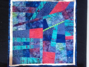
Self Portrait, machine pieced and quilted 23×30.75″


Auction Quilt

For the past several years I’ve donated a small quilt for the fundraising auction at the local public elementary school that my kids attend. I’ve just finished this year’s auction quilt, a small 24-inch square wall quilt called “Interleave #2: Sunset over water.” This is the second in my series of Interleave art quilts, and it seems likely there will be more. (See my last post for Interleave #1’s story.)  The quilt will be auctioned off on February 16. Contact me for details if you are interested in bidding.

Interleave #1 had a lot going on, with primary-colored improv-pieced panels spliced together before being sliced into 24 pieces and sewn back together again. For Interleave #2 I made the panels out of only six pieces of fabric each, and I sliced them into only 12 pieces. But there is still a lot of texture here, as most of the fabrics I used are multi-colored commercial batiks. I cut the slices 1.5-inches wide so that they would end up 1-inch after accounting for seam allowances. In order to keep everything lined up nicely with proper spacing, I had to cut a .5-inch strip after cutting every 1.5-inch strip. These narrow strips are not actually used in the quilt, but they do make for some colorful ribbons that are too nice to throw away.

This time I used Fairfield Soft Touch Cotton Batting. I found it made the quilt-as-you-go quilting a little bit easier than the Thermore I used last time because the fibers don’t puff up as much. I also marked the ends of each row directly on the batting with a fabric marker and used my new 36″ clear plastic ruler to make it easier to keep everything lined up. Unfortunately, I made a mistake while marking that I didn’t notice until I was almost done, so gave myself a bit of an extra challenge and wondered why I had to keep correcting things that weren’t lining up. The fact that the strips were cut on the bias (and thus fairly stretchy) added to the challenge of keeping everything lined up.

This quilt is finished with some meandering free motion machine quilting in a colorful variegated thread. I debated whether or not to add the quilting to this one. I think it looked fine without it, but the quilting pulls the whole thing together nicely.

Interleave#2: Sunset over water, 24×24″ machine pieced and quilted

Winter break projects

In between family activities I worked on some artsy activities over winter break. My mother taught me how to crochet (but I haven’t made anything other than practice pieces), and I worked on some Spoonflower fabric for a couple of future projects (stay tuned!).  I spent most of my time on a small wall quilt that involved cutting fabric into lots of small pieces, sewing those pieces together, cutting them up, and sewing them back together again.

My inspiration came from some images of quilts by Kent Williams in the January 2013 issue of American Quilter. I like the way Kent creates the illusion of shape by sewing together thin strips of fabric and I wanted to try the technique. But thin strips of fabric are hard to sew precisely. I also recently read an article in the December 2012 Quilting Arts Magazine by Ann Brauer in which she explained her quilt-as-you-go approach for making quilts out of thin strips of fabric. It occurred to me that Ann’s method might simplify the construction of the quilt I envisioned. (I’m actually not entirely sure about Kent’s method. I’ve only found tiny photos of his quilts – not enough detail to reverse engineer his process. I did observe that the short edges of his strips are all butted up against the next strip at 90 degree angles, suggesting his technique for cutting the strips is different than the one I describe below.) I worked out that with 1/4 inch seam allowances, if I cut the fabric into 1-inch strips, half of each strip would be lost to seam allowances. Thus 1-inch strips from two panels of fabric could be interleaved, allowing the designs from the two panels to be superimposed without distortion. I decided to add improvisational piecing to the mix to add an extra layer of interest to the design, and because improv piecing is fun.

This quilt was a lot of fun to make but it required some courage to keep cutting up what looked like a perfectly good composition with the expectation that when I sewed it back together according to a vision I had in my mind, the result would be even better.

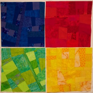
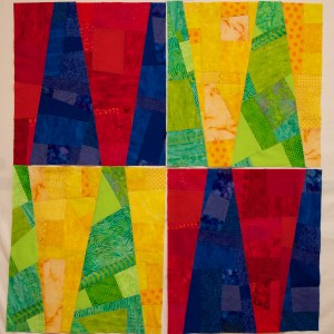
The first step was to make four 26-inch single-color square panels, each improvisationally pieced from about a half-dozen fabrics. The panels were each beautiful on their own, and lovely when placed together. I hesitated to cut them up.

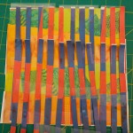
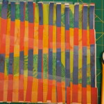
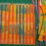
I did some paper prototyping to convince myself that my slicing plan was going to work, and also to experiment with some of the details. I cut up photos of the single-color panels and reassembled them into red/blue and yellow/green panels. Then I tried positioning the red/blue panel perpendicular to the yellow/green panel, and sliced them both into 24 strips. I wasn’t entirely pleased with the results – the red/blue panel didn’t show strongly because the lines separating the colors got lost between the slices (left image). I cut up another red/blue paper panel, this time rotated 90 degrees. I liked the result (center image), but now the shapes in the two panels were superimposed and didn’t interact in interesting ways. In my third attempt (right image) I shifted the red/blue strips until they created an interesting overlapping pattern (and indeed this is the effect I love in Kent Williams’ quilts).


My next challenge was figuring out exactly where to slice the single-color panels to make the red/blue and yellow/green panels. Originally I was going to slice them at somewhat random angles, but my paper prototyping convinced me that I would get better results if I selected the angles purposefully and made the panels mirror images of each other. I figured out the ratios I wanted and actually did a bit of algebra to work out exactly where to make the cuts. I did the slicing and reassembly and had four striking bi-color panels. This time I was really hesitant to slice them up again, but I sauntered on and prepared to begin cutting up two of the bi-color panels.

But before I started slicing, I needed one more prototype to test out the quilt-as-you go technique. I grabbed some scrap fabric and sliced it into one-inch strips. But what kind of batting to use? I decided I wanted a fairly light batting, and nothing fusible (lately I’ve been enjoying the convenience of Hobbs Heirloom Fusible Cotton/Poly Batting). I had some pieces of Fairfield Soft Touch Cotton Batting and Thermore Ultra Thin Polyester Batting, which both seemed like reasonable choices for the project. I cut a small sample of each and tried both. The results were fine either way. The Thermore (on the left of the above sample) resulted in a lighter weight quilt that felt less stiff than the cotton (on the right). But both looked about the same once they were inside the quilt.

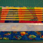
I decided to use the Thermore in my quilt, mostly because I had a piece already cut that was about the right size. I cut out some backing fabric for my quilt (blue fabric with primary-colored fish that I bought years ago to make baby quilts) a little bit larger than the batting and layered the batting on top of it. I had been planning to use the edge of each previous fabric strip sewed as a guide for sewing the next strip, but my prototype revealed that would likely lead to skewed  lines after a few strips. So I used a fabric pen to mark guide lines along the left and right edges of the backing fabric every half inch.

Then I setup an assembly line. I layered a red/blue panel over a yellow-green panel on my gridded cutting mat and made a one-inch slice. I then placed one fabric slice on the batting, used a straight edge to align the slice with the guide lines, and pinned it in place. For the first strip only, I did not immediately sew it, but placed the second strip in place and sewed them together. I pressed open the second strip, cut more strips, aligned the next strip, sewed, and repeated over and over again. I waited in suspense until I had sewn enough strips that the pattern started to emerge, and I could see the quilt in my mind take form in fabric. But it wasn’t until many, many hours later after all 48 strips were cut and sewn in place that I had confidence that this quilt was going to “work.”

Now, the quilt is finished and bound. Overall I’m pleased with the result. I like the interweaving images. I like the third layer of images from the improv piecing. I like the fact that it looks like you are looking through Venetian blinds. Sometimes when I look at it I think the contrast between the adjacent interleaved strips is too much and creates some visual dissonance. I would like to try this technique again with lower-contrast fabrics. I wish I had cut and sewn some of the strips straighter. Would a bigger rotary cutter, longer ruler, or different batting help? I wonder how it would look with fatter strips. What if they were cut diagonally? I’m contemplating a more purposeful placement of fabrics in the single-color panels. I’m pondering doing this with curves and with photos printed on fabric. So many ideas…. But first I have to decide what to do with the other two bi-colored panels.

Interleave #1: Venetian Lines – 23.75″x23.75″ Machine pieced and quilted cotton fabric.


P3P is dead, long live P3P!

I didn’t attend the W3C’s Do Not Track and Beyond Workshop last week, but I heard reports from several attendees that instead of looking forward, participants spent a lot of time looking backwards at last decade’s W3C web privacy standard, the Platform for Privacy Preferences (P3P). P3P is a computer-readable language for privacy policies. The idea was that websites would post their privacy policies in P3P format and web browsers would download them automatically and compare them with each user’s privacy settings. In the event that a privacy policy did not match the user’s settings, the browser could alert the user, block cookies, or take other actions automatically. Unlike the proposals for Do Not Track being discussed by the W3C, P3P offers a rich vocabulary with which websites can describe their privacy practices. The machine-readable code can then be parsed automatically to display a privacy “nutrition label” or icons that summarize a site’s privacy practices.

Having personally spent a good part of seven years working on the P3P 1.0 specification, I can’t help but perk up my ears whenever I hear P3P mentioned. I still believe that P3P was, and still is, a really good idea. In hindsight, there are all sorts of technical details that should have been worked out differently, but the key ideas remain as compelling today as they were when first discussed in the mid 1990s. Indeed, with increasing frequency I have discussion with people who are trying to invent a new privacy solution that actually looks an awful lot like P3P.

Sadly, the P3P standard is all but dead and practically useless to end users. While P3P functionality has been built into the Microsoft Internet Explorer (IE) web browsers for the past decade, today thousands of websites, including some of the web’s most popular sites, post bogus P3P “compact policies” that circumvent the default P3P-based cookie-blocking system in Internet Explorer. For example, Google transmits the following compact policy, which tricks IE into believing that Google’s privacy policy is consistent with the default IE privacy setting and therefore its cookies should not be blocked.

P3P:CP="This is not a P3P policy! See 
http://www.google.com/support/accounts/bin/answer.py?hl=en&answer=15165 for more info."

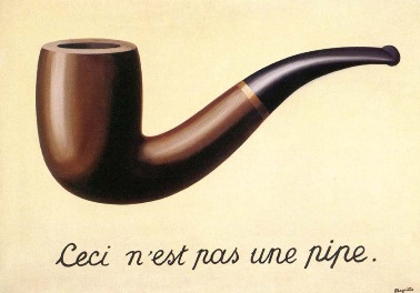
Ceci n'est pas une pipeGoogle’s approach is both clever and (with apologies to Magritte) surreal. The website transmits the code that means, “I am about to send you a P3P compact policy.” And yet the content of the policy says “This is not a P3P policy!” Thus, to IE this is a P3P policy, and yet to a human reader it is not. As P3P is computer-readable code, not designed for human readers, I argue that it is a P3P policy, and a deceptive one at that. The issue got a flurry of media attention last February, and then was quickly forgotten. The United States Federal Trade Commission and any of the 50 state attorney generals (or even a privacy commissioner in one of the many countries that now has privacy commissioners to enforce privacy laws) could go after Google or one of the the thousands of other websites that have posted deceptive P3P policies. However, to date, no regulators have announced that they are investigating any website for a deceptive P3P policy. For their part, a number of companies and industry groups have said that circumventing IE’s privacy controls is an acceptable thing to do because they consider the P3P standard to be dead (even though Microsoft still makes active use of it in the latest version of their browser and W3C has not retired it).

The problem with self-regulatory privacy standards seems to be that the industry considers them entirely optional, and no regulator has yet stepped in to say otherwise. Perhaps because no regulators have challenged those who contend that circumventing P3P is acceptable, some companies have already announced that they are going to bypass the Do Not Track controls in IE because they do not like Microsoft’s approach to default settings (see also my blog post about why I think the industry’s position on ignoring DNT in IE is wrong).

Until we see enforcement actions to back up voluntary privacy standards such as P3P and  (perhaps someday) Do Not Track, users will not be able to rely on them. Incentives for adoption and mechanisms for enforcement are essential. We are unlikely to see widespread adoption of a privacy policy standard if we do not address the most significant barrier to adoption: lack of incentives. If a new protocol were built into web browsers, search engines, mobile application platforms, and other tools in a meaningful way such that there was an advantage to adopting the protocol, we would see wider adoption. However, in such a scenario, there would also be significant incentives for companies to game the system and misrepresent their policies, so enforcement would be critical. Incentives could also come in the form of regulations that require adoption or provide a safe harbor to companies that adopt the protocol. Before we go too far down the road of developing new machine-readable privacy notices (whether comprehensive website notices like P3P, icon sets, notices for mobile applications, Do Not Track, or other anything else), it is essential to make sure adequate incentives will be put in place for them to be adopted, and that adequate enforcement mechanisms exist.

I have a lot more to say about the design decision made in the development of P3P, where some of the problems are, why P3P is ultimately failing users, and why future privacy standards are also unlikely to succeed unless they are enforced. In fact I wrote a 35-page paper on this topic that will published soon in the Journal on Telecommunications and High Technology Law. Some of what I wrote above was excerpted from this paper. If you are contemplating a new privacy policy/label/icon/tool effort, please read some history first. Here is the abstract:

Necessary But Not Sufficient: Standardized Mechanisms for Privacy Notice and Choice

For several decades, “notice and choice” have been key principles of information privacy protection. Conceptions of privacy that involve the notion of individual control require a mechanism for individuals to understand where and under what conditions their personal information may flow and to exercise control over that flow.  Thus, the various sets of fair information practice principles and the privacy laws based on these principles include requirements for providing notice about data practices and allowing individuals to exercise control over those practices. Privacy policies and opt-out mechanisms have become the predominant tools of notice and choice. However, a consensus has emerged that privacy policies are poor mechanisms for communicating with individuals about privacy. With growing recognition that website privacy policies are failing consumers, numerous suggestions are emerging for technical mechanisms that would provide privacy notices in machine-readable form, allowing web browsers, mobile devices, and other tools to act on them automatically and distill them into simple icons for end users. Other proposals are focused on allowing users to signal to websites, through their web browsers, that they do not wish to be tracked. These proposals may at first seem like fresh ideas that allow us to move beyond impenetrable privacy policies as the primary mechanisms of notice and choice. However, in many ways, the conversations around these new proposals are reminiscent of those that took place in the 1990s that led to the development of the Platform for Privacy Preferences (“P3P”) standard and several privacy seal programs.

In this paper I first review the idea behind notice and choice and user empowerment as privacy protection mechanisms. Next I review lessons from the development and deployment of P3P as well as other efforts to empower users to protect their privacy. I begin with a brief introduction to P3P, and then discuss the privacy taxonomy associated with P3P. Next I discuss the notion of privacy nutrition labels and privacy icons and describe our demonstration of how P3P policies can be used to generate privacy nutrition labels automatically. I also discuss studies that examined the impact of salient privacy information on user behavior.  Next I look at the problem of P3P policy adoption and enforcement. Then I discuss problems with recent self-regulatory programs and privacy tools in the online behavioral advertising space.  Finally, I argue that while standardized notice mechanisms may be necessary to move beyond impenetrable privacy policies, to date they have failed users and they will continue to fail users unless they are accompanied by usable mechanisms for exercising meaningful choice and appropriate means of enforcement.

Big, colorful quilt with no name

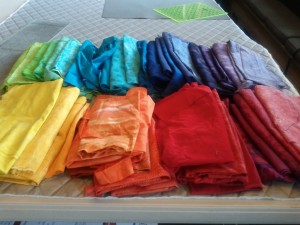
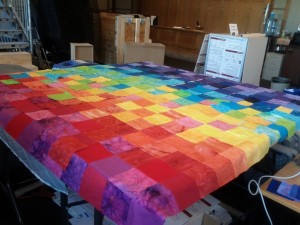
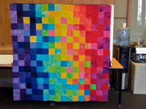
At the beginning of October I started a quilt project, inspired by the oh-so-colorful paintings of Loretta Grayson. I happened upon a photo of her gorgeous colorful crocheting on Facebook, and then went to her blog and finally to photos of her paintings. After a few days of being mesmerized by all that wonderful color I sorted through my fabrics and found the 40 or so brightest, most saturated, near-solid fabrics in my collection. Then I began cutting them up into piles of 4.5-inch squares. The original plan was to assemble the squares into a colorful 8×8 grid, and then superimpose some dark spirals. I started with the warm colors. Then I thought maybe I would make two 8×8 grids (one warm colors, one cool colors), cut away some shapes from one, and reverse applique it to the other. Once the two 8×8 grids were assembled, they looked quite striking sitting next to each other, taking up half my table at the STUDIO. But imagine how more striking they would look if the whole table was filled with color. So I made two more grids, and sewed them together. And then I had a 16×16, 64″ grid, and no more room on the table.

Several people have asked me how I decided which colors to put where. And why are there yellow squares and green squares off where they seem not to belong? I started with a warm quadrant and a cool quadrant. I had sorted my squares chromatically and I formed each quadrant row by row by introducing several adjacent colors into a row and then carrying them through with less frequency into the next several rows. That sounds confusing, but I had an algorithm in mind as I laid out the squares. The quadrants emerged as rough gradients, somewhat in order by hue, with some variation so as to provide more visual interest and some contrast between adjacent squares. I positioned those quadrants diagonally opposite of each other, and then constructed the remaining two quadrants to blend the warm and cool colors. But again, I wanted some contrast and I added some of those unexpected squares to help move the viewer’s eye around the quilt.

I’ve also been asked how I sewed all those squares into rows with the corners all matching up. Actually, not all the corners match up exactly, but many of them do. I do not have the patience to cut everything as exactly as I should, and I’m all for fast piecing techniques that minimize the need for pinning. I chain pieced each row of eight, first in groups of two, then sewed them into groups of four, and then finally the row of eight. The hard part was keeping the squares in order. I solved this problem by marking small numbers in the bottom right corner of each square with a ball point pen. I pressed the seam allowances all in the same direction, reversing the direction on alternating rows.Then I pinned two rows together, butting the seams together, and sewed. I added on rows until I had a quadrant. After all four quadrants were done, joining them together was just more of the same.

When you step back from the quilt, it looks large, bright, and pixelated. Was I thinking pixels when I created it? Not specifically. But I have been ruminating on some privacy-related ideas that involve pixelating faces, so maybe my subconscious was thinking about pixels. There is no hidden meaning in this one (maybe I shouldn’t tell you that, it will spoil the fun!); it is really just about color.

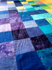
The STUDIO is a large room, but you can’t miss a 64″ square blast of intense, saturated color. So the quilt-in-progress started to attract attention from the various people who wandered into the room. I have had some lovely conversations with various musicians and artists who wandered by. But I was at a loss for how to quilt it. I took a photo of the quilt top, pasted it into a Powerpoint file, and auditioned various quilt patters by drawing lines over the photo. I also brought the quilt top to a Pittsburgh Fiberarts Guild meeting and asked for advice. The guild members suggested circles, swirls, anything to contrast with the regular grid. But in the end I disregarded their advice and decided to quilt straight lines. Lots of straight lines, running in every direction and in different colors. And by hand.

I do know my limits, and hand quilting little itty bitty stitches on anything larger than a handkerchief is probably not something I would have the patience to attempt. But big stitch quilting is less intimidating. I estimated I would need about 2,500 inches of quilting, which I could probably complete in 10-15 hours. So, I made plans for how to tackle this task.

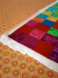
But first I needed to assemble the quilt into a quilt sandwich. For a 64-inch quilt, this requires about 4 yards of fabric for the back. I hate wasting expensive fabric for the back of a wall quilt that will never be seen, so I buy clearance fabric for this purpose — the bolder and gaudier the better. My stock of backing fabric was running low so I ordered some lovely bright fabrics from Hancocks of Peducah at $3.99 a yard. It took a week or so for the fabric to arrive, and I was away for the STUDIO for much of that time anyway.

Finally back at the STUDIO I cut two 66-inch pieces of my wonderful citrus clearance fabric and sewed them together to get a wide enough piece for the quilt backing. Then I unrolled my largest piece of batting and discovered I had previously taken a big chunk out of it and now it was only about 50 inches wide. But I had just pieced the backing, so why not piece the batting as well? I dunno… never tried it, will it work? The Internet came to the rescue and I learned that piecing batting is actually pretty easy, thanks GirlReaction Crafts for a very clear photo and explanation!

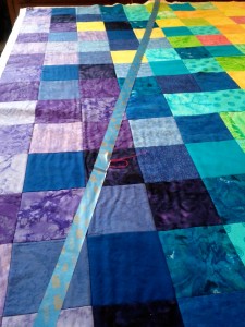
Having assembled the quilt sandwich I’ve now begun quilting. Each 64-plus-inch line of stitching is taking me about 15 minutes to execute, using blue painters tape as a guide. After a few lines I switched to wider, two-inch painters tape, which was easier to lay down straight. Twelve lines in, I think this plan is going to work.

Next problem, what to call the quilt. I’m taking suggestions (if Marissa Mayer can crowd source her baby’s name, why not crowdsource naming my quilt?).


Sabbatical ramblings

It’s been a while since I’ve posted an update, and I’ve got a bunch of random things to say… so forgive me as I ramble.

I’m working on a quilt that is bigger than I am now, so no, it is not done yet. It’s been in the works for about a month now, and maybe I will tell you more about it in my next post.

I’ve been distracted by some not-so-sabbatical-conducive activities, like start a new masters program to train privacy engineers. Really that is not the sort of activity one should do on sabbatical. But in order to have a new program start next fall, the program had to get approved and we needed to start recruiting now. Besides work on the curriculum and lining up faculty, there was some political wrangling to do. Now all we need is students. Tell your friends to apply.

I’m trying my best to stay out of my office when it is not Wednesday. Unfortunately, that’s not always possible. But my students are helpfully chastising me whenever they see me in my office on a day other than Wednesday.

The STUDIO organized a bus trip to the World Maker Faire in NYC at the end of September. That seemed like a good sabbatical activity, but the thought of an overnight trip (the bus was leaving Pittsburgh at midnight) with a bus full of students was not appealing. Yes, I did a red-eye to Barcelona earlier this year, and a few hours later put on a suit and spoke in front of an audience. But I flew business class. I may be too old to sleep on a bus and end up remotely coherent the next day. So I decided to spring for a plane ticket, two actually… I brought my 11-year-old son with me too. Getting to the airport in the morning turned out to be an unexpected challenge (who knew that busses stop running 2 hours before the Great Race starts?), but after that we had a great day. Maker Faire is full of cool stuff as far as the eye can see. I was on the lookout for LEDs suitable for sewing into quilts, and I did get some good ideas. Shane was enthralled by all the 3-D printers. We watched battery-powered go-carts race in the rain (the rain ponchos I had stuffed in Shane’s backpack came in handy!), and enjoyed a display of dozens of mentos-laces soda bottles spraying their contents high into the air.

I’ve had my big screen movie debut in the feature-length documentary CODE 2600. In October we hosted the Pittsburgh premier at CMU and I moderated a panel discussion with the filmmaker. I actually have a very small part, but the rest of the movie is good, and I’ve got my own IMDb page now.

I ran my second 5k race, Run Shadyside. I’m really not a runner. I don’t run fast. A nine-year-old neighbor ran faster than I did. I don’t run when it is hot. I don’t run when it is cold. But I ran the whole way, and I finished. I even “trained” for a few weeks beforehand. It is cold now. I probably will not run again until Spring.

Eight weeks into my hair dye experiment, most of the blue had faded, leaving me with streaks of greenish grey hair, with a few bright turquoise streaks peaking out. It is a mystery to me why some strands stayed blue while the rest faded. They do, after all, reside on the same head. I wasn’t thrilled with the faded look, so I headed back to my hair dresser for another round of blue. This time there was no need to bleach my hair so she went straight for the dye, and left it in a really long time in hopes that it might last longer this time around. This resulted in turning the bleached hair a very dark indigo blue and the surrounding brown hair a dark navy, almost black. In low light, my hair looks black, but in the sun there are nice indigo highlights. Now almost two weeks into the second round of blue, it is still very dark.
A really good sabbatical activity at the end of October was chaperoning a fourth-grade field trip on RiverQuest. Normally I don’t have time to spend the day on a field trip, but I’m on sabbatical, so why not? It was a beautiful day on the water, the fall leaves were gorgeous, and the trip was really interesting. I took a lot of photos. The kids learned a lot about the health of the three rivers. They collected water samples and ran various test on the water, collected mud samples and looked for macro invertebrates, and collected plankton samples and tried to ID various plankton and microorganism. It was really a fun day!

Another project, nine years in the making, is a new kitchen for our house. I never liked the kitchen from the time we bought the house. But it took a while to figure out what I wanted instead. After much planning, construction has begun. We have now survived 10 days without a kitchen. There’s a lot you can do with a microwave and a toaster oven, but cooking without a sink is kind of a pain. The contents of our kitchen, pantry, and mudroom have been spread throughout the house.  Our old kitchen has been stripped down to its bare studs. Our contractor was somewhat surprised by how the walls are being held up. A beam expert will advise next week….

People often travel a lot on their sabbaticals, but since this is a staybatical, I’m trying to keep travel to a minimum. I actually made it through most of September and October without leaving Pittsburgh. But at the end of October I headed to Williamstown, MA to give two invited lectures at Williams College. I enjoyed my visit, and got back before Frankestorm arrived. Going to Williams was also a good excuse not to go to Uruguay for a privacy conference.


This post is brought to you by the letter B

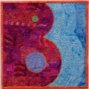
I finished a little quilt this week. No deeper meaning in this one. It is the letter B. Or if you rotate it 90 degrees counter-clockwise it is an autumn landscape with two ponds, or a pink crocodile winking at you in the water.

This is a 12-inch square made as part of the Fiberarts Guild of Pittsburgh‘s Artabet project. Members of the guild are making letters that will be photographed and used to create alphabet wrapping paper. There will also be an exhibit of the letters this spring. Some people asked to do their initial. I didn’t request any particular letter, so B is what I got assigned.

This quilt is mostly about shape and color. The negative spaces are as important as the positive spaces. I was aiming for a composition that was appealing even if you don’t care about the letter B, which I don’t.  I also wanted a quilt that demonstrates the techniques I like to use and my personal style.

This letter B is bright, bold, bodacious. It speaks with bravado. And yet, it is also playful (bouncy? that’s the closest synonym I can find that starts with B). When this B enters the room, heads turn.

I designed the shapes in Illustrator and printed a template, which I traced onto freezer paper. I cut out the freezer paper pieces and ironed them onto the fabric and cut around them loosely. The pink/orange part of the B is improvisationally pieced from scraps of pink and orange batiks. There are three light blue fabrics, one green, one violet. I assembled the pieces using reverse applique. For example, I loosely cut the B and layered it on the dotted blue fabric. I stitched along the edge of the B and then cut away the excess pink and orange fabric. Then I zigzagged over the raw edge. I couched (couching is sewing yarn or cord to fabric by zigzagging over the yarn) an orange and rainbow twisted yarn on the edges of the B. I filled the B with free-motion machine-quilted stipples and some random hand quilting. The blue area has straight-line machine quilting and french knots. There is some embroidery in the violet area. I attached a mitered French binding on the edges.

So there you have it: the letter B.


De-identification

When I applied for my sabbatical, I proposed to explore visualizing privacy concepts through art. It sounded like a plausible way to tie my research interests to my sabbatical plan, but I wasn’t entirely sure how I was going to do that. Well, I have now finished my second sabbatical quilt, and it is actually about privacy. And there is a long story to go with it.

When I was at SXSW last spring, I saw a Japanese startup at the trade show that was handing out 30x lenses you could stick on your smartphone. They wanted people to use the lenses to take close-up photos of their skin problems and upload them to a social network called Beautécam. I was somewhat horrified by the concept, but happily accepted a 30x lens and hurried off to another booth. When I got home I stuck the lens on my Android phone and started taking photos. Once I got the hang of using it (it has a very short focal length) I was amazed at the detailed photos it took. I took a bunch of photos of fabrics and flowers with very nice results.

Using the lens made me think a lot about privacy. Given my research area, I think a lot about privacy anyway, but this creepy skin-care lens seemed well suited for visualizing privacy concepts. I tried to understand why the intended use of this lens had such a high “yuck” factor for me. For one thing, 30x closeup photos of skin are actually not very attractive, even if your skin is flawless, which mine certainly is not. But most of us don’t get really close-up views of very many other peoples’ skin, because that usually requires being in uncomfortably close proximity to those people. We all learn to keep a certain distance away from people out of respect for their personal space. Just how far that distance is seems to vary somewhat by culture.

In order to be in focus, an object must be within about a millimeter of the end of the 30x lens. So using this lens to photograph skin requires pressing the lens against the skin. Taking pictures of flowers with the lens requires shoving the cone-shaped lens into the center of the flower, and in some cases, gently prodding the flower into the center of the lens. So, there is no way to use the lens without invading the personal space of the person or object you are photographing. Of course, flowers don’t care, but I like the metaphor.
The flower images and the privacy metaphor especially intrigued me, and I started thinking about how I might use them in a quilt. I assembled a panel of some of my favorite flower images in Photoshop and uploaded them to Spoonflower, a company that prints digital images on fabric. About a week later Spoonflower delivered a yard of Kona cotton fabric with my images printed on it. The images looked soft and lovely on the fabric, although the colors were not as intense as in the original. After I machine washed the fabric a little more intensity was lost. Clearly the images would need embellishment to regain some of the vibrancy of the originals.

After pondering the images on the fabric for a while I decided to take advantage of the lossy images and use the fabric for a study of visual de-identification. I selected nine of the images and set out to create a 12-inch block featuring each one. I went to my fabric stash and pulled out a large stack of fabrics (mostly batiks) that blended with the colors in the flower images. Each block has these ready-made commercial fabrics spliced together with my custom-printed fabric. On some of the blocks I overlaid polyester organza, a shimmery, translucent fabric. In some blocks, I retained large areas of the flower image, with small strips of fabrics spliced between. In other blocks the flower images are chopped into small pieces and interspersed among the commercial fabrics. I put each block together improvisationally, as a mini-quilt unto itself.

I assembled nine blocks and then sewed the blocks together into a very colorful 3×3 square. I pondered what color to use to bind the quilt, and eventually decided it would look better without binding. So I decided to try the envelope method of binding in which the front and back of the quilt are layered facing each other (with the batting layered on top), sewn around the edges, and turned right-side out through a slit in the backing fabric. The slit gets covered over in the end by the hanging sleeve. The result is a nice clean, modern-looking edge to the quilt, rather than a picture frame.

The next decision, was how to quilt the piece. I decided to use a mix of techniques — free-motion machine quilting, straight-line machine quilting, hand quilting, and embroidery –and use the quilting to both add color intensity and to further de-identify the flower images. Each block has its own quilting pattern that spills out into neighboring blocks. There are fun spirals, circles, petals, and stipples free-motion quilted in bright colors. There are yellow, red, and lavender French knots, liberally sprinkled throughout. And lots of hand and machine quilted lines.

Looking at the finished piece, I see a lot going on. There are nine separate compositions that are loosely tied together (not as well as I had hoped, actually, but perhaps that’s part of the point). There are flower images rendered difficult-to-identify by the unusual close vantage point from which they were taken. These images are further obfuscated by slicing and reassembly, overlays, and stitching. The edges of images are mixed with their neighbors so it isn’t always clear what pieces belong with which images. But if you saw the original flowers, you could probably eventually re-identify most of the images. (Perhaps I will do another quilt on “re-identification.”) It is a lot like personal data de-identification, in which data is removed and digital noise is introduced, but in the end the de-identified data might be re-identified given sufficient contextual information.

Blue hair and work Wednesday

me with blue hairThis was the first official week of my sabbatical, after the summer-long soft launch. I celebrated by getting my hair dyed blue. Not all over blue, just blue highlights in front. Not shocking, you-can’t-miss-it sky blue. Rather, deep cobalt, almost indigo, make-you-look-twice-because-you’re-not-sure blue. There are a few streaks of turquoise mixed in too… I think that’s how the dye stuck to my grey hairs. The blue gets more obvious in the sunlight and when I flip it back. If I have to go somewhere where suits are required, I won’t look too terribly out of place.

I’ve gotten some interesting reactions. Some of my colleagues were confused by it. “What’s that all about?” “That’s not permanent is it?” Some people see me and exclaim, “Your hair is blue!” But for the most part, the blue hair is getting rave reviews. I’m pretty happy with how it came out, except for the fact that I have to keep wiping blue smudges off my forehead.

Some of my friends, who know I have enough purple apparel to clothe the Northwestern University marching band, have asked, why blue? Why not purple? In short, this was  a decision delegated to my  hairdresser. I have learned that I have neither the time nor the skill to coax my hair into doing anything remotely similar to what I want it to do. But my hairdresser has succeeded in getting my hair to do what she wants it to do. As long as she gives me instructions for maintaining my hair that require no more than three-minutes a day to execute, I can keep my hair looking more or less (ok, usually less) the way she wants it to look. And she wants it to be blue. We had a conversation that went roughly like this:

Me: I’m doing a sabbatical this year at the art school.

Hairdresser: Wonderful! You need an artsy hairdo. We will dye your hair blue.

I didn’t even ask her what shade of blue before she began applying bleach and wrapping my hair in little foil packets to remove the natural color, as apparently blue dye doesn’t do much for brown hair. Within the hour I had white-blond highlights. She then applied dark blue gloop to the highlighted hair, wrapped it back up in foil packets, and the next time I saw my hair it was blue.

Of course, if you have blue hair, you have to document it. Who knows, I may never have blue hair again, depending on how annoying the blue forehead smudges get. So I setup for a photo shoot in my son’s bathroom (it has blue walls and good natural light through the window, and the mirror is an added bonus) so I could capture my blue self-portrait. There’s not much room to setup a tripod in a bathroom, but I got it wedged in managed to shoot a decent self portrait.

So, with hair dyed blue, I spent the week enjoying the energy of a campus filled with students once again, content in the knowledge that I would not be teaching any classes to these students this year. I sat outside and watched them play frisbee. When a soccer ball came my way, I kicked it back. And I sat it the STUIO tying French knots on the quilt I was trying to finish this week for a competition deadline (I made the deadline, more on the quilt in my next post). But unlike the past 8 years, I did not spend the last week in August scrambling to finish a syllabus, polish off lecture slides, and get ready for a busy semester.

My sabbatical is actually a 75% sabbatical. I did promise to spend 25% of my time doing research and advising my students. And so, I have designated Wednesday as work day in my office (or in meetings). Ok, the reality is that I cannot get all my work done in one day per week, and I cannot force all meetings I need to attend to schedule themselves on Wednesdays. Indeed I spent a good chunk of Monday in meetings, and arrived on campus at 8:30 am on Friday to get a quick meeting out of the way before heading to the STUDIO. But I did manage to spend most of Tuesday, Thursday, and Friday quilting this week. And on Wednesday I had 13 meetings. In fact, I have 11 standing meetings with my students and research groups scheduled every Wednesday for the rest of the semester. (Except for next week when I’ve cancelled them all so I can go to a conference on Wednesday.)  Oh, and I’m co-directing a new masters program in privacy engineering (more on that later too).

My kids started their schools this week too. Only two days so far. Once we determined that  our school bus stop was not actually located at the corner indicated in the letter from the school district, everything has gone smoothly.

Soft launch

I’m a few weeks in to the “soft launch” of my sabbatical. Officially the sabbatical starts with the fall semester at the end of August. But things slow down in the summer so I’m trying to spend two days per week sabbaticing, at least for the weeks when I am in town.

My sabbatical is a “staybattical.” With 3 school-aged kids and a husband who wasn’t keen on the idea of relocating for a year, a sabbatical in some exotic foreign place was out of the question. But just because I am not going anywhere, doesn’t mean I can’t do something different, interesting, exciting, mentally liberating, intellectually restorative, relaxing, and totally awesome. I am spending my sabbatical as a fellow at the STUDIO for Creative Inquiry in the Carnegie Mellon School of Art.

The first question everyone has been asking me when they hear this is, “What will you do there?” And the answer is, of course, “Art.” I have some ideas and a little bit of a plan — I had to write something on my sabbatical request form — but actually I don’t have too much of a plan. And that’s sort of the point. I want to do some quilting, I want to play with some e-textiles, I want to do a project related to privacy (that was the part I promised on my sabbatical request form), and beyond that, we’ll see…. I am just really excited to have the opportunity to spend a year being an artist and trying new things with no particular plan (while still getting paid).

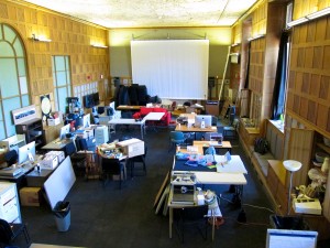
A bird’s eye view of the STUDIO. On the right you can see my workspace with sewing machine.

According to the STUDIO website, “The Frank-Ratchye STUDIO for Creative Inquiry at Carnegie Mellon University is a laboratory for atypical, anti-disciplinary, and inter-institutional research at the intersections of arts, science, technology and culture.” So that seems to allow for pretty much anything.

Art has always been an interest of mine. When I was an undergraduate engineering student I minored in fine arts. I remember fondly the hours spent in the art school, and how different the environment was from the engineering school. I loved my art classes, both for the art, and for the perspective it gave me on engineering. I’m hoping that 20 years later, the experience will be just as enriching.

The STUDIO is a huge two-story high rectangular room with a recycled rubber floor and lots of tables and large Macintosh monitors. There is a construction project going on right now to make the entrance handicapped accessible so its also kind of a mess. I’ve been given 4 tables with which to carve out my workspace. I put two of the tables up on bed risers to make a tall table for ironing and cutting. I have an ironing blanket, a cutting mat, and a design board made from old conference posters covered in black fleece (the STUDIO is definitely a reuse/recycle sort of place). I have an old Pfaff sewing machine borrowed from the Drama School’s costume shop. I also have a cabinet to store my supplies and a wonderful window seat.

So, after a few weeks of spending 1-2 days per week in the studio, I have succeeded in setting up my space, locating and borrowing a sewing machine, touring the costume shop (when I picked up the sewing machine), and piecing a 2 ft x 2 ft wall quilt. I have also acquired an Arduino and several programming books. Since I am, after all, a computer science professor, I think the other folks in the STUDIO are expecting that I will write lots of code. However, for the time being, I seem to be the only one in the studio who is not writing code. There will be plenty of time for writing code. But for now I need to make something I can touch. The need to make tangible things was actually what got me started quilting in graduate school almost 20 years ago, and it is, perhaps, that need that has inspired me to keep at it.