Neck Ties

A while ago I made a bunch of ties and never got around to blogging about them. Here they are. Details on pattern below.

I previously had commissioned a tie-seller on Etsy to make some ties out of my bad passwords fabric. But she isn’t on Etsy any more so I decided to try sewing some times myself. There are lots of tie patterns available online, some of them free. Most require a main fabric, interfacing, and lining, and require some hand sewing along the center back seam. So I was excited to find Bryanna’ Free Neck Tie Pattern and Tutorial that was super easy and can be made without any interfacing or hand sewing (except for tacking down the tie keeper ribbon on the back). I tried it and it was great, but when I came back later to find it I saw that Bryanna had taken down her sewing site some time in 2023. Fortunately, you can still view her tutorial using the Wayback Machine. Unfortunately, you cannot view her pattern. But I had previously saved it and hacked it a bit. So I will share my hacked version of it here.

First I merged the multi-page file into a single page, suitable for projector sewing. For those of you who are printing out your patterns on 8.5×11 pages, sorry this may not work for you. You may be able to print it tiled. The pattern calls for cutting the tie in two long strips diagonally (on the bias). The front is much longer than the back and requires a really long piece. This minimizes the number of ties you can get out of a yard of fabric. The long front piece is also too long to easily project. So I took a segment of the tie front and moved it to the tie back. In my hacked pattern you can see the segment and you can put it on the front or the back as you see fit. Just don’t put it in both places or you will end up with an extra long tie. You do end up with a seam where the front and back connect, but in my experience, even in my hacked short front, the seam does not end up in a visible part of the tie when being worn.

The great part about this pattern is you layer your main fabric and your lining, fold them, and sew the whole thing together in one long seam on your sewing machine. You then turn the whole thing inside out in step 7 and you are basically done. The tricky part, is in the turning the whole thing inside out with a safety pin. You have to feed the thick part of the tie through the narrow neck, and that is not all that easy to do. Just take it slowly and you’ll get there eventually.

Bryanna suggests folding the ends of a 3″ tie keeper and hand sewing them in place. Instead I recommend cutting a 4.5″ tie keeper, folding it in half, and sewing it into the main seam of the tie as part of step 6 (just the ends will be sticking out of the seam at the end of step 6). After the tie is turned right side out in step 7, you will have a tie keeper tucked into the seam, with no raw edges. At that point you just need to flatten it out and stitch down the sides. I think it looks a little neater this way.

After I made a few password ties, I found the cookie fabric and decided to make a tie for my student who was presenting our research paper on cookie consent banners at a conference.

Password dress: ball gown edition

I made my first bad password dress back in 2013 — a simple, short, sleeveless sheath, that has become quite famous. After wearing it to give a lot of security talks, it started showing wear and so I made a second one — the original is in the privacy art collection of the International Association of Privacy Professionals. But I finally got tired of wearing it to places like Davos in the winter where everyone insisted that I needed to be photographed outside in the snow and experiencing cold arms and lack of pockets, so I made the long-sleeved version last winter. But now I have taken this whole wearable password game to the next level and I give you the password dress: ball gown edition. So as not to keep you in suspense, I’ll jump right to the photos. But scroll past if you want all the details about how and why I made it.

It’s made from a luxurious custom printed crushed velour fabric from Contrado. It’s vibrant and shiny, especially in the sun. And it feels stretchy and soft and is the most comfortable ball gown ever. All of my past custom password fabric orders have been from spoonflower.com. But they didn’t offer a suitable fabric that was both dressy and stretchy, so I started looking for other custom fabric vendors. Contrado is based in the UK so I was a little bit uncertain about placing an international order, but they offer a ton of fabric options so I ordered a fabric swatch kit. A few days later I opened an envelope with more fabric swatches than I knew what to do with. I didn’t count them, but I think there were over 100. So many fabric choices! I dumped them out on the floor and tested each one for light weight, softness, and stretchability, narrowing down the pile to a short list of scuba variants and crushed velour. They were all nice, but I loved the feel of the crushed velour and the way it catches the light. So with that in mind I ordered some cheap crushed velour to make a muslin of the pattern I intended to make (Sinclair Serena), but at a shorter length. The cheap crushed velour did not feel luxurious at all, but it made a nice dressy summer dress that I have worn several times this summer.

Once I had picked out the fabric and settled on the pattern, I worked on the fabric design. I took the PDF file for the Serena dress in the size 4 petite, and extended the skirt length to be long enough to graze the tops of my feet after hemming. I then created a PDF file the width of the fabric (53.15 inches) by 108 inches long in Affinity Designer. I pasted the Serena pattern pieces into the file, mirroring those that needed to be mirrored. The skirt back at that length was wider than 53 inches, so I decided to add a back seam and print the skirt back in two pieces. I split the skirt back and added a seam allowance to the center back seam. The skirt front is not as full so it fit the fabric width without a problem. I made all the pattern lines red and deleted all of the internal pattern markings, keeping only the outlines. Then I added a solid purple layer under the pattern pieces. The next step was to add all the passwords to the dress. I started with my previous password dress fabric and cut and pasted the passwords inside the pattern pieces (removing the naughty words this time). In some cases I rotated them or scaled them slightly from the previous design. I spent a lot of time rearranging the passwords to fit them all into the puzzle. I also chose some of my favorites for prominent placement. I decided to cover the entire skirt and back of the bodice with passwords but leave the bodice front solid purple.

I could have continued futzing with the password layout for quite some time, but I was not sure how long it would take for my order to be delivered and I had a deadline for finishing the dress, so I saved a giant jpg file and called it done. (I subsequently spotted several small glitches but hopefully nobody else will notice.) I went ahead and placed the order on a Sunday morning in August. Much to my amazement, the fabric was printed in the UK, shipped across the ocean, and was delivered via FedEx to my doorstep in Pittsburgh, PA just TWO DAYS LATER on Tuesday! The custom fabric is expensive. Even with a discount coupon it was $42 per yard. But I paid only $9.95 for standard international shipping.

The Contrado website said the fabric would be machine washable, but was a little vague on whether to expect shrinkage. Given that it was 100% polyester fabric I took a chance that there would be minimal shrinkage (definitely a risk if you print your pattern pieces directly on the fabric) and I was right.

I laid the fabric out on my magnetized cutting mat and cut it out along the red lines with my rotary cutter. I knew from sewing the muslin that crushed velour is slippery and hard to pin in place, so I did a lot of hand basting and then serged most of it, leaving the cutting knife retracted so I wouldn’t accidentally cut anything I didn’t want to cut (since the pattern had 1/4-inch seam allowances there wasn’t really any need to trim as I sewed). The first few steps of the bodice assembly went pretty well, until it came time to join the F1 piece to the F2/F5 piece of the bodice. There are multiple points to line up and after basting and unbasting multiple times I realized that there was no possible way to get everything simultaneously lined up. After about three hours of this I finally gave up and sewed it together so the outside looked good, but the inner lining (purple ITY) looked like a train wreck. But nobody will ever see it, except for the fact that I am showing you this photo right here so that you can see that the inside is a complete disaster but the outside still looks really good. You will see there is a diagonal piece that goes from the top left to the bottom right. There is another diagonal piece that starts in the middle and goes to the bottom right. Those two pieces are supposed to be sewn together on top of each other, but yet there is a bout a 1 inch gap between them. So that nothing would be flapping in the breeze, I sewed the loose edge to the inner lining. I believe the problem has to do with the fact that my fabric stretches only in the horizontal direction and has almost no vertical stretch (going against the advice of the pattern maker). The fabric I used for my muslin was similar, yet somehow I did not end up with this particular problem. I’m perplexed, but it all worked out in the end.

Of course, I chose the pocket option, since Cinderella and I always need pockets, even when we go to a ball. I decided to make the pocket bags out of the purple stretch velour so that they would not show if they fell open. Stretch velour is not really ideal pocket bag material, especially since I stitched the pocket openings up a bit to prevent things from falling out. Sticking my hand in a pocket tends to cause the pocket bag to come out with my hand, but it works well enough for holding my phone and a small wallet. From past experience with this pattern, I know that I prefer the pockets to sit a bit higher than the pattern calls for so they don’t jiggle around when I walk, so I ignored the marks and just tried on the partially completed dress and pinned the pockets where I wanted them to go.

I’m really happy with the end result. It is exactly what I wanted. I was so excited that I put it on and made my husband follow me around my yard with my DXLR camera while I played fashion model and posed for photos. He has no formal photography training but he is starting to get the hang of fashion photography as I explain to him that there is a difference between zooming in and moving closer to the subject.

Did I mention that this dress has some twirlability?

Ok, so why did I make this dress? Well I’m the director of the CyLab Security and Privacy Institute at Carnegie Mellon University. This is our 20th anniversary year and we held a gala to celebrate on Tuesday. Obviously, I need a password ball gown to wear to the gala. (And of course my husband needed a matching tie.)

CyLab 20th Anniversary Gala

As an added bonus, the Carnegie Science Center held their Geek Out Gala on Thursday, and this was the perfect outfit! So many people I didn’t know came up to me to talk with me about my dress.

Scarves, scarves, and more scarves

DSCF7849Last summer I took photos of a bunch of my favorite paintings by Grandma Gladys (see also this article about her and this TV interview), and then turned them into fabric designs on spoonflower.com. I then turned a couple of my favorite designs into infinity scarves, and when I told Grandma about it, she requested one of each. It has taken me a while to make this happen, but with the help of Jen Primack of Upcycled Designs, I now have a big stack of infinity scarves ready to ship to Grandma. These were all printed by Spoonflower on performance polyester. They each use a half yard of fabric (so you get 2 out of a 1-yard cut). Fabric is folded the long way, sewn in a tube inside out, joined at the ends with a small opening, turned right side out, and the opening stitched closed.

I setup a tripod and took a lot of selfies so you could see all the scarves. Since I had enough fabric for 2 of each, I’m keeping the duplicates of some of my favorites for myself… but so hard to decide!

Tartan Tango, now in scarf form

Lorrie modeling Tartan Tango infinity scarf

A few months ago I got a request from the powers that be at CMU to design a scarf based on my Tartan Tango quilt design that they had commissioned when I was on sabbatical back in 2013. I was happy to oblige. I dusted off my Interleave quilt design software and produced a fabric design based on the quilt. After experimenting with the design in both a large and small size, we settled on the smaller version.

But they wanted 50 of them ASAP, which is well beyond what I could possibly sew in a week (or even a year given my current schedule). So I ordered a huge bolt of fabric from Spoonflower and subcontracted the sewing to Jen Primack of Upcycled Designs.  Jen cut the fabric and sewed it on her serger, and was able to deliver the first half of the order within a few days, and the second half not long after.

I also learned a bit about scarf packaging, and acquired suitable glossy white boxes and gold “stretch loops” for a finishing touch (yes, that is the proper term for those gold elastic cords, tied in a bow, that decorate small packages… I just learned that).

I have another slightly smaller project in the works that Jen is helping me with, and will sew a few more scarves myself with fabric I designed from Grandma Glady’s paintings.

25 Tartan Tango infinity scarves

25 Tartan Tango infinity scarves on my kitchen table

Password fashion and home decor roundup

Bad password fabric

I’ve been collecting images of all the cool things that I and others have made with my bad password fabric. The fabric is available from Spoonflower in three size and both with and without the naughty words. It has a purple background and includes 501 passwords. Spoonflower offers a variety of different kinds of fabrics, including a performance knit, basic cotton, and faux suede. They also will print this design on wrapping paper and wall paper.

Bad passwords dress (Security Blanket quilt in background)

Recapping for those who are just seeing this, I designed a series of bad password fabrics based on the most popular passwords stolen in a Rockyou.com data breach. First I made a “Security Blanket” quilt printed on basic cotton fabric in pastel colors. This quilt appeared in Science Magazine and was on display at the residence of the Carnegie Mellon University president for most of last year. Then I designed a purple version of the fabric and made a password dress with performance knit fabric. The dress has gotten some nice press on CNET, the Trib, and the Women you should know blog.

Then my friends started requesting other password apparel. Mary Ellen Zurko commissioned my friend Jen Primack of Upcycled Designs to make her a t-shirt from cotton knit fabric. Then Jeremy Epstein asked for ties, and we found Jen Knickerbocker of LoveCrushDresses and got her to offer regular ties and bow ties in her Etsy shop. The ties are made from cotton sateen.

Bad passwords t-shirtbad passwords tiesbad password bow ties (two)

Then Jen Primack bought an old chair and reupholstered it with my passwords fabric in heavy cotton twill. Doesn’t it look great in my living room?

password chair upholstered by Jen Primack password chair upholstered by Jen Primack

Kristin Briney emailed me to tell me she had made a password dress from cotton poplin. And I just made a password infinity scarf from silky faille (a woven polyester).

Kristin Briney's bad password dresspassword infinity scarf

Password baby quilts and couch throws made out of kona cotton are coming soon….

In the mean time, I’ve gotten many requests to wear the password dress to events. I wore it to give an invited talk at the 2014 Grace Hopper Celebration of Women in Computing (where I was referred to as a “password researcher and fashion idol“). I also wore it to a couple of briefings I gave to Congressional staff on Capitol Hill.

Lorrie speaking about passwords at Grace Hopper Celebration Lorrie with Jeremy Epstein wearing password apparel Susie, Lorrie, and Roxana at NSF Congressional briefing

And for those wondering about the different types of fabric. The polyester fabrics are much brighter than the cottons. They are all fairly consistently bright with nice saturated colors. My favorite is the performance polyester, which doesn’t wrinkle and has a little bit of stretch and a nice drape. But it’s not really what you want to use for a quilt or a tie. The kona cotton is a little disappointing because the colors print a little dull. The basic cotton (which is similar to the kona but slightly lighter weight and less expensive), cotton sateen, and the heavy cotton twill produce brighter colors. They aren’t as bright as the polyester, but they are noticeably brighter than the kona cotton. The cotton silk also does not produce bright colors. I think the polyester silky faille might work well for ties and some other applications where you might otherwise use a woven cotton but want brighter colors. It’s a little slippery and harder to work with than cotton though. I got samples of the polyester faux suede and polyester eco canvas. They are both lovely bright fabrics, but I haven’t made anything out of them yet.

1/22/15 update: Von Welch, Director of the Center for Applied Cyber Security at Indiana University Bloomington wore his Password tie for a local TV interview. The reporters loved the tie and commented on it at the end of the interview.

2/6/15 update: Baby quilt in kona cotton finished!

DSCF7245 DSCF7251

7/16/15 update: I made a password bolster pillow for the CMU ECE department head’s conference room.

DSCF0090 DSCF0097

6/28/20 update: Given current circumstances, password masks were required! I printed my design XX small on cotton spandex jersey and lined the inside of the mask with fabric from an old cotton spandex t-shirt (outer layer and lining each cut 10.5 x 5.5 inches; sewn together at top and bottom; left and right sides folded in and stitched to make a casing on each side; long 1-inch strip of stretchy t-shirt fabric pulled through the two casings and tied to make 2 loops to go around the back of the head). Spoonflower also sells masks already made (and lots of other things) for those of you who don’t sew. This link at Spoonflower might work: https://www.spoonflower.com/en/products/2126447-bad-passwords-clean-edition-xxsmall-by-lorrietweet?product=homegoods-kitchen-dining. See also the images and links at https://www.secmeme.com/2020/06/bad-passwords-face-mask.html.

To infinity… and beyond!

While I often imagine myself making homemade gifts for everyone on my list, that doesn’t actually ever happen. This year I got a fun idea for one special gift, and liked it so much that I decided to make several more on a similar theme. This year was the year of the infinity scarf (a scarf with the ends sewn together in a loop). But not just any old infinity scarf…. this year I designed three original fabrics, had them digitally printed at spoonflower.com, and turned them into infinity scarves.

The first scarf was inspired by a colorful painting that my grandmother made earlier this year in her art class. The painting is framed and on display on a shelf in my kitchen. I love the bright-colored swirls and spirals, reminiscent of my own doodles, and thought it would look lovely on a scarf. I took a digital photo of the painting and loaded it into Photoshop. I played with it a bit and realized that all I needed to do was tile it in a mirror-image pattern to create an absolutely stunning design. The shapes in the painting combined with their mirror images to form new shapes and an intriguing pattern.

Painting by Gladys Lipton 2013   gladys-668x900    gladys-tile1


I uploaded the design to spoonflower and ordered two yards of performance knit fabric, a washable polyester knit. Then I waited about a week for my custom fabric to arrive in the mail (the worst part of using spoonflower is the wait!).

IMG_5589

Two yards is enough fabric to make three infinity scarves using the free pattern from Sewn Studio’s Jersey Infinity Scarf Tutorial. The tutorial was super easy to follow. The hardest part is cutting two yards of this slippery fabric into three 24-inch pieces. I made my first scarf in less than an hour and was quite pleased with the results. The scarf can be worn long, or looped around twice. It can also be knotted in various ways for a different sort of look – although one of the great features of infinity scarves is that you don’t have to mess around with tying them. I made three scarves – one for Grandma Gladys, one for my mother, and one I kept for myself.

output_19_45_15

I decided to try my hand at some more fabric design. I went back to the Processing computer program I had used to design my Interleave quilts and adapt it for fabric design. My first design is based on my Interleave #3 quilt. I used the same pattern and color scheme, but added gradients so each bar is a lightly different color. The addition of the gradients adds dimension to an otherwise flat design, and makes it almost appear to glow.

My second design was based on my Interleave #4 quilt. Here I completely changed the colors and used gradients to not only add dimension, but also to introduce more colors. I love the way the colored stripes mix to produce the illusion of additional colors. Here you can see the fabric pattern, as well as the scarf being modeled by me as well as by my mother-in-law.

output_20_22_17  Lorrie with interleave infinity scarf 

The infinity scarves were big hits. Here you can see them modeled by my grandmothers and by my mother. Grandma Gladys, second from the left below, made the painting that is featured on the fabric. (Did you guess that we all like purple?)

Gertie, Gladys, Judy, and Lorrie

These fabrics are all available for sale from my shop at spoonflower. You can have them printed on your choice of fabrics (or even wallpaper or gift wrap).


Password dress

IMG_5014This is old news, but just now getting around to posting it. I made a password dress to go with the password quilt. I wore it to the opening of the Computers, Quilts & Privacy show and to give my artist’s talk.  I also wore it to a faculty meeting and disrupted the meeting.

As with the Security Blanket quilt, I generated a Wordle from the RockYou password set, and then edited it in Adobe Illustrator. I selected brighter colors for the dress and had it printed at spoonflower.com on performance knit polyester fabric (UPDATE: You can purchase similar fabric on spoon flower that I created and ties made from this fabric on Easy…. and read about lots of other passwords stuff made by me and other people) I made my own pattern by tracing a store-bought dress I own that fits me well. It is just two pieces of fabric. The only tricky part was finishing the neckline and arm holes. I bought a double needle and used it to do the hem. This was my first foray into sewing with knit fabric.

And here are some more photos from the Computers, Quilts & Privacy show at the Frame. There is also a video of my talk that I will post after it is edited.

Security Blanket

As I’ve been thinking about quilt ideas related to security and privacy during my staybatical at the STUDIO for Creative Inquiry all year, the title for this quilt was obvious: Security Blanket. Less obvious was the design of a quilt that would fit this title. Ultimately, I took inspiration from the research on the security and usability of text passwords that I’ve been working on with my students and colleagues. While this quilt started out as an art project inspired by my research, what I learned from creating it will likely influence my future password research.

Security Blanket, machine quilted, digitally printed cotton fabric, 63.5″x39″

Our research group has collected tens of thousands of passwords created under controlled conditions as part of our research. Among other things, we have compared these passwords with the archives of stolen passwords that have been made public over the past few years. Perhaps the largest such archive consists of 32 million passwords stolen from social gaming website RockYou and made public in December 2009. These passwords are notably weak, having been created without the requirement to include digits or symbols or even avoid dictionary words. Security firm Imperva published an analysis of these passwords. More recent analyses of stolen passwords have found that passwords stolen in 2012 are pretty similar to those stolen in 2009.

The media had fun publishing the most common passwords from the RockYou breach. As with other breaches, password and 123456 figured prominently. But after you get past the obvious lazy choices, I find it fascinating to see what else people choose as passwords. These stolen passwords, personal secrets, offer glimpses into the collective consciousness of Internet users.

I asked my students to extract the 1000 most popular passwords from the RockYou data set and provide a list to me with frequency counts.  I then went through the list and sorted them into a number of thematic groups. I assigned a color to each group and entered the passwords with weights and colors into the Wordle online word cloud generator. I then saved the output as a PDF and edited it in Adobe Illustrator to rearrange them in a shape that I liked, with some pairs of words purposefully place in close proximity. I designed a border, and had the whole thing printed on one large sheet of fabric by Spoonflower. When the fabric arrived, I layered it with batting and quilted it. I bound it with matching fabric from Spoonflower that I designed.

Sorting 1000 passwords into thematic categories took a while. While a number of themes quickly emerged, many passwords could plausibly fall into multiple categories. I tried to put myself in the mindset of a RockYou user and imagine why they selected a password. Is justin the name of the user? Their significant other? Their son? Or are they a Justin Bieber fan? Is princess a nickname for their spouse or daughter? The name of their cat? Their dog? (It shows up frequently on lists of popular pet names and a recent surveyfound that the most common way of selecting a passord is using the name of a pet.) Is sexygirl self referential? What about daddysgirl? dreamergenius?

When I didn’t recognize a password I Googled it. Most of these unknown passwords turned out to be ways to express your love in different languages. For example, I learned that mahalkita means I love you in Tagalong. Love was a strong theme in any language; there seems to be something about creating a password that inspires people to declare their love.

Not surprisingly, the top 1000 passwords list includes a fair share of swear words, insults, and adult language. However, impolite passwords are much less prevalent than the more tender love-related words, appropriate for all audiences.

There are a couple dozen food-related words in the top 1000 passwords. The most popular is chocolate and most of the others are also sweets (and potentially nicknames for a significant other), but a few fruits and vegetables, and even chicken make their way to the top as well. Among fruits, banana appears in both singular and plural.

Animals are also popular. While felines appear on the password list in a number of forms and languages, monkey is by far the most popular animal, and the fourteenth most popular password. I can’t quite figure out why, and I don’t know whether or not this is related to the popularity of “banana.”

Fictional characters are also popular, especially cartoon characters. The twenty-fifth most popular password is tigger (which might also be on the list because it is a popular name for a cat). A number of super heroes and Disney princesses also make the list, as well as another cartoon cat, hellokitty. Real life celebrities also make the list, including several actors and singers. While at first I thought booboo might refer to the reality TV star Honey Boo Boo, I realized that the date of the password breach predates the launch of that TV show.

A number of passwords relate to the names of sports, sports teams, or athletes. Soccer-related passwords are particularly popular. There are several cities on the list that I’m guessing were selected as passwords because of their sports teams, especially soccer teams.

Besides the obvious lazy password password, and also PASSWORD, password1, and password2, some more clever (but nonetheless unoriginal) variations included secret and letmein. And I love that the 84th most popular password is whatever.

Some passwords puzzled me. Why would anyone select “lipgloss” as their password. Why not “lipstick” or “mascara”? Perhaps it refers to a 2007 song by Lil Mamma?  Why “moomoo”? Why “freedom”?

Even more popular than the word password were the numbers 123456, 12345, 123456789. Other numbers and keyboard patterns also appear frequently. When I laid out the 1000 passwords on the quilt, I scaled them all according to their popularity. The most popular number sequence was chosen by more than three times as many people as the next most common password and was so large that I decided to place it in the background behind the other passwords so that it wouldn’t overwhelm the composition.

I made a few mistakes when designing the quilt that I didn’t notice until I was quilting it (quilting this quilt provided an opportunity to reflect on all the passwords yet again as I stitched past them). One problem was that when I transferred the top 1000 password list to Microsoft Excel while categorizing the passwords, the spreadsheet program removed all the zeros at the beginning of passwords. As a result there are three passwords that are actually strings of zeros (5, 6, and 8 zeros) that are printed simply as 0. In addition there are three number strings that start with a 0 followed by other digits are printed without the leading 0. Another problem was that the color I selected for jesus, christian, angel, and a number of other religious words blended in with the background numbers when printed on fabric, making those words almost invisible (even though they showed up fine on my computer screen). I had carefully checked most of the colors I used against a Spoonflower color guide printed on fabric, but had inadvertently forgotten to check this particular color. I reprinted about half a dozen of these words in a darker color and sewed them onto the quilt like patches that one might add to repair a well-worn spot.

There are also some passwords that I colored according to one category, and upon further reflection I am convinced more likely were selected for a different reason and should be in a different category, but we’ll never know for sure. I invite viewers to discover the common themes represented by my color-coded categories and to speculate themselves about what users were thinking when they created these passwords. Zoom in on the thumbnail images above to see all of the smaller passwords in detail.

The colors, size, and format of this quilt were designed to be reminiscent of a baby quilt, which I imagine might become a security blanket. Like the passwords included in this piece, a security blanket offers comfort, but ultimately no real security.

Inspired!

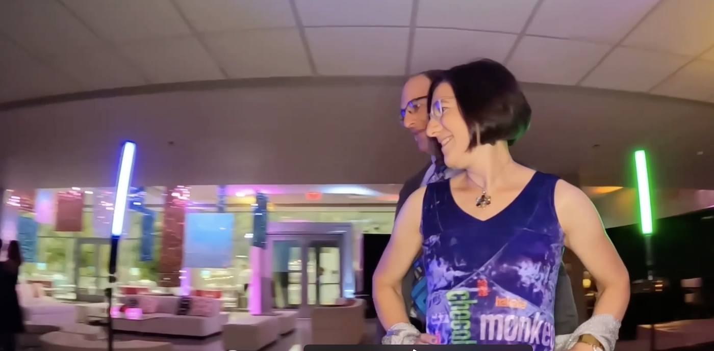
I’m excited to finally reveal Interleave #6: Porto, which was presented to Ed Frank and Sarah Ratchye at a reception before the Grand Finale dinner of the Carnegie Mellon Inspire Innovation! fundraising campaign last night. I was commissioned to make this quilt to thank Ed for serving as chair of the Inspire Innovation! campaign. (The campaign was incredibly successful, raising well over the $1 billion goal. As a faculty member at a terrific university that has a much smaller endowment than most of our peer institutions, I really appreciate how this infusion of funds will benefit the university.)

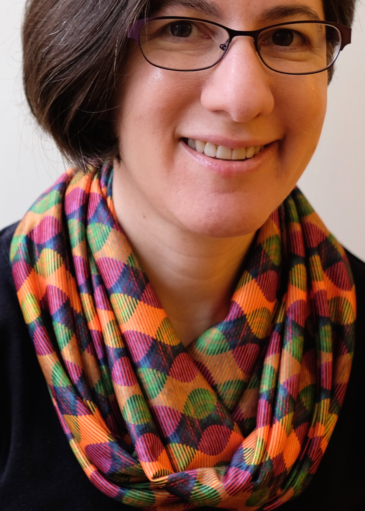
I felt truly honored to be asked to make this gift, and somewhat nervous about whether I could produce something that would live up to expectations. Ed and Sarah are art collectors, and Sarah is herself an accomplished artist. The folks who approached me about making the gift were hoping for a piece that would represent the interplay of art and technology, consistent with the mission of the STUDIO. Having spent a good part of the past year working in the STUDIO, I am personally grateful to Ed and Sarah for their financial support of the STUDIO as well.

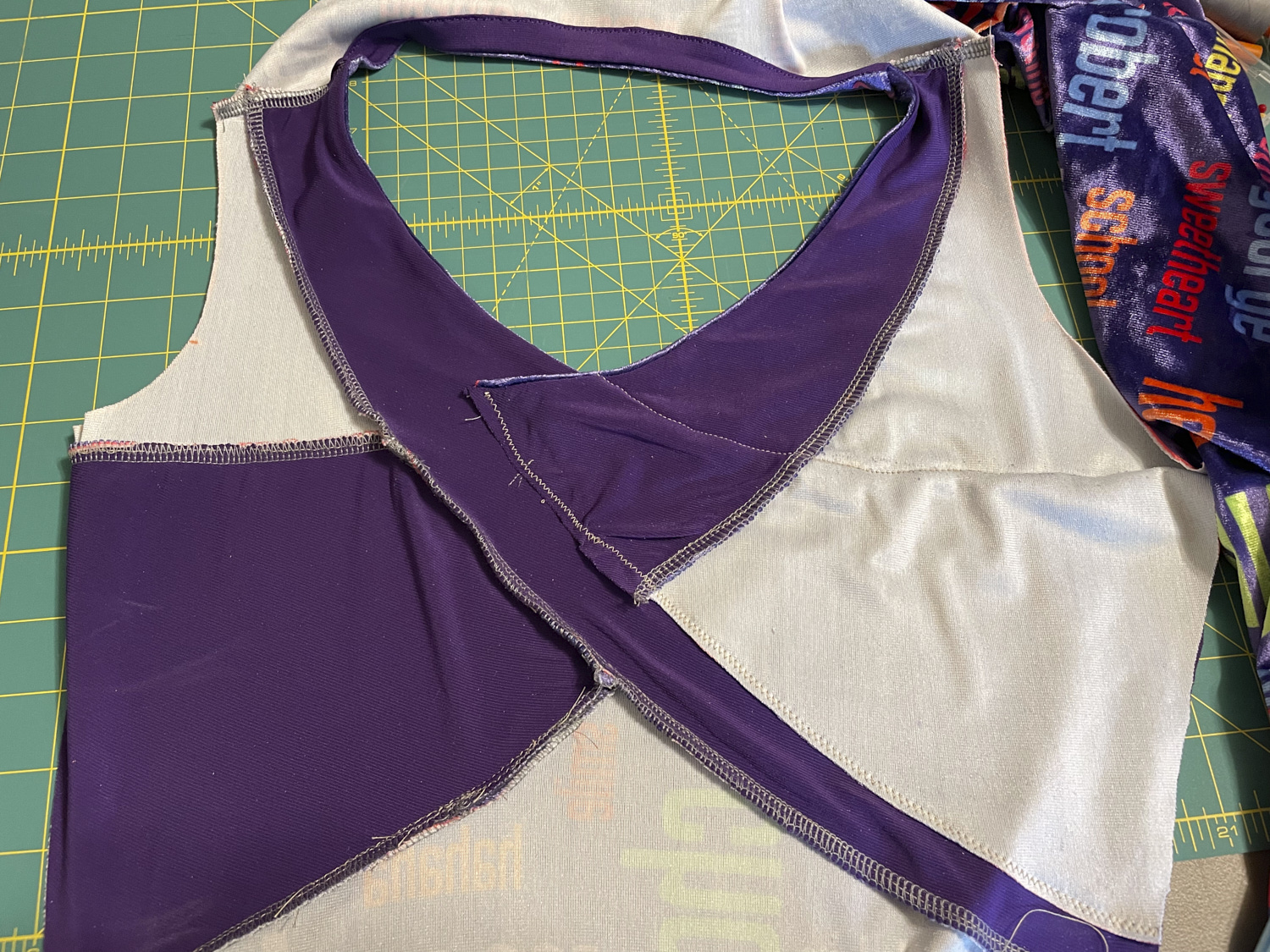
I did not have a lot of time to produce this quilt, and it involved a number of new techniques I hasn’t tried before. It all came together fairly well until the end. Last weekend I finished the binding, and when I put it up on my design wall for a photograph I realized the corners were not square. Really not square. It was a lovely rhomboid parallelogram. Because I have different prescriptions in each lens of my glasses, when I take my glasses off the world looks a bit un-square (which drives my OCD side nuts). But my glasses were on.  I checked the quilt corners against the grid on my cutting mat, and there was no denying it. The quilt was not square. This was the widest Interleave quilt in the series and I realized that the longer the strips, the more room there is for the fabric to stretch as I sew – and I hadn’t noticed until that point that there was actually quite a bit of skew. I pondered the problem over night and the next day ended up removing the binding and vertical borders so I could square it up. Fortunately, I had used Aurifil 50 weight thread for piecing, which made the un-piecing a snap (my new favorite (un)piecing thread – really nice thin thread with low lint that doesn’t break while sewing but so easy to rip out without tearing your fabric when the situation calls for it). I reattached the borders and the binding and finally could declare it finished.

I already wrote up a little artist’s statement, which the CMU advancement folks had a designer incorporate into a little booklet to accompany the quilt. I will just include the statement here for those of you who want to learn more about the quilt. I’ve also included some bonus images  so you can see how it was made.

Artist’s Statement

At first glance the Frank-Ratchye STUDIO for Creative Inquiry at Carnegie Mellon University appears like a good place for a computer science professor, but an odd place for a quilter. I am both a quilter and a CMU computer science and engineering professor who is spending my sabbatical as a fellow at the STUDIO.

While other faculty and students in the STUDIO spend the day creating new concepts from behind computer screens, I set up shop with an old sewing machine, an ironing blanket, a cutting mat and a huge pile of colorful fabric.  At the beginning of my fellowship, I smiled politely every time someone suggested ways of attaching the old sewing machine to a robotic arm, and spent days with needle and thread hand quilting colorful lines.

Hand quilting is a process that offers one a lot of time to think, and I did spend a lot of time thinking about the art and craft of quilting, and how I might use technology in my work. For most of my piecing and quilting, I use a sewing machine, which was fairly sophisticated technology when it was invented about 200 years ago. My most recently purchased sewing machine is actually called a “sewing computer” by its manufacturer, and it has some innovative features such as a sensor that can detect the speed at which the operator is moving a piece of fabric so that the machine can automatically adjust the speed at which the needle goes up and down.

I appreciate the added value that technology can bring to my art, enabling me to create in ways that would be difficult or impossible for me unassisted. But it is not my goal to use technology to eliminate the need for me to participate in the fabrication process. Part of my attraction to quilting and fiber arts is the tactile nature of the medium. For me, part of the fun is manipulating fabric and thread with my hands. I want to use technology to enhance my skills – let me sew straighter, faster, better – or, better yet, to let me create in ways I otherwise could not.

STUDIO director Golan Levin suggested the use of digital technology that was necessary for me to create this quilt. When I started my Interleave series of quilts, I sketched the quilt designs in pencil and did some design experimentation with scissors and paper. As I started to design the third quilt in the series, I began using Microsoft PowerPoint to sketch out some ideas involving sine waves. It was a tedious process as PowerPoint was really not the right tool for the job.

Golan saw what I was doing and suggested I write a program using an arts engineering toolkit called Processing to draw my design. As a computer scientist, I wasn’t previously familiar with Processing, which was developed by artists, for artists, and is taught in CMU’s undergraduate art classes. The program I wrote allowed me to generate the sorts of designs I had been struggling with, and it included sliders to allow me to experiment with sine waves of different frequencies and amplitudes. Using this program, I was able to rapidly iterate through large numbers of design possibilities before selecting one to actually fabricate. I did some engineering to figure out how to actually construct the quilt I designed, and then adapted my program to produce full-scale templates that I could print on paper and use to cut out my fabric.

Each quilt in the Interleave series uses a variation on the technique I described, but each includes a new twist on the approach. For Interleave #6, the new twist was the inclusion of a photograph digitally printed on fabric. After considering a variety of photo ideas, I chose a photo I took in Porto, Portugal in 2009 while on a short trip with some of my colleagues to attend a meeting for the Carnegie Mellon Portugal program. Although I was there for less than three days, I managed to meet the Prime Minister José Sócrates as well as experience the city’s São João festival. Walking around the city, I took lots of pictures with my DSLR camera.

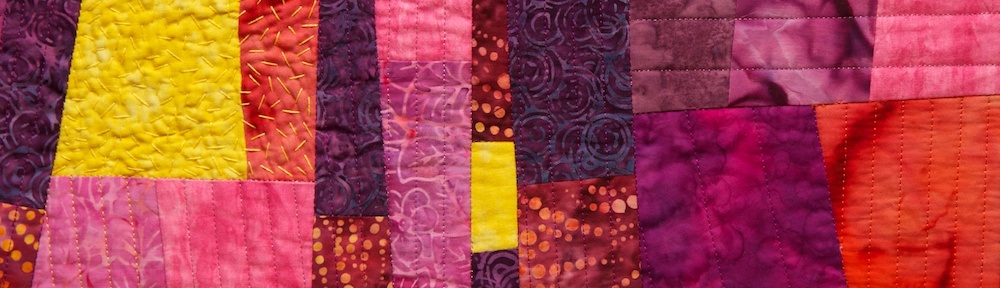
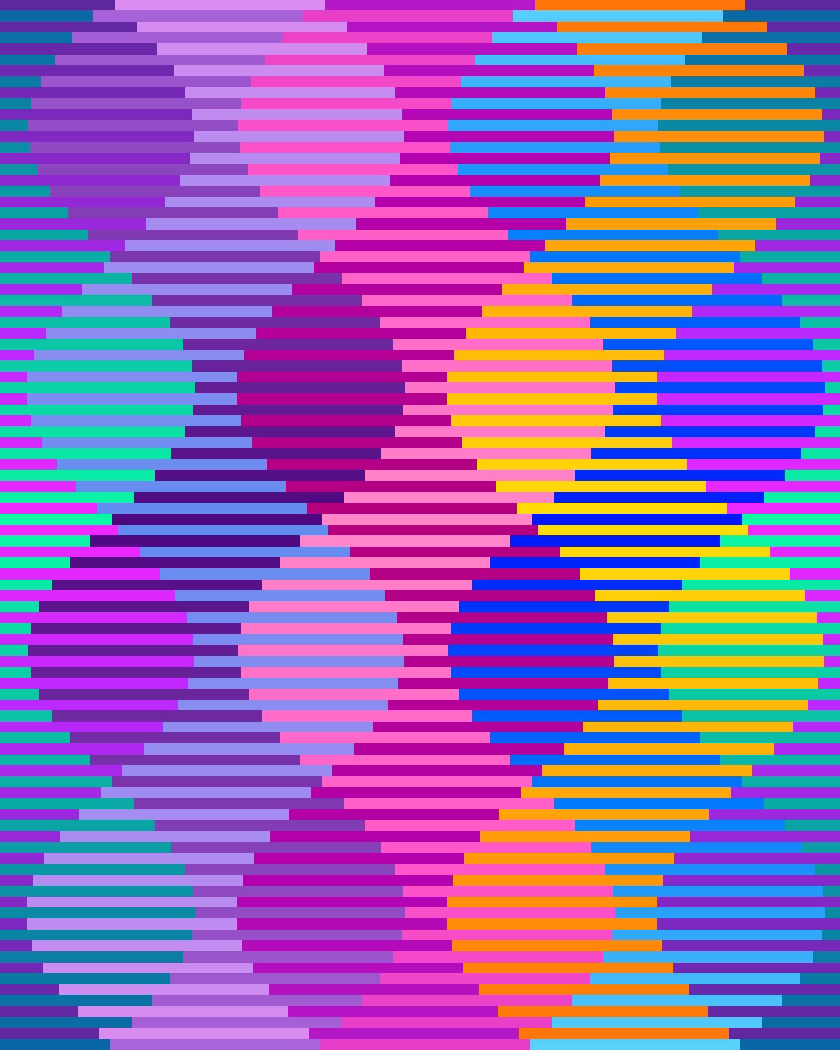
Porto is a wonderfully photogenic city, full of hundreds-of-years-old apartments with bright red-orange roofs. The city also has amazing staircases, some of which appear on maps as roads. The Duoro River runs through the city, with tall bridges stretching across it. The view of the Ribeira district from across the river is particularly spectacular, and affords a view of layer upon layer of buildings built into the steep hillside. It is a photo of this view that I selected for the Interleave #6 quilt.

Full-scale paper prototype to check that everything was in order before printing the fabric.

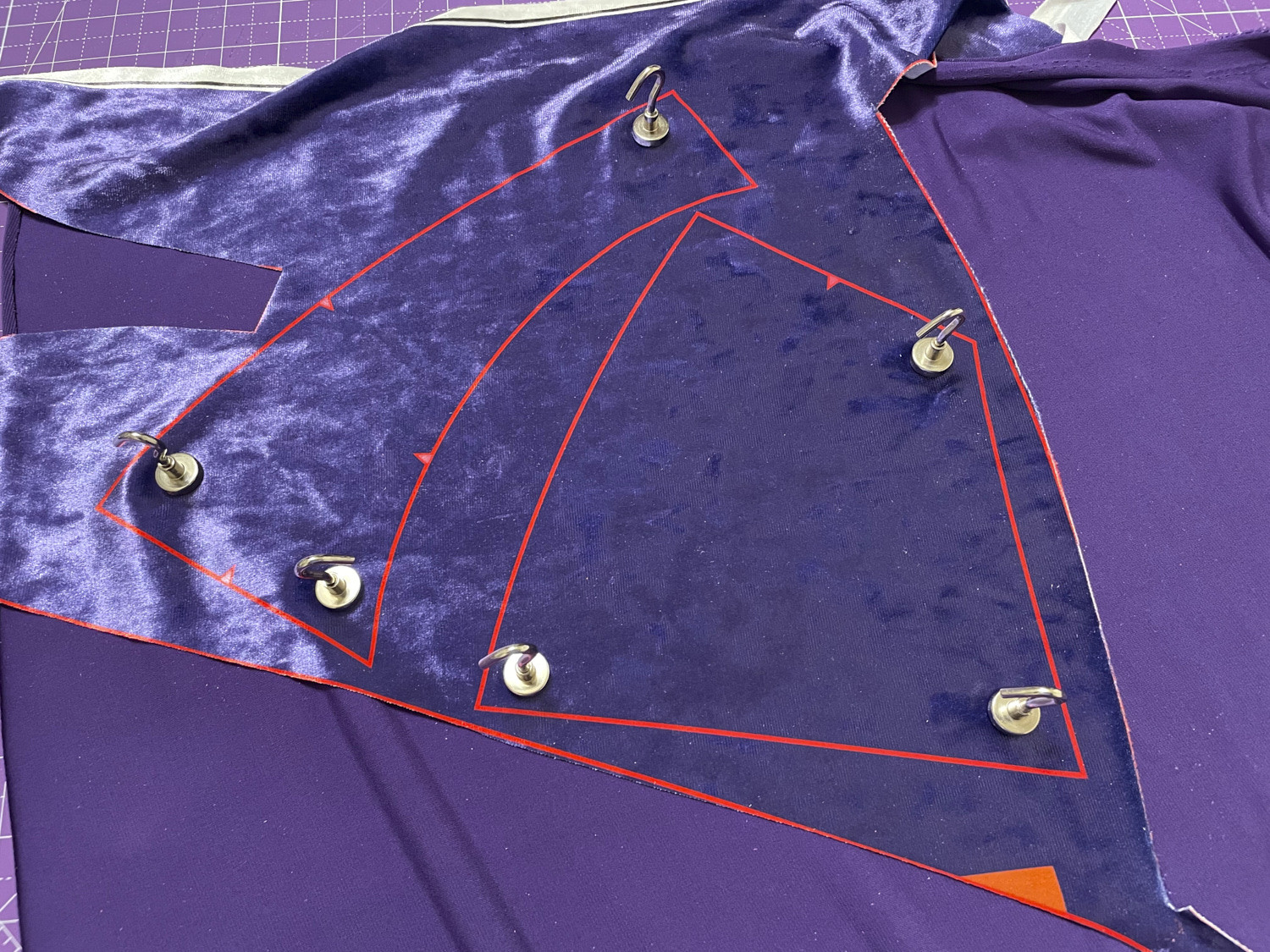
Before printing the photo on fabric, I manipulated it in several ways, including increasing the color vibrancy and saturation. Additionally, I created three versions of the photo at varying degrees of pixilation. Then I used my Processing program to interleave the three versions in a sine wave formation and to leave space for splicing in batik fabrics. Next, I adjusted the end result so it could be printed on fabric complete with guides for cutting and splicing. Since I wasn’t entirely sure I had calculated everything properly, before having the fabric printed at spoonflower.com, I did a trial run with paper to reassure myself that it would work as I envisioned. When the fabric finally arrived in the mail I cut it up and sewed it back together, layered with a foundation grid, batting and backing fabric. The final touch was some hand embroidery for added texture and emphasis.

This was one of the two fabric panels I had printed to make this quilt. I removed the wide yellow and blue stripes and replaced them with batik fabric before making one-inch slices along the white lines.

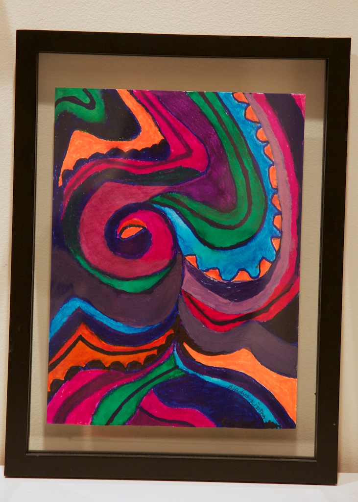
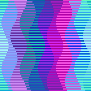
The quilt is designed to show a view of Porto at various levels of focus, granularity, and abstraction. If you look at the quilt up close the pixelated sections appear mostly as abstract regions of color. On the other hand, you can see the un-pixelated sections most clearly, although they are rippled, as if reflected off water. The ripples are both a design choice, and an artifact of the medium – fabric stretches as it is sewn, so perfect alignment is difficult to achieve.

Step back from the quilt until you are too far away to see the un-pixelated sections clearly, and now the pixelated sections start coming into focus. Step back further and the larger pixelated sections convey meaning. The batik fabric sections appear as regions of color taken from the scene: the most abstract representation, color without meaningful shape. I began playing with pixelated images in my earlier quilts as I explored visual representations of privacy, and have continued to use this technique, even when privacy is not the main focus of a piece.

Interleave #6: Porto
25.5″x31.5″ digitally printed cotton and commercial batik fabric, machine pieced and quilted, hand embroidered with pearl cotton
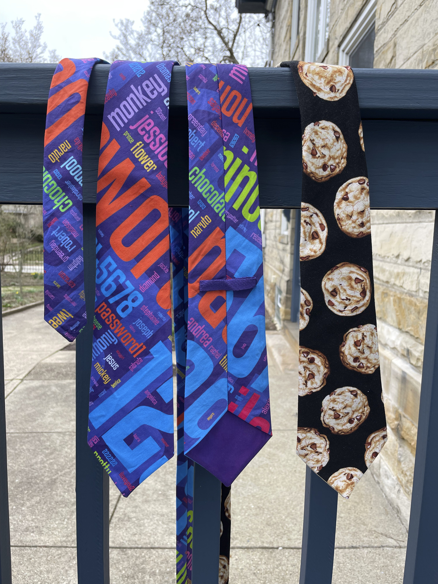
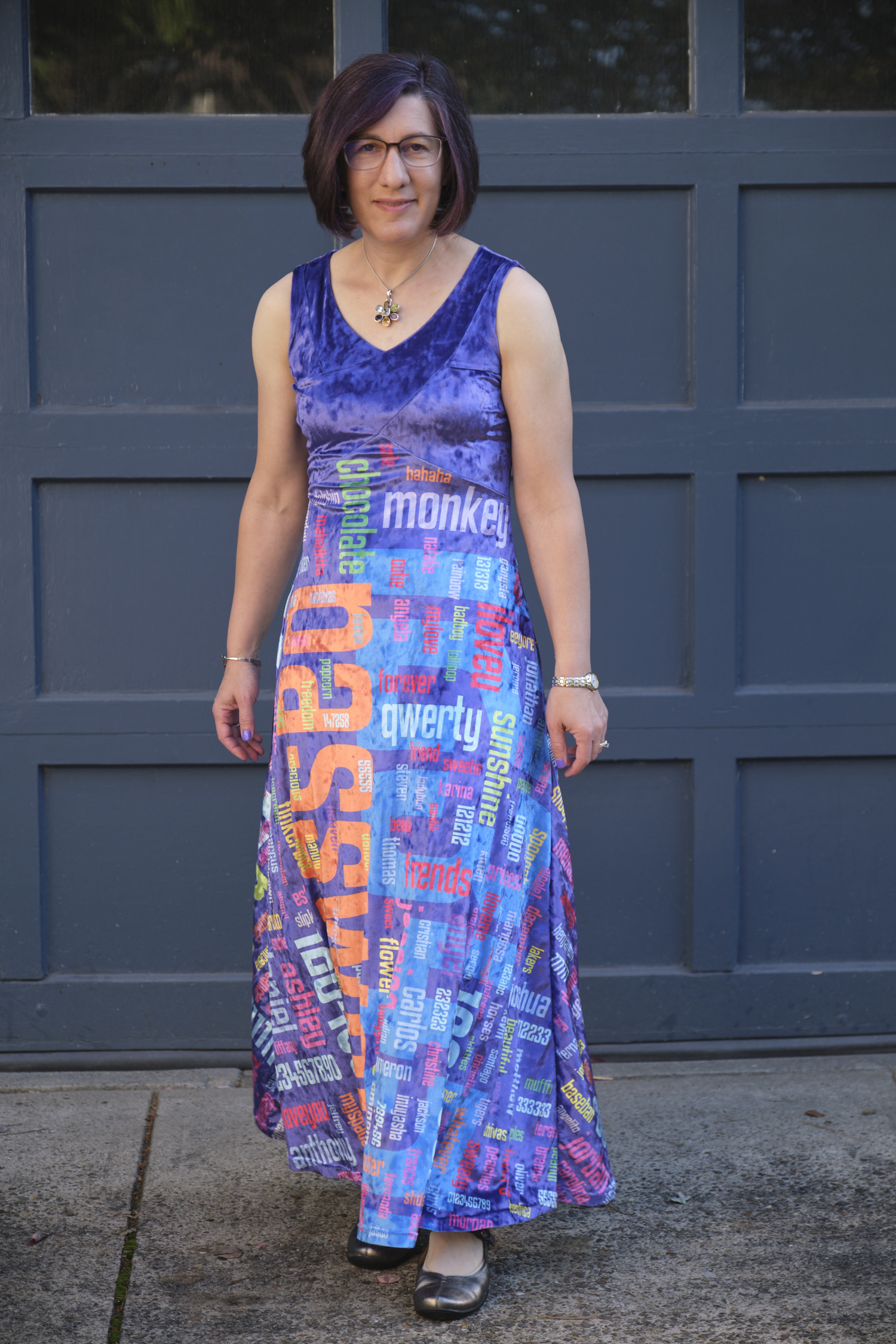
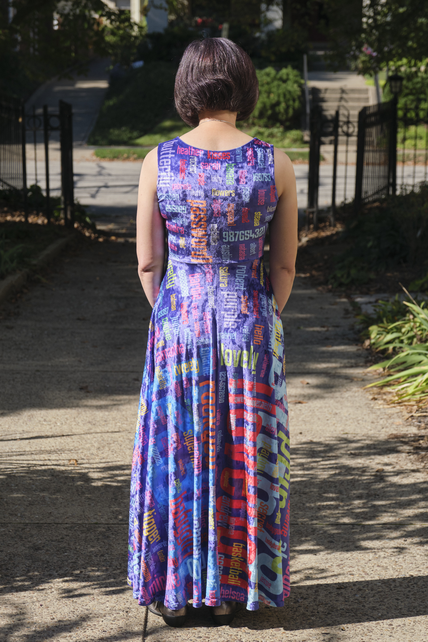
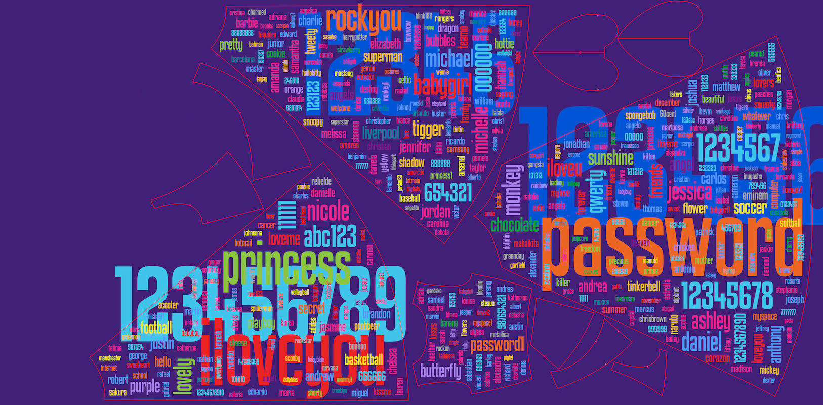
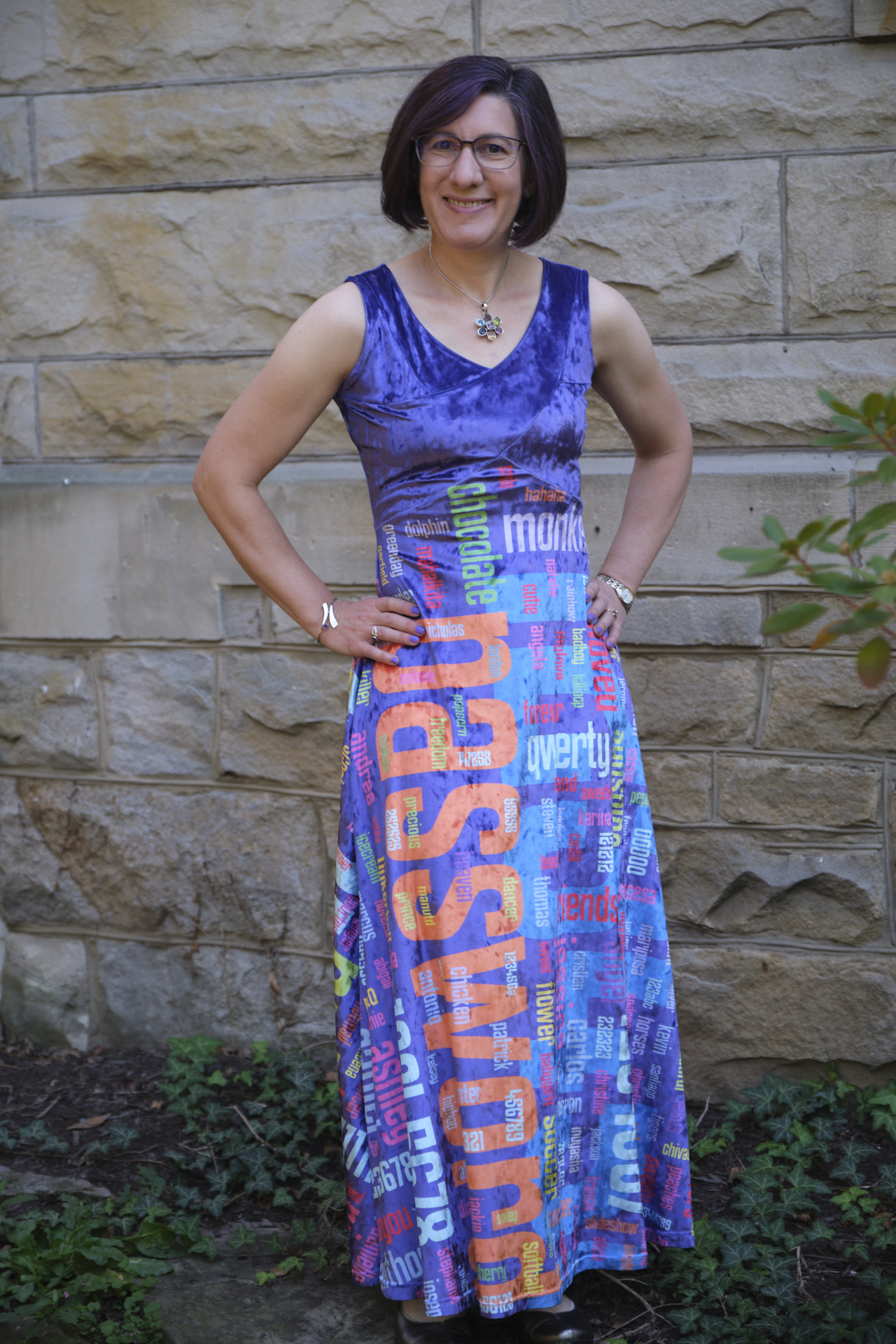
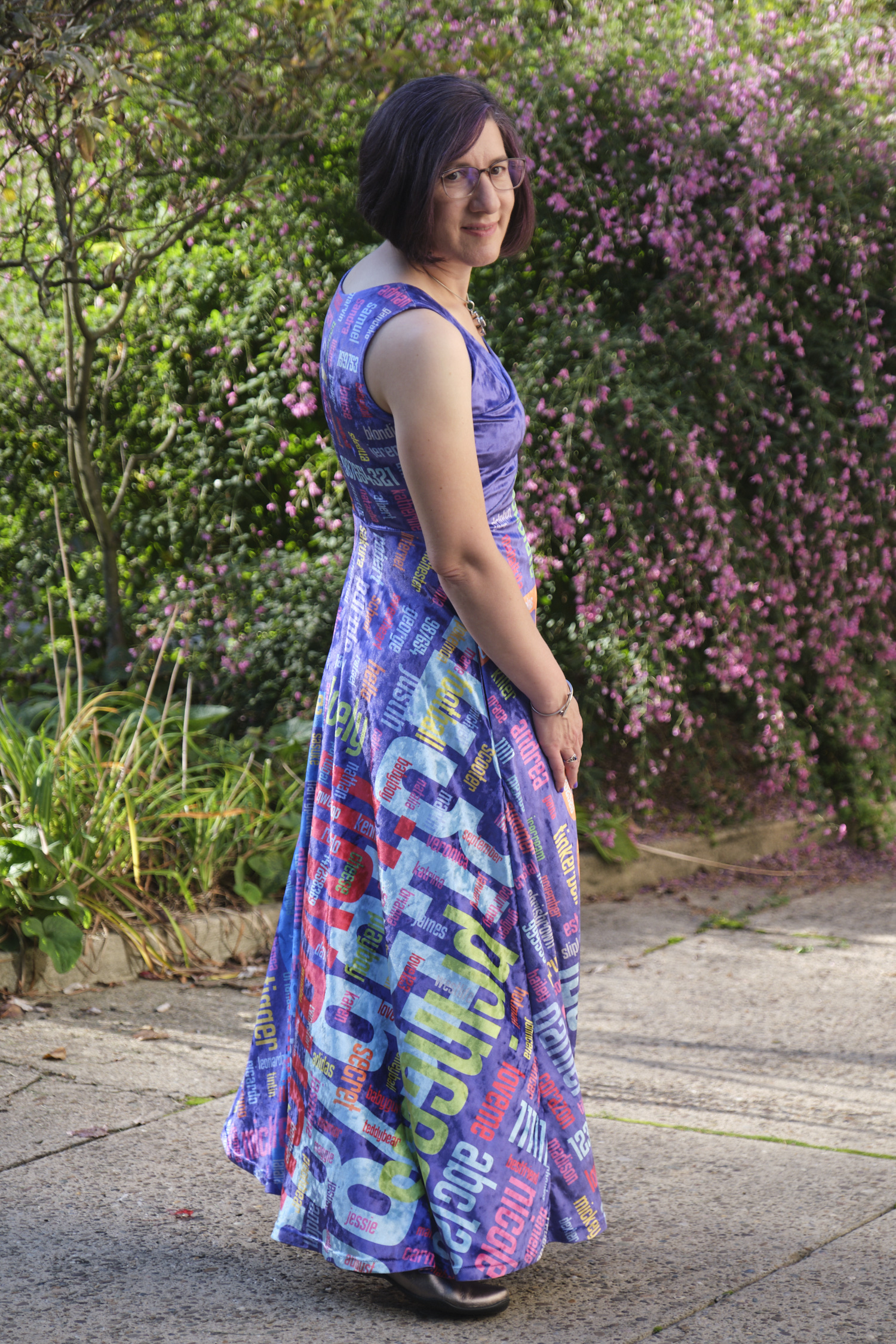
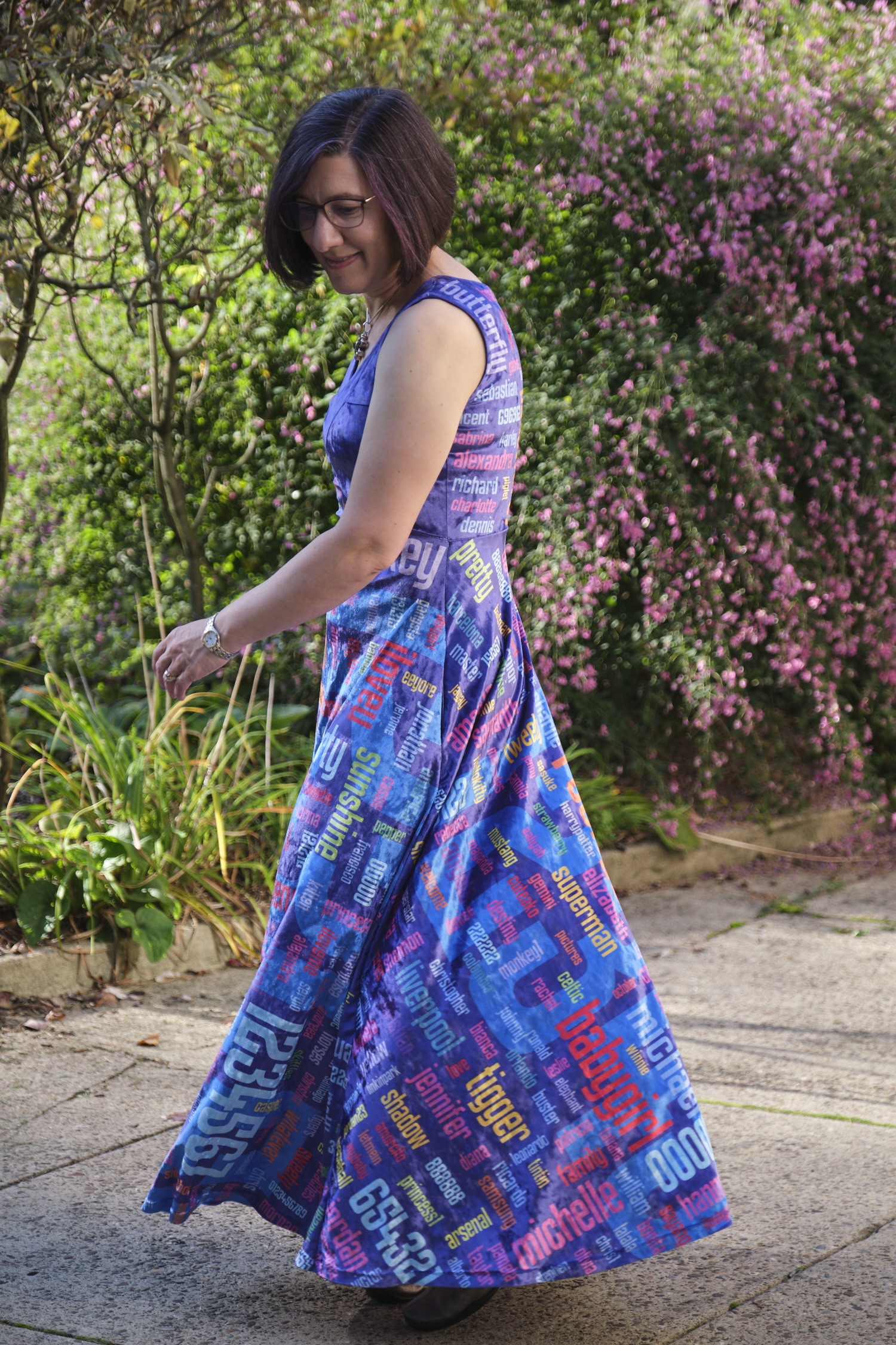
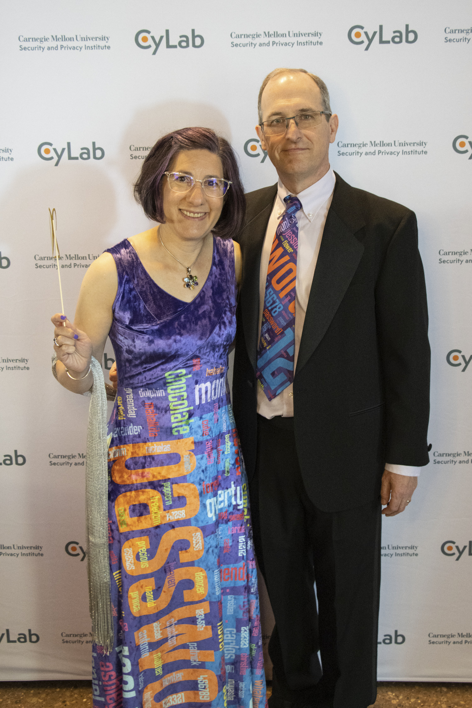
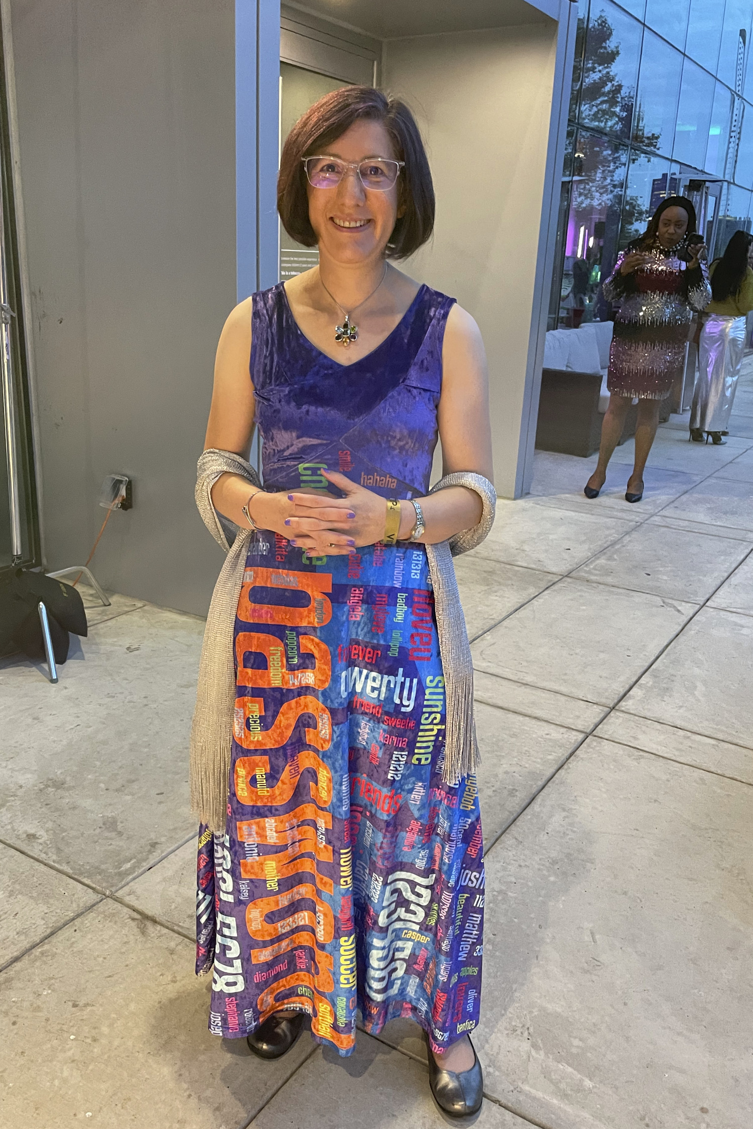
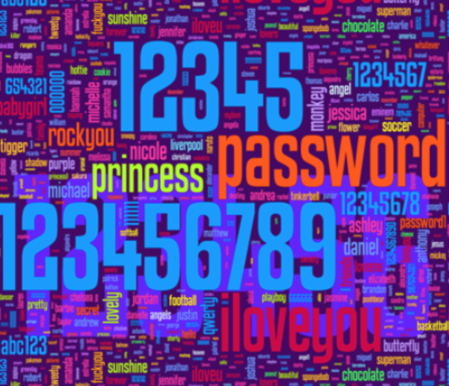
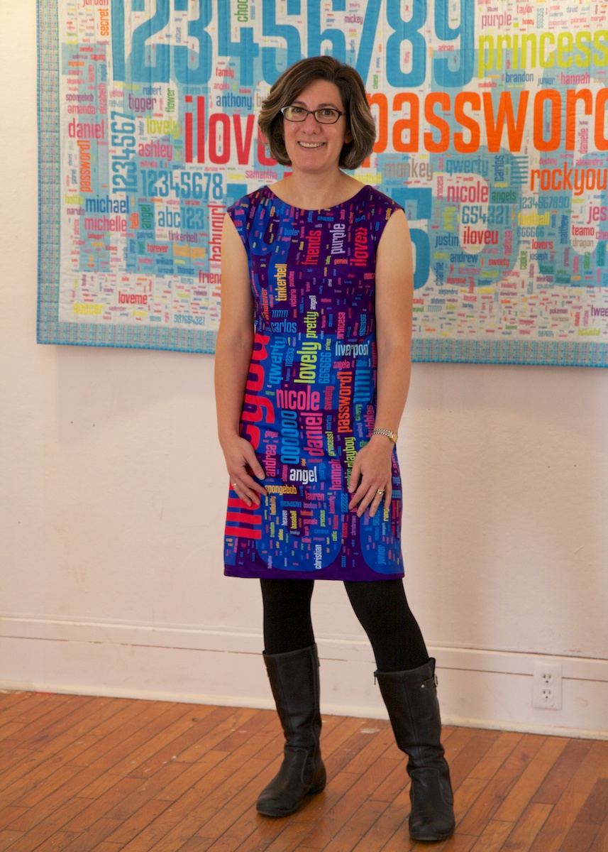
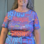
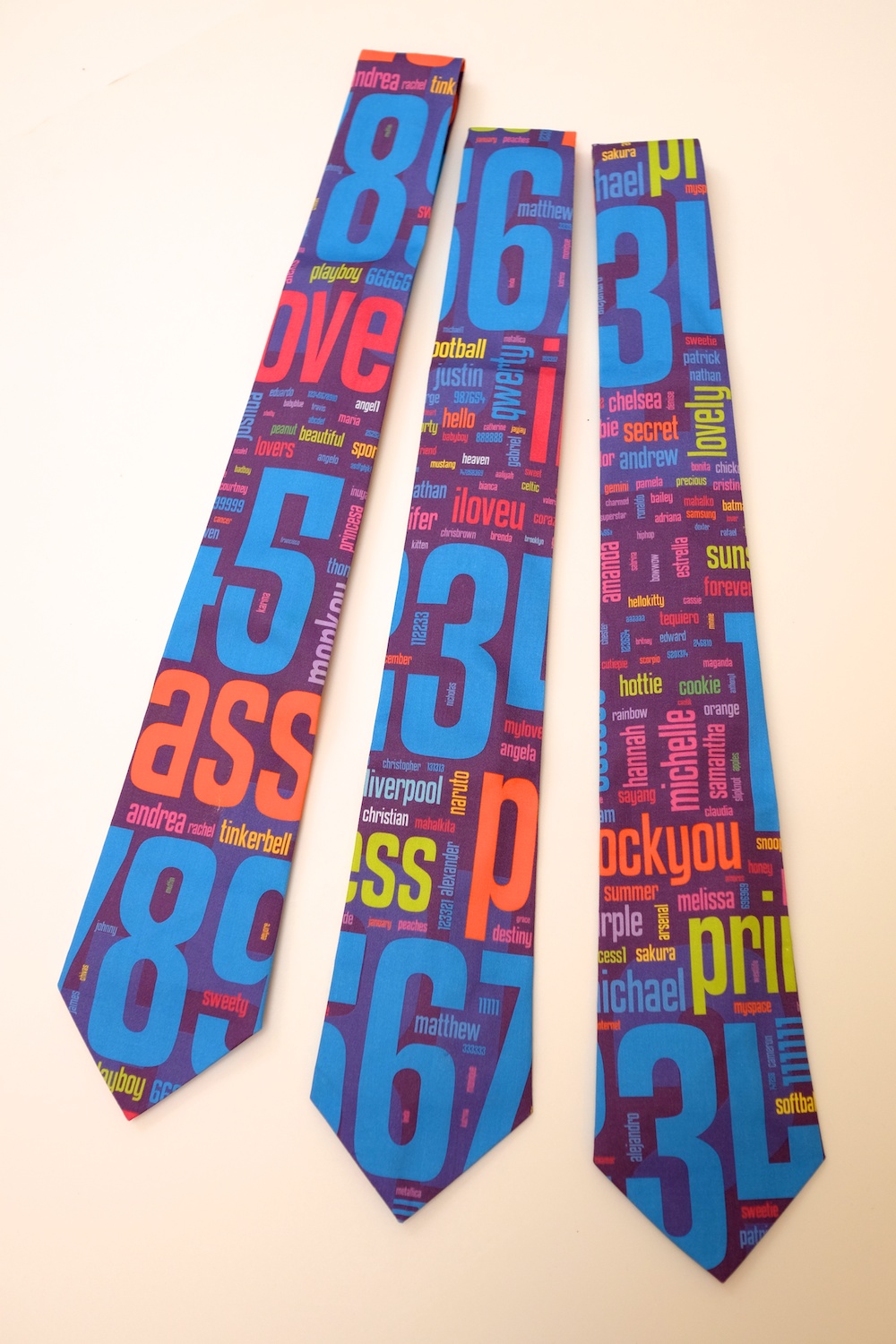
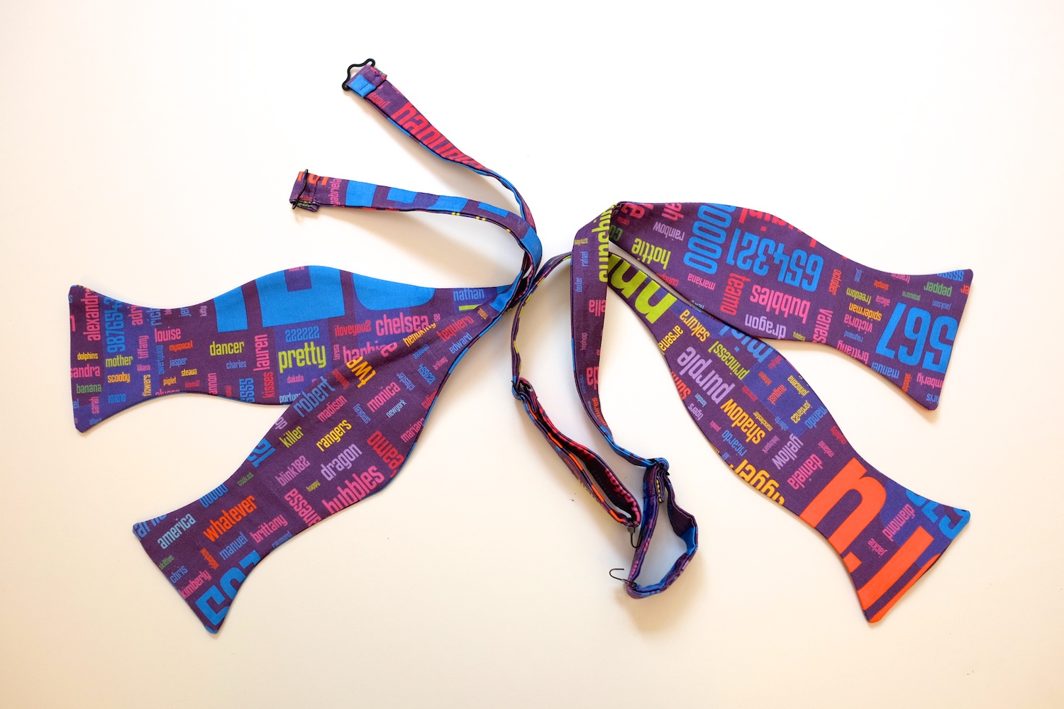
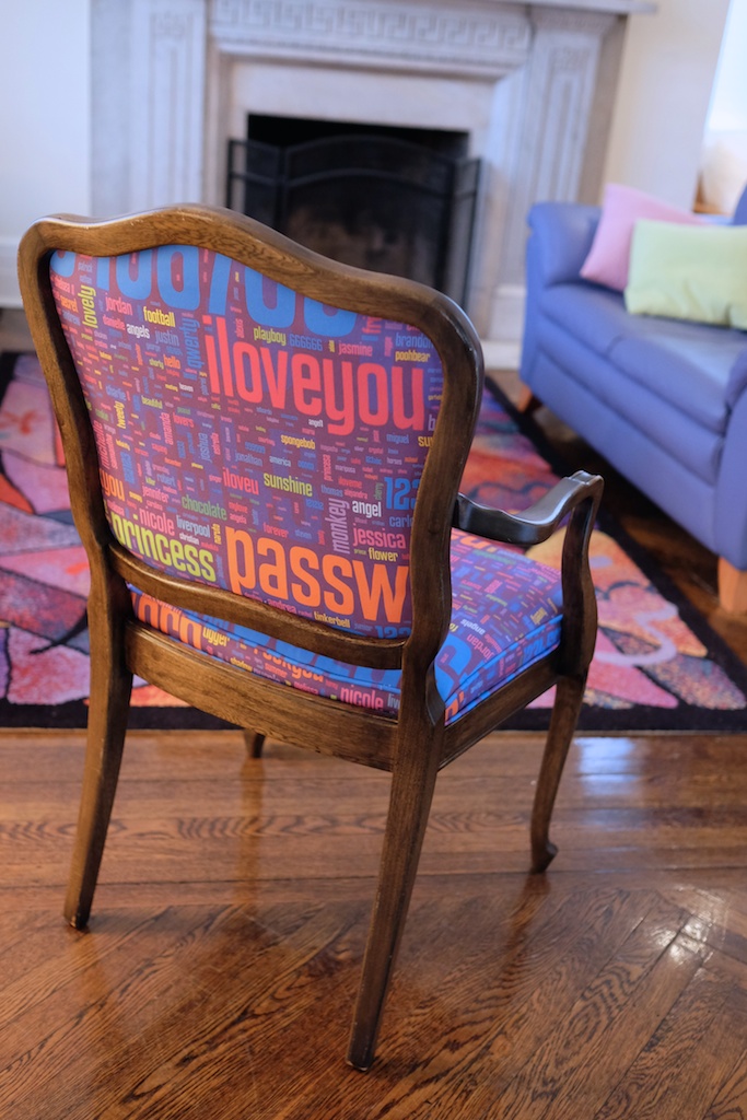
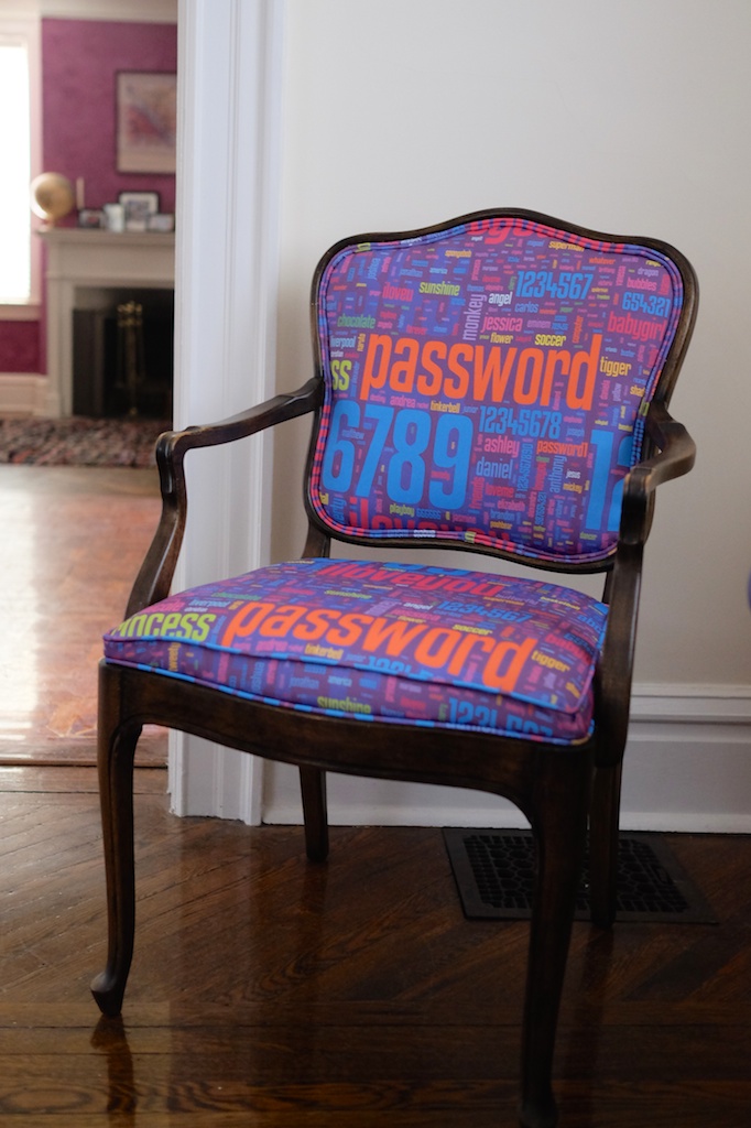
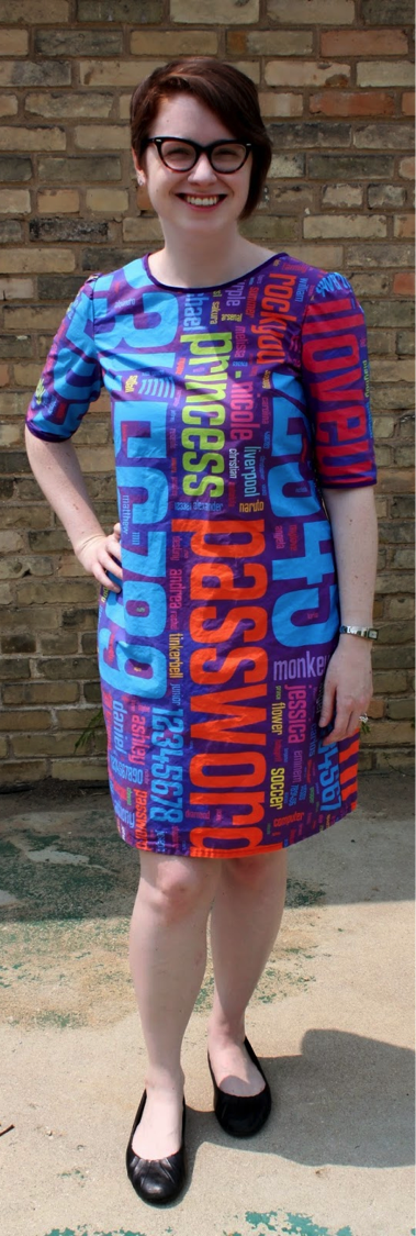
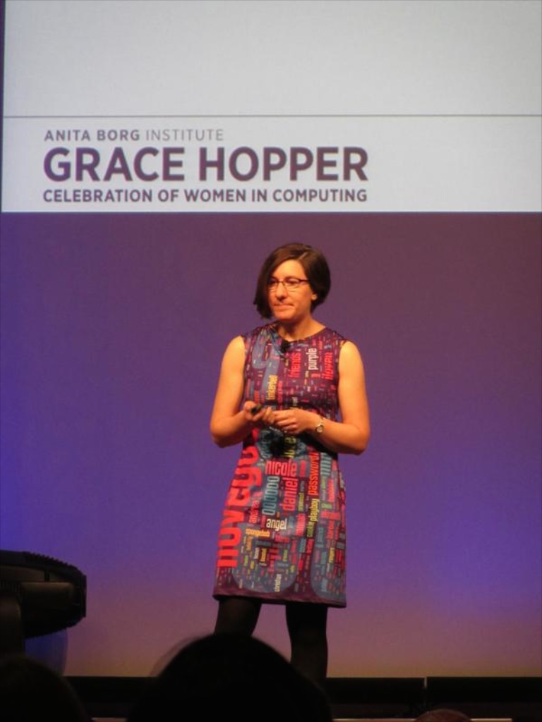
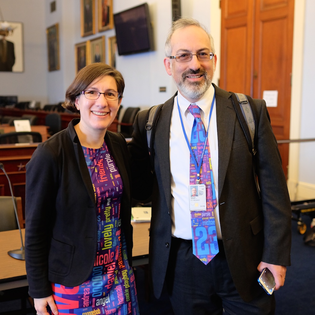
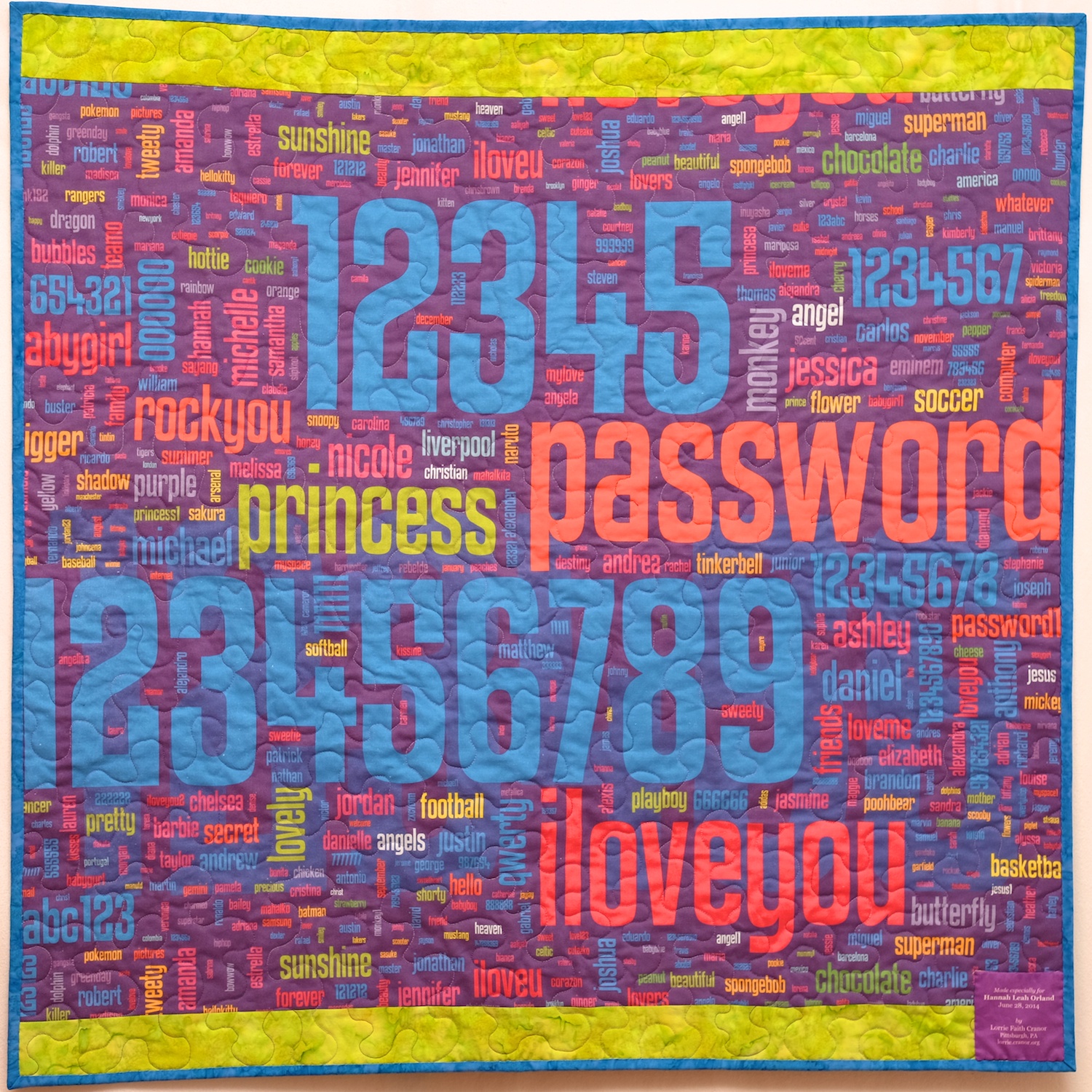
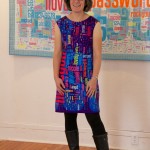
 

Self Portrait

As part of my sabbatical project, I  have been continuing to contemplate ways to visualize privacy. My De-identificaiton quilt featured digitally-printed photos de-identified by their extreme magnification and by splicing them together with other fabric. Another approach to visual de-identification is pixelation. To pixelate an image, we superimpose a grid on the image and replace each cell with a color representing the average of all the pixels in that grid cell. Although pixelation has been shown to be highly vulnerable to automated re-identification, it is a widely used method of obscuring images to make them more difficult for humans to recognize.

I have long been intrigued by the Salvador Dali paintings, Lincoln in Dalivision (1977) and Gala Contemplating the Mediterranean Sea which at Twenty Meters Becomes the Portrait of Abraham Lincoln (Homage to Rothko) (1976), which in turn were inspired by Leon Harmon’s grey photomoasic of Abraham Lincoln (1973).

Recently, Ray J released the single “I Hit it First” with a pixelated photo on the album cover. The photo was quickly recognized as a 2010 photo of bikini-clad Kim Kardashian.

Original portrait

While working on my Big Bright Pixels quilt, people kept asking me whether there was a hidden picture or message. There wasn’t. But that did get me thinking about doing a pixel quilt with a hidden image. But what image should I pixelate? I had recently used a pixelated face in the logo I designed for the Privacy Engineering masters program, and a face seemed a natural choice given that faces are commonly pixelated to protect privacy in news photos. (Other body parts are also frequently pixelated, and I love the censorship towel, but I digress.) I settled on pixelating a face, and briefly considered using a face of a famous person before deciding to use my own face. I selected a blue-haired portrait, photographed by Chuck Cranor.

Pixelated portrait

Pixelated portrait

Pixelation can be done trivially with a computer using standard image processing software packages or by rolling your own. I started working on my pixelated quilt before I started programing in Processing, so I used Photoshop to pixelate a headshot of myself. The initial pixelation was nice, but I wanted something more colorful and also higher contrast so that the differences between colors would show up better when printed on fabric (digital printing on fabric tends to dull colors). I experimented with adjusting the contrast, brightness, and color settings in Photoshop until I came up with a brighter and more colorful pixelated image. This was the image I sent to Spoonflower for digital printing.

Pixelated portrait with high contrast and color manipulation

Pixelated portrait with high contrast and color manipulation

By the time the fabric arrived I had gotten busy with other quilts, and I was also a little disappointed in how the printed fabric looked, so I left the fabric sitting out on my table in the STUDIO for a while. I decided that the dulled digital print needed some more punch, so periodically I cut a fabric square to match a pixel in the fabric and pinned it in place. I cut some of these squares from translucent polyester organza, adding some vibrancy and shimmer to the pixels over which I layered them. I cut other squares from lace, commercial batiks, and printed fabrics that were more intense versions of the hues in the digital print. I ended up covering about 20% of the pixels with other fabric.

Back of quilt top with vertical lines sewed

Back of quilt top with vertical lines sewed

After a few months of staring at the pixels I finally decided to sew the quilt together. I used a shortcut technique to sew the quilt together without actually cutting apart the squares in the digital print. I folded the fabric along one of the vertical lines, catching the pinned squares in the fold, and stitched along the line with a quarter-inch seam allowance. I repeated this approach to sew all the vertical lines and pressed all the seam allowances to the side. Then I folded the fabric along one of the horizontal lines and repeated this process. The end result was a pieced quilt top that appeared to have been pieced out of 130 2.25″ squares (2.75″ with seam allowances). Theoretically this approach should have resulted in precisely pieced seams; however, some of the lines are actually slightly off and the rows and columns did not come out quite as square as I had hoped they would.

Pieced quilt top

Pieced quilt top

I layered the quilt top over batting and backing and used a spiral free-motion machine quilting pattern to quilt the whole thing free hand. I did the quilting in several sessions as I had time, doodling spirals until my hands got tired. I used several different thread colors to roughly match the color of the thread with the pixels I was quilting. I decided not to bind this quilt, and instead made an envelope and quilted all the way to the edge. There is a little bit of stippled hand quilting done with perl cotton surrounding my signature in the lower right corner.

So now the quilt is done and I’m pretty happy with this self portrait. Most people who have seen it do not recognize it as a self portrait, which is ok, and sort of the point. On the other hand, Golan said the blue and purple hair was a dead give away for him. I had not actually started out with the intention to make a self portrait, but ultimately I think the piece works better for me as a self portrait than any more accurate likeness would.


Self Portrait, machine pieced and quilted 23×30.75″


De-identification

When I applied for my sabbatical, I proposed to explore visualizing privacy concepts through art. It sounded like a plausible way to tie my research interests to my sabbatical plan, but I wasn’t entirely sure how I was going to do that. Well, I have now finished my second sabbatical quilt, and it is actually about privacy. And there is a long story to go with it.

When I was at SXSW last spring, I saw a Japanese startup at the trade show that was handing out 30x lenses you could stick on your smartphone. They wanted people to use the lenses to take close-up photos of their skin problems and upload them to a social network called Beautécam. I was somewhat horrified by the concept, but happily accepted a 30x lens and hurried off to another booth. When I got home I stuck the lens on my Android phone and started taking photos. Once I got the hang of using it (it has a very short focal length) I was amazed at the detailed photos it took. I took a bunch of photos of fabrics and flowers with very nice results.

Using the lens made me think a lot about privacy. Given my research area, I think a lot about privacy anyway, but this creepy skin-care lens seemed well suited for visualizing privacy concepts. I tried to understand why the intended use of this lens had such a high “yuck” factor for me. For one thing, 30x closeup photos of skin are actually not very attractive, even if your skin is flawless, which mine certainly is not. But most of us don’t get really close-up views of very many other peoples’ skin, because that usually requires being in uncomfortably close proximity to those people. We all learn to keep a certain distance away from people out of respect for their personal space. Just how far that distance is seems to vary somewhat by culture.

In order to be in focus, an object must be within about a millimeter of the end of the 30x lens. So using this lens to photograph skin requires pressing the lens against the skin. Taking pictures of flowers with the lens requires shoving the cone-shaped lens into the center of the flower, and in some cases, gently prodding the flower into the center of the lens. So, there is no way to use the lens without invading the personal space of the person or object you are photographing. Of course, flowers don’t care, but I like the metaphor.

The flower images and the privacy metaphor especially intrigued me, and I started thinking about how I might use them in a quilt. I assembled a panel of some of my favorite flower images in Photoshop and uploaded them to Spoonflower, a company that prints digital images on fabric. About a week later Spoonflower delivered a yard of Kona cotton fabric with my images printed on it. The images looked soft and lovely on the fabric, although the colors were not as intense as in the original. After I machine washed the fabric a little more intensity was lost. Clearly the images would need embellishment to regain some of the vibrancy of the originals.

After pondering the images on the fabric for a while I decided to take advantage of the lossy images and use the fabric for a study of visual de-identification. I selected nine of the images and set out to create a 12-inch block featuring each one. I went to my fabric stash and pulled out a large stack of fabrics (mostly batiks) that blended with the colors in the flower images. Each block has these ready-made commercial fabrics spliced together with my custom-printed fabric. On some of the blocks I overlaid polyester organza, a shimmery, translucent fabric. In some blocks, I retained large areas of the flower image, with small strips of fabrics spliced between. In other blocks the flower images are chopped into small pieces and interspersed among the commercial fabrics. I put each block together improvisationally, as a mini-quilt unto itself.

I assembled nine blocks and then sewed the blocks together into a very colorful 3×3 square. I pondered what color to use to bind the quilt, and eventually decided it would look better without binding. So I decided to try the envelope method of binding in which the front and back of the quilt are layered facing each other (with the batting layered on top), sewn around the edges, and turned right-side out through a slit in the backing fabric. The slit gets covered over in the end by the hanging sleeve. The result is a nice clean, modern-looking edge to the quilt, rather than a picture frame.

The next decision, was how to quilt the piece. I decided to use a mix of techniques — free-motion machine quilting, straight-line machine quilting, hand quilting, and embroidery –and use the quilting to both add color intensity and to further de-identify the flower images. Each block has its own quilting pattern that spills out into neighboring blocks. There are fun spirals, circles, petals, and stipples free-motion quilted in bright colors. There are yellow, red, and lavender French knots, liberally sprinkled throughout. And lots of hand and machine quilted lines.

Looking at the finished piece, I see a lot going on. There are nine separate compositions that are loosely tied together (not as well as I had hoped, actually, but perhaps that’s part of the point). There are flower images rendered difficult-to-identify by the unusual close vantage point from which they were taken. These images are further obfuscated by slicing and reassembly, overlays, and stitching. The edges of images are mixed with their neighbors so it isn’t always clear what pieces belong with which images. But if you saw the original flowers, you could probably eventually re-identify most of the images. (Perhaps I will do another quilt on “re-identification.”) It is a lot like personal data de-identification, in which data is removed and digital noise is introduced, but in the end the de-identified data might be re-identified given sufficient contextual information.