When I applied for my sabbatical, I proposed to explore visualizing privacy concepts through art. It sounded like a plausible way to tie my research interests to my sabbatical plan, but I wasn’t entirely sure how I was going to do that. Well, I have now finished my second sabbatical quilt, and it is actually about privacy. And there is a long story to go with it.
 When I was at SXSW last spring, I saw a Japanese startup at the trade show that was handing out 30x lenses you could stick on your smartphone. They wanted people to use the lenses to take close-up photos of their skin problems and upload them to a social network called Beautécam. I was somewhat horrified by the concept, but happily accepted a 30x lens and hurried off to another booth. When I got home I stuck the lens on my Android phone and started taking photos. Once I got the hang of using it (it has a very short focal length) I was amazed at the detailed photos it took. I took a bunch of photos of fabrics and flowers with very nice results.
 Using the lens made me think a lot about privacy. Given my research area, I think a lot about privacy anyway, but this creepy skin-care lens seemed well suited for visualizing privacy concepts. I tried to understand why the intended use of this lens had such a high “yuck” factor for me. For one thing, 30x closeup photos of skin are actually not very attractive, even if your skin is flawless, which mine certainly is not. But most of us don’t get really close-up views of very many other peoples’ skin, because that usually requires being in uncomfortably close proximity to those people. We all learn to keep a certain distance away from people out of respect for their personal space. Just how far that distance is seems to vary somewhat by culture.
 In order to be in focus, an object must be within about a millimeter of the end of the 30x lens. So using this lens to photograph skin requires pressing the lens against the skin. Taking pictures of flowers with the lens requires shoving the cone-shaped lens into the center of the flower, and in some cases, gently prodding the flower into the center of the lens. So, there is no way to use the lens without invading the personal space of the person or object you are photographing. Of course, flowers don’t care, but I like the metaphor.
 The flower images and the privacy metaphor especially intrigued me, and I started thinking about how I might use them in a quilt. I assembled a panel of some of my favorite flower images in Photoshop and uploaded them to Spoonflower, a company that prints digital images on fabric. About a week later Spoonflower delivered a yard of Kona cotton fabric with my images printed on it. The images looked soft and lovely on the fabric, although the colors were not as intense as in the original. After I machine washed the fabric a little more intensity was lost. Clearly the images would need embellishment to regain some of the vibrancy of the originals.
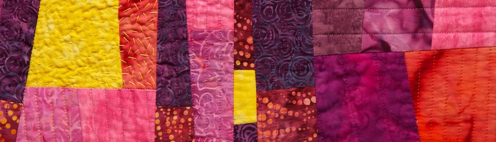
 After pondering the images on the fabric for a while I decided to take advantage of the lossy images and use the fabric for a study of visual de-identification. I selected nine of the images and set out to create a 12-inch block featuring each one. I went to my fabric stash and pulled out a large stack of fabrics (mostly batiks) that blended with the colors in the flower images. Each block has these ready-made commercial fabrics spliced together with my custom-printed fabric. On some of the blocks I overlaid polyester organza, a shimmery, translucent fabric. In some blocks, I retained large areas of the flower image, with small strips of fabrics spliced between. In other blocks the flower images are chopped into small pieces and interspersed among the commercial fabrics. I put each block together improvisationally, as a mini-quilt unto itself.
 I assembled nine blocks and then sewed the blocks together into a very colorful 3×3 square. I pondered what color to use to bind the quilt, and eventually decided it would look better without binding. So I decided to try the envelope method of binding in which the front and back of the quilt are layered facing each other (with the batting layered on top), sewn around the edges, and turned right-side out through a slit in the backing fabric. The slit gets covered over in the end by the hanging sleeve. The result is a nice clean, modern-looking edge to the quilt, rather than a picture frame.
The next decision, was how to quilt the piece. I decided to use a mix of techniques — free-motion machine quilting, straight-line machine quilting, hand quilting, and embroidery –and use the quilting to both add color intensity and to further de-identify the flower images. Each block has its own quilting pattern that spills out into neighboring blocks. There are fun spirals, circles, petals, and stipples free-motion quilted in bright colors. There are yellow, red, and lavender French knots, liberally sprinkled throughout. And lots of hand and machine quilted lines.
 Looking at the finished piece, I see a lot going on. There are nine separate compositions that are loosely tied together (not as well as I had hoped, actually, but perhaps that’s part of the point). There are flower images rendered difficult-to-identify by the unusual close vantage point from which they were taken. These images are further obfuscated by slicing and reassembly, overlays, and stitching. The edges of images are mixed with their neighbors so it isn’t always clear what pieces belong with which images. But if you saw the original flowers, you could probably eventually re-identify most of the images. (Perhaps I will do another quilt on “re-identification.”) It is a lot like personal data de-identification, in which data is removed and digital noise is introduced, but in the end the de-identified data might be re-identified given sufficient contextual information.
 I finished a little quilt this week. No deeper meaning in this one. It is the letter B. Or if you rotate it 90 degrees counter-clockwise it is an autumn landscape with two ponds, or a pink crocodile winking at you in the water.


