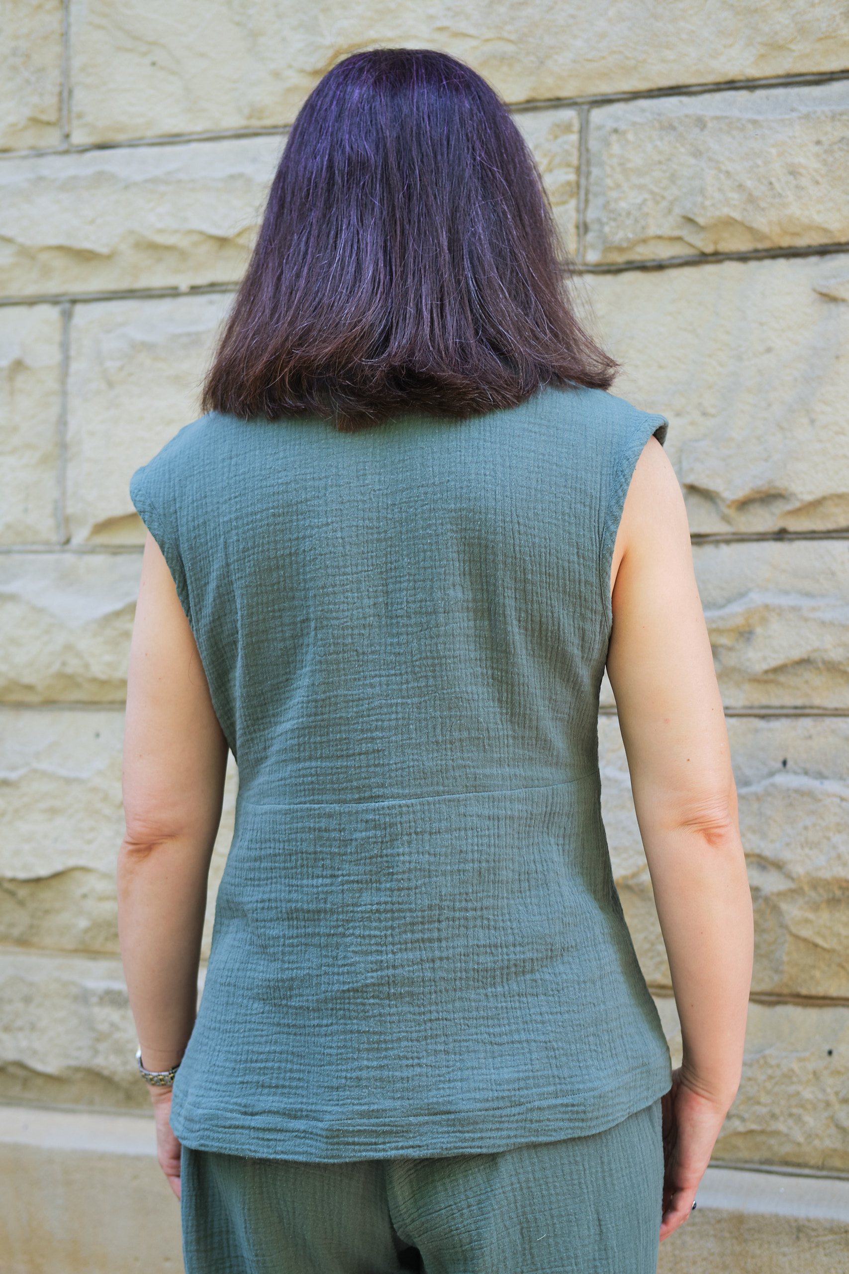
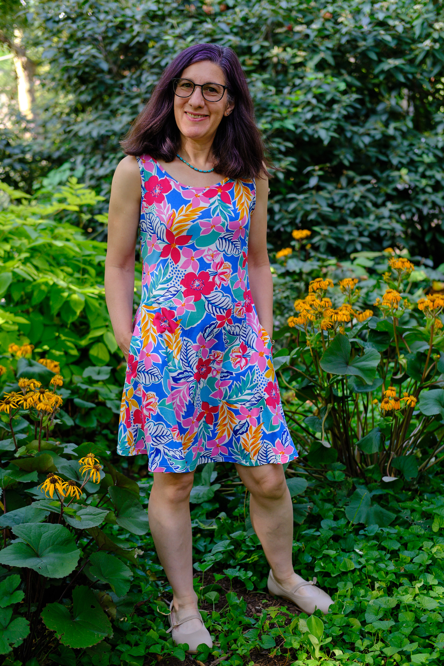
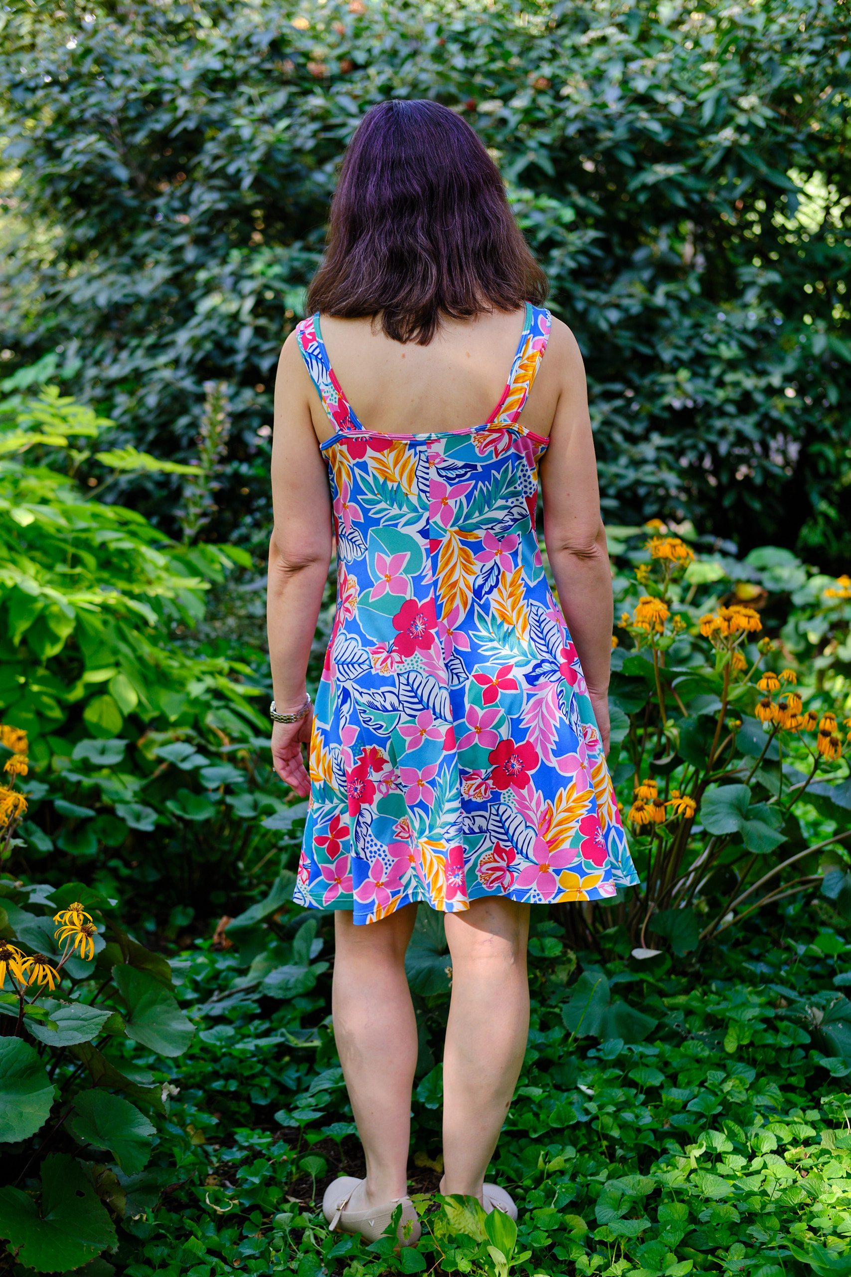
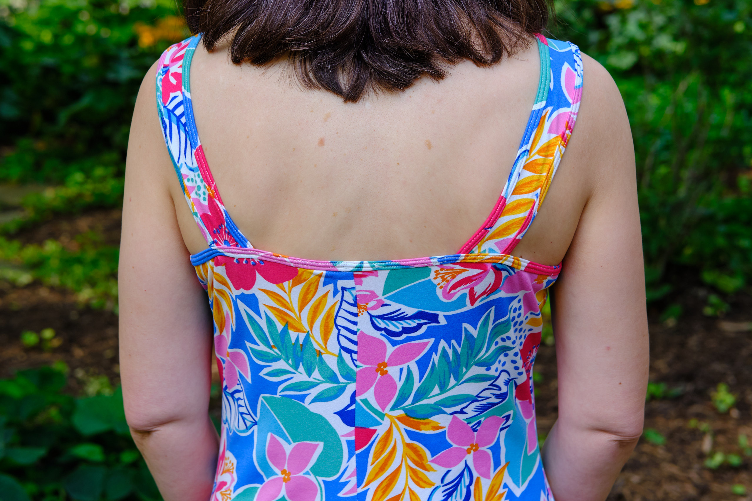
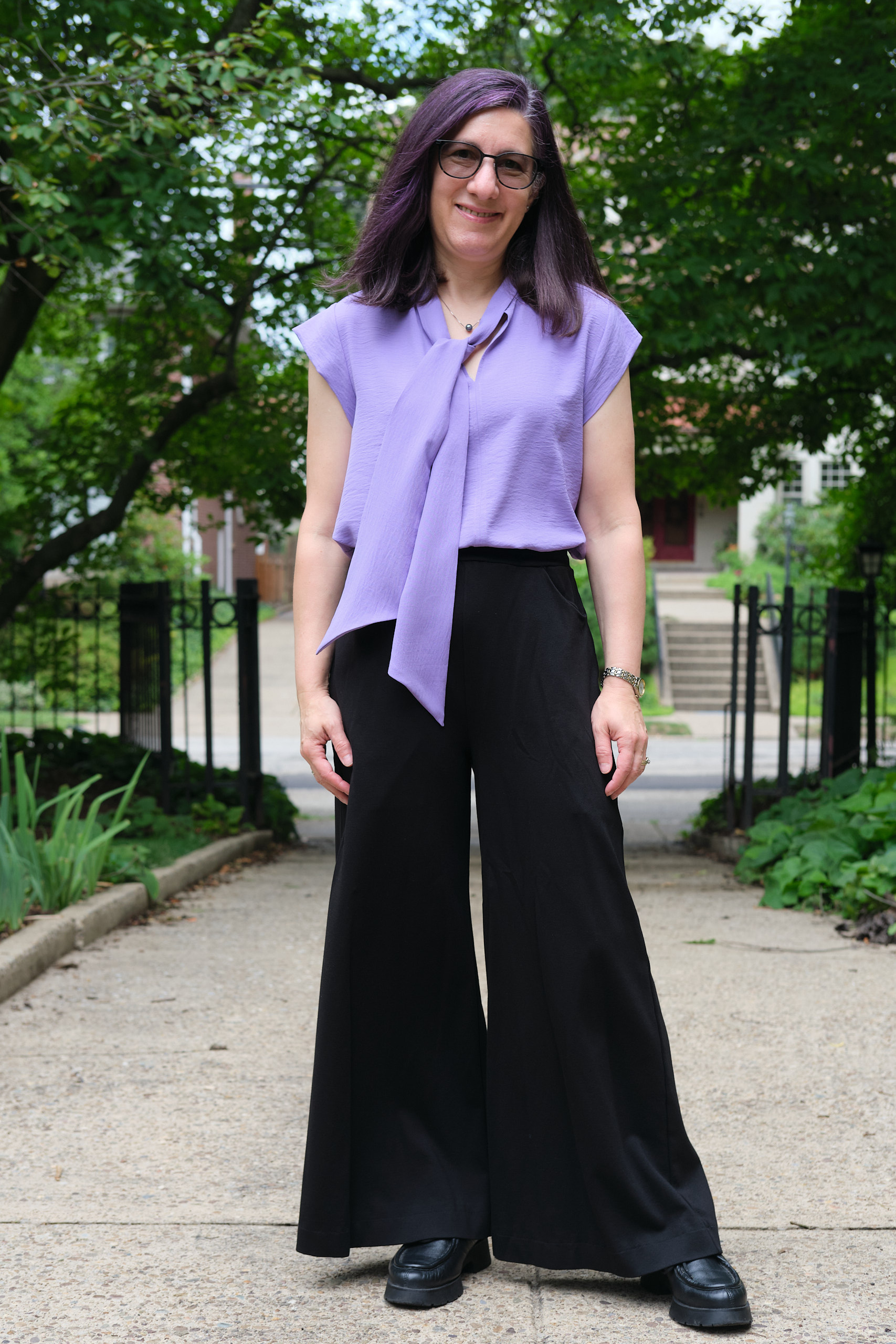
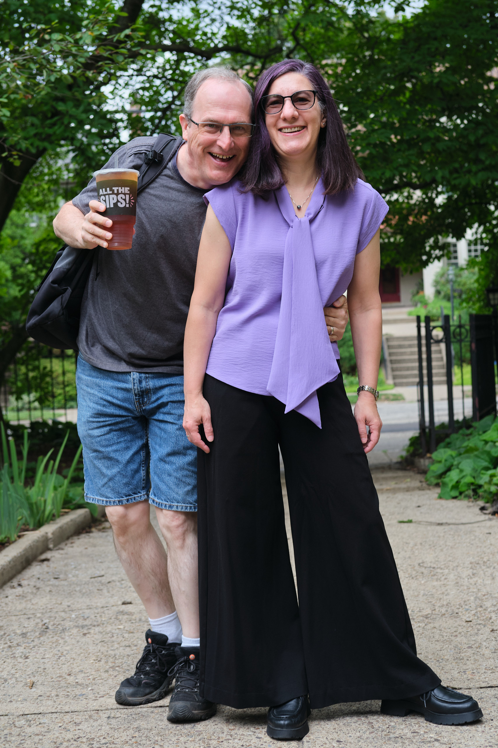
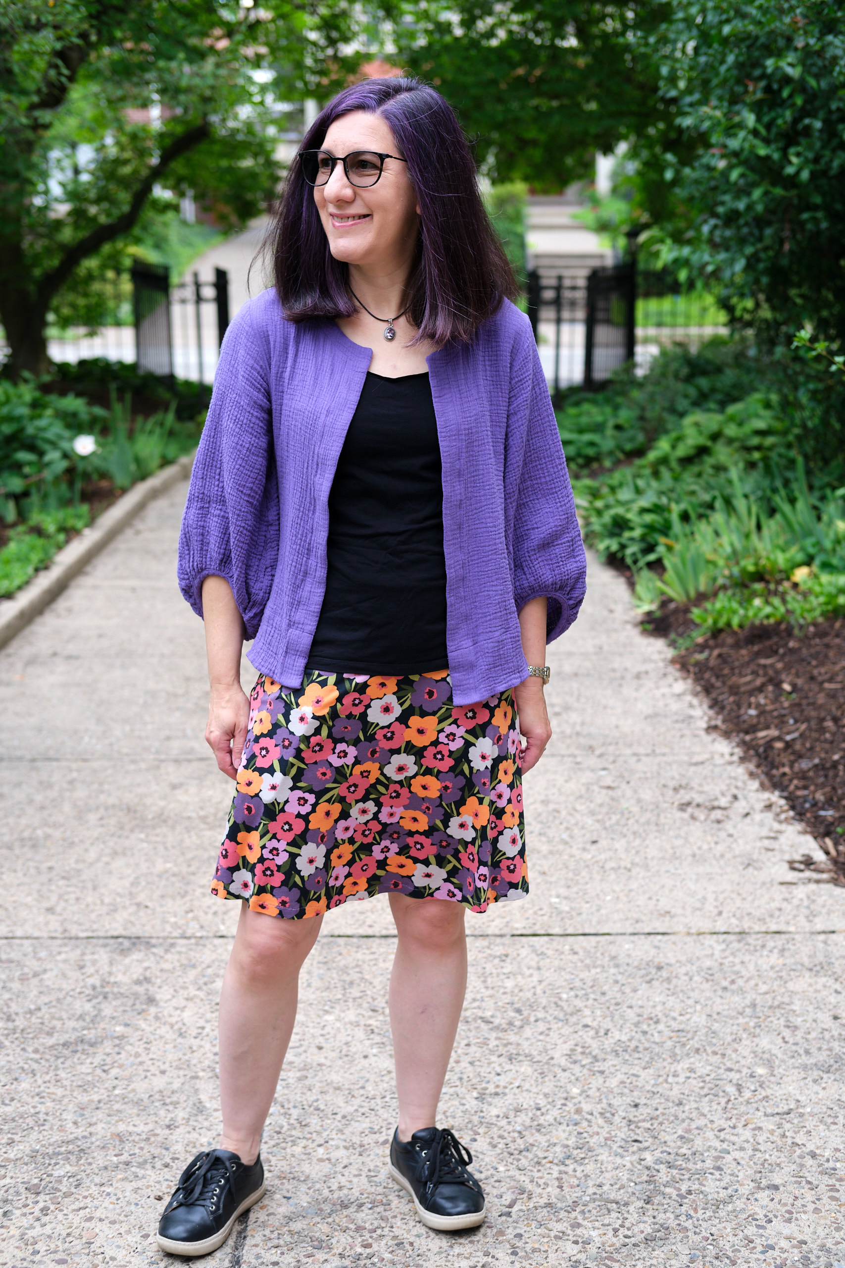
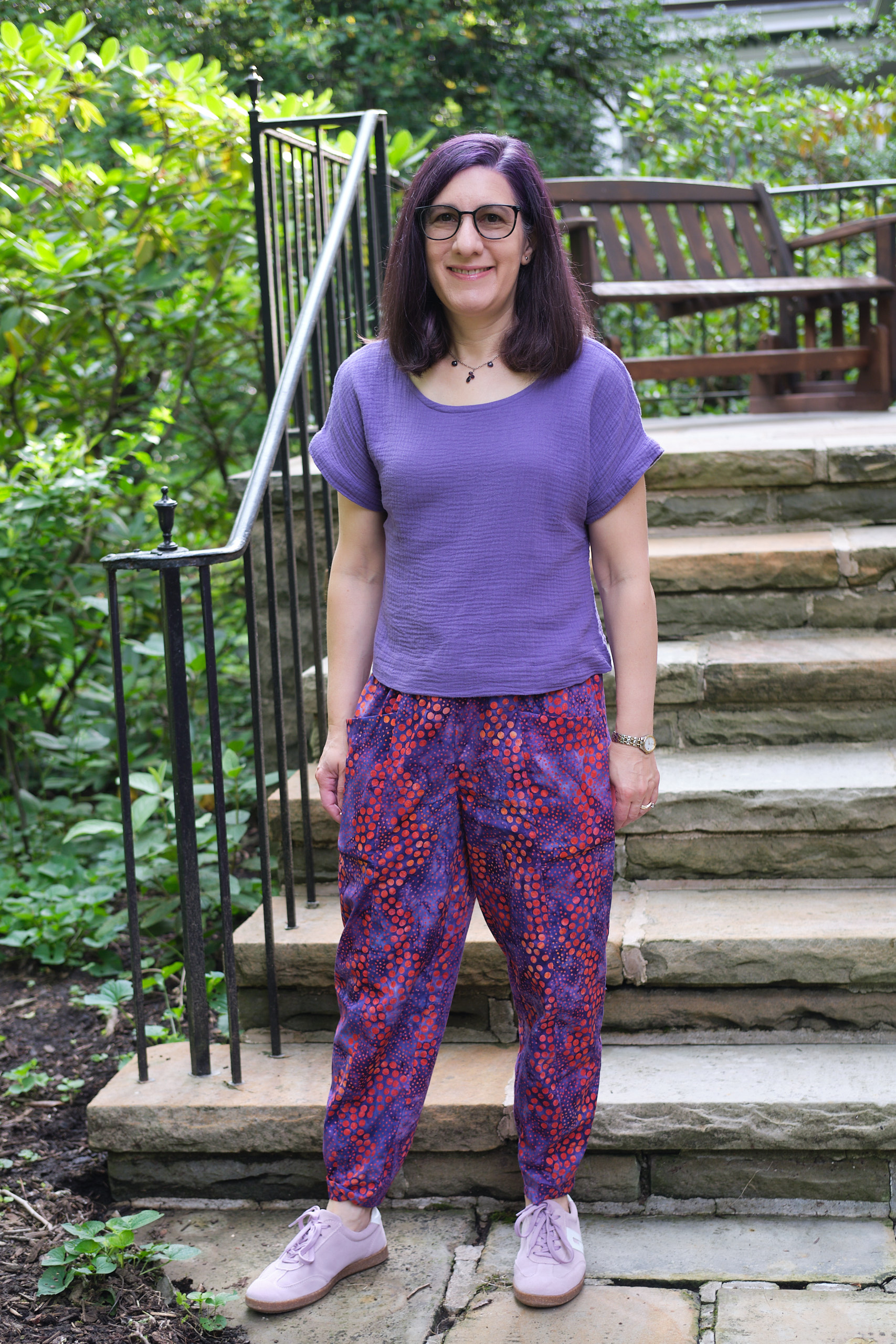
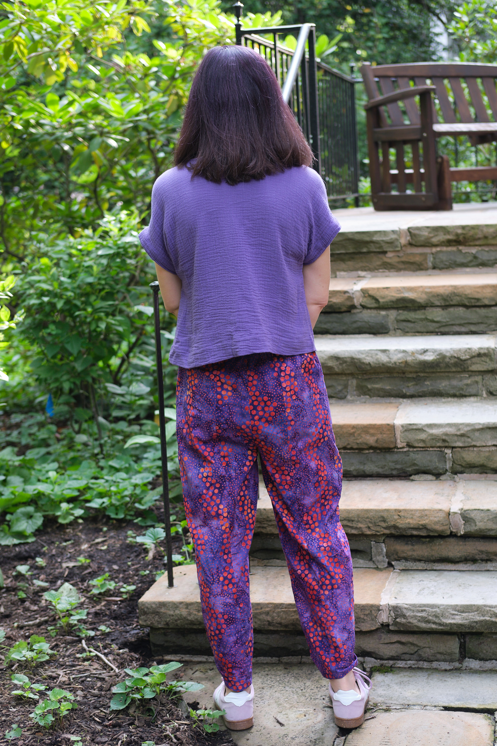
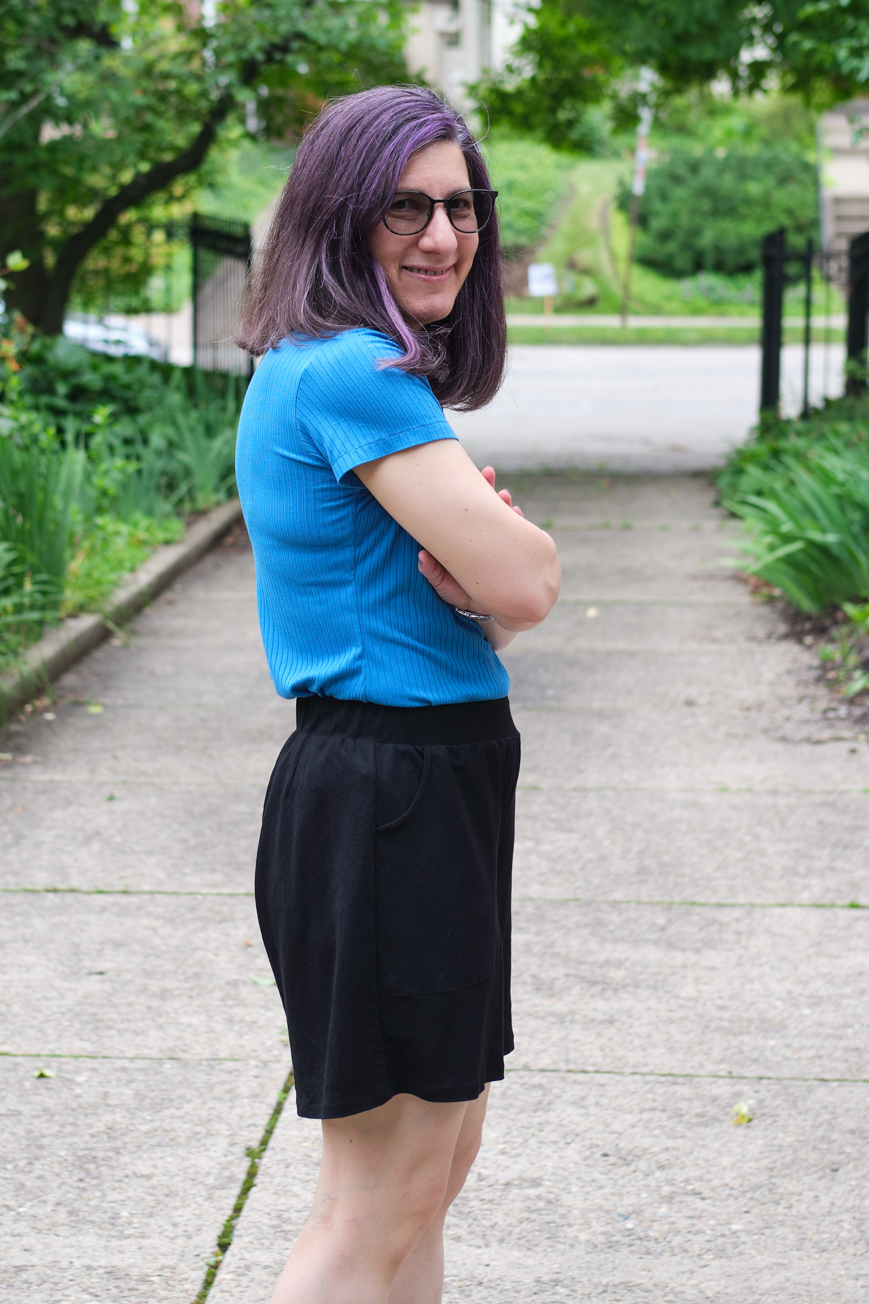
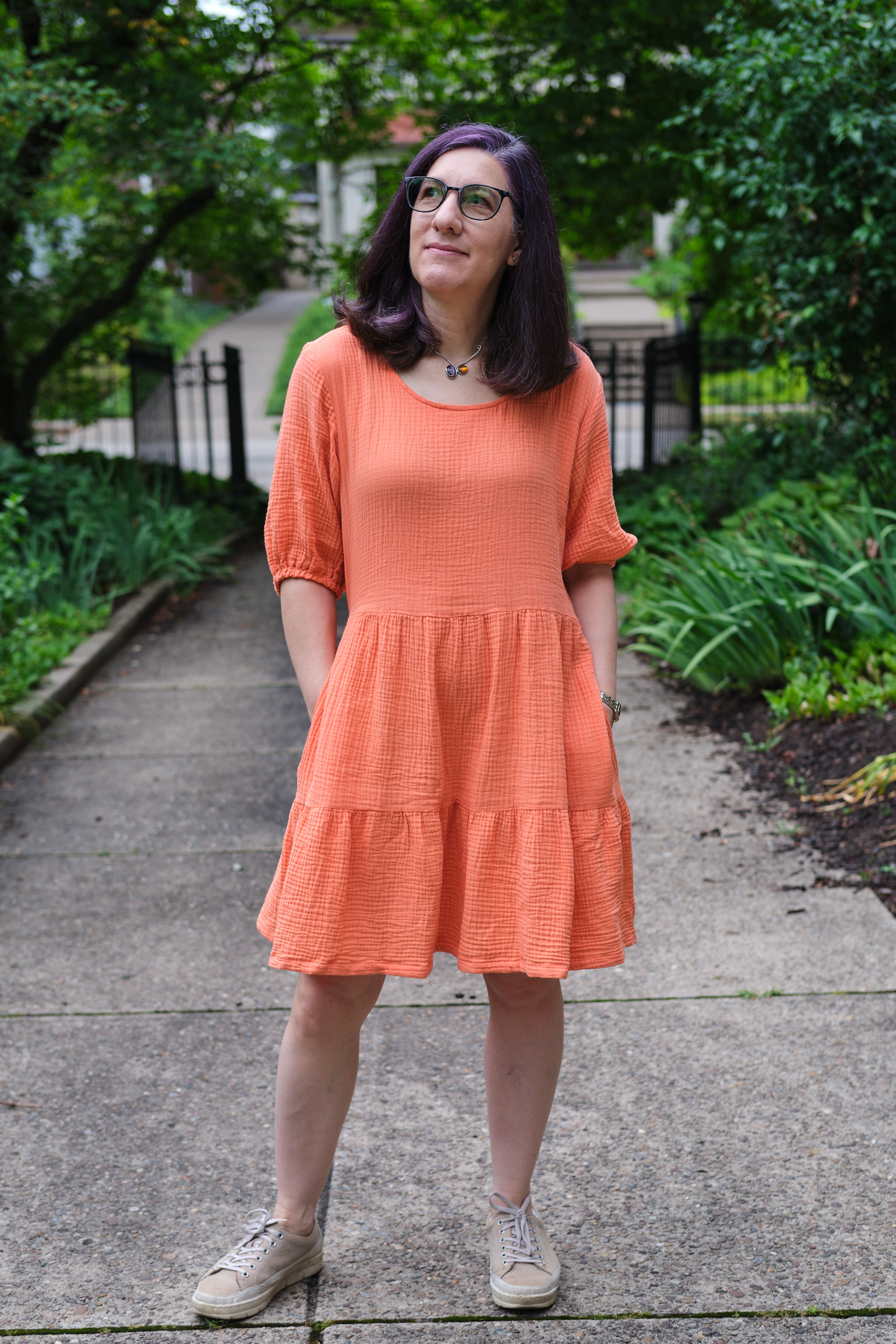
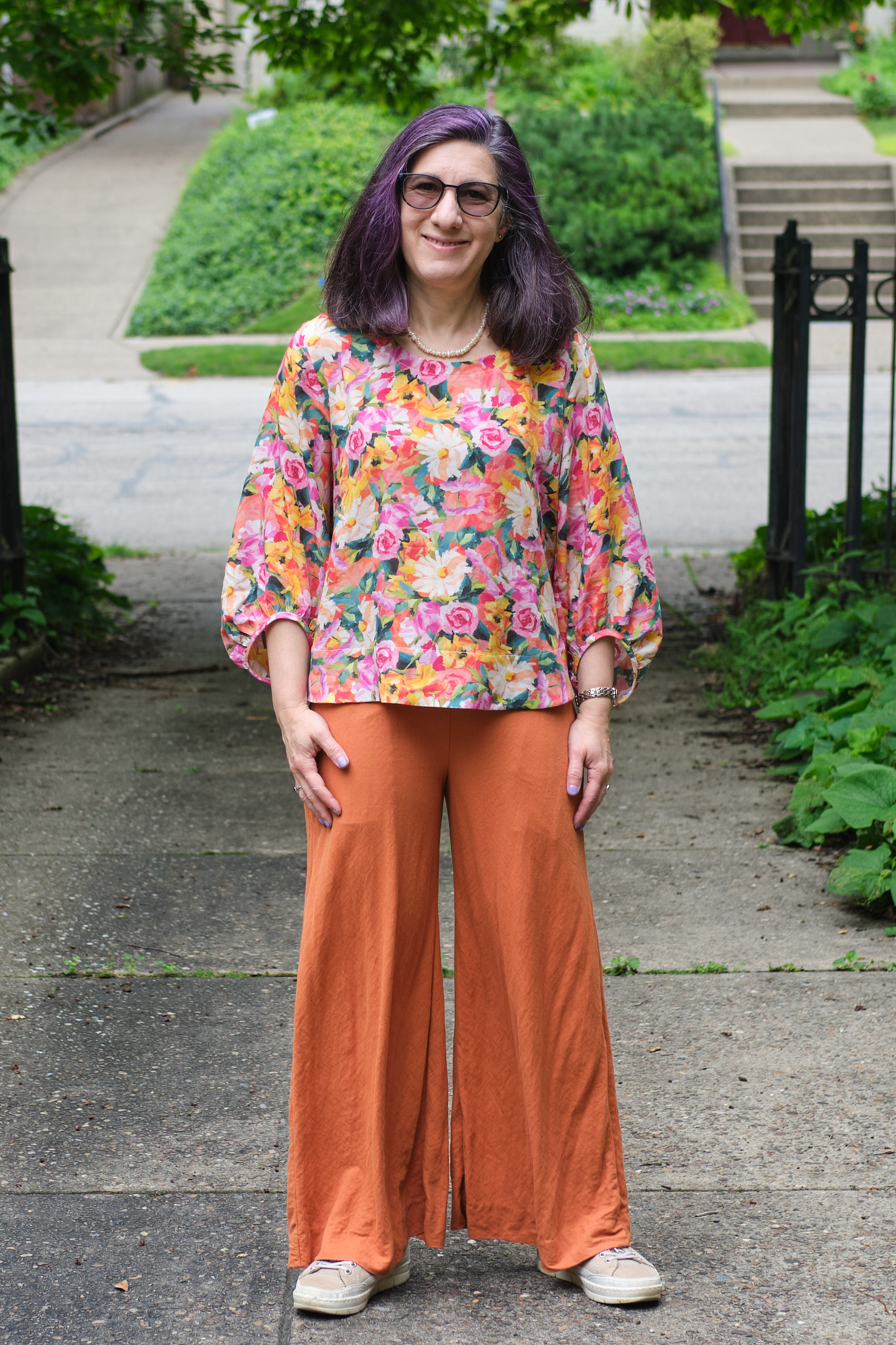
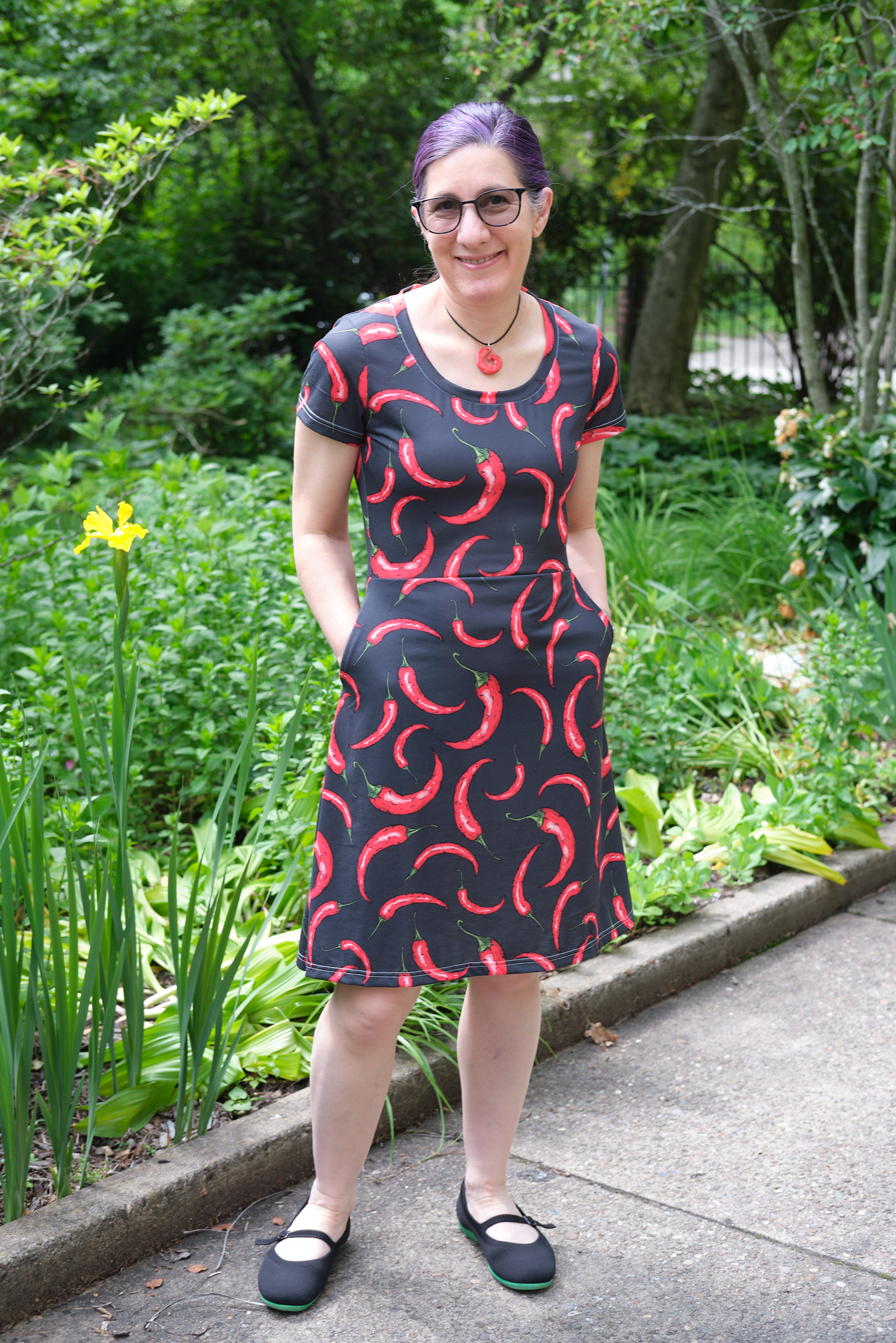
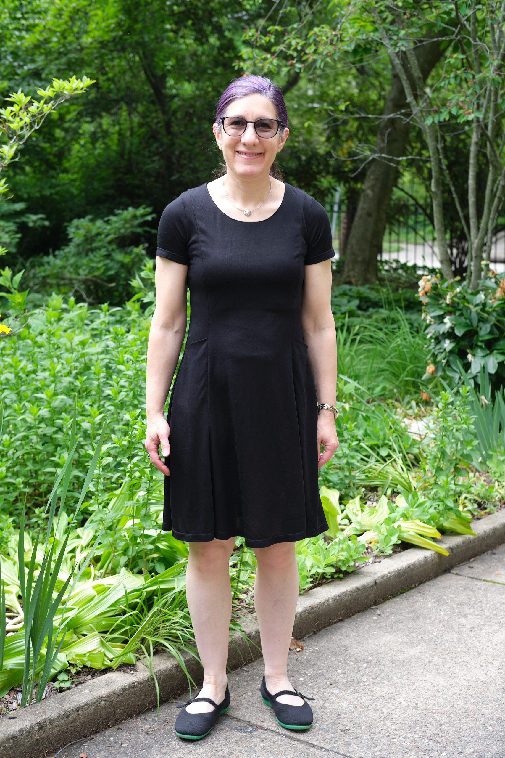
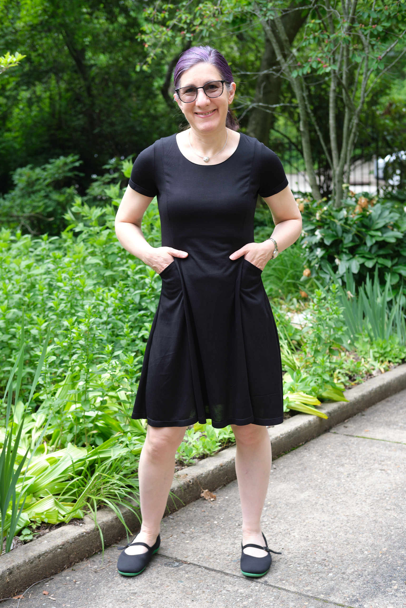
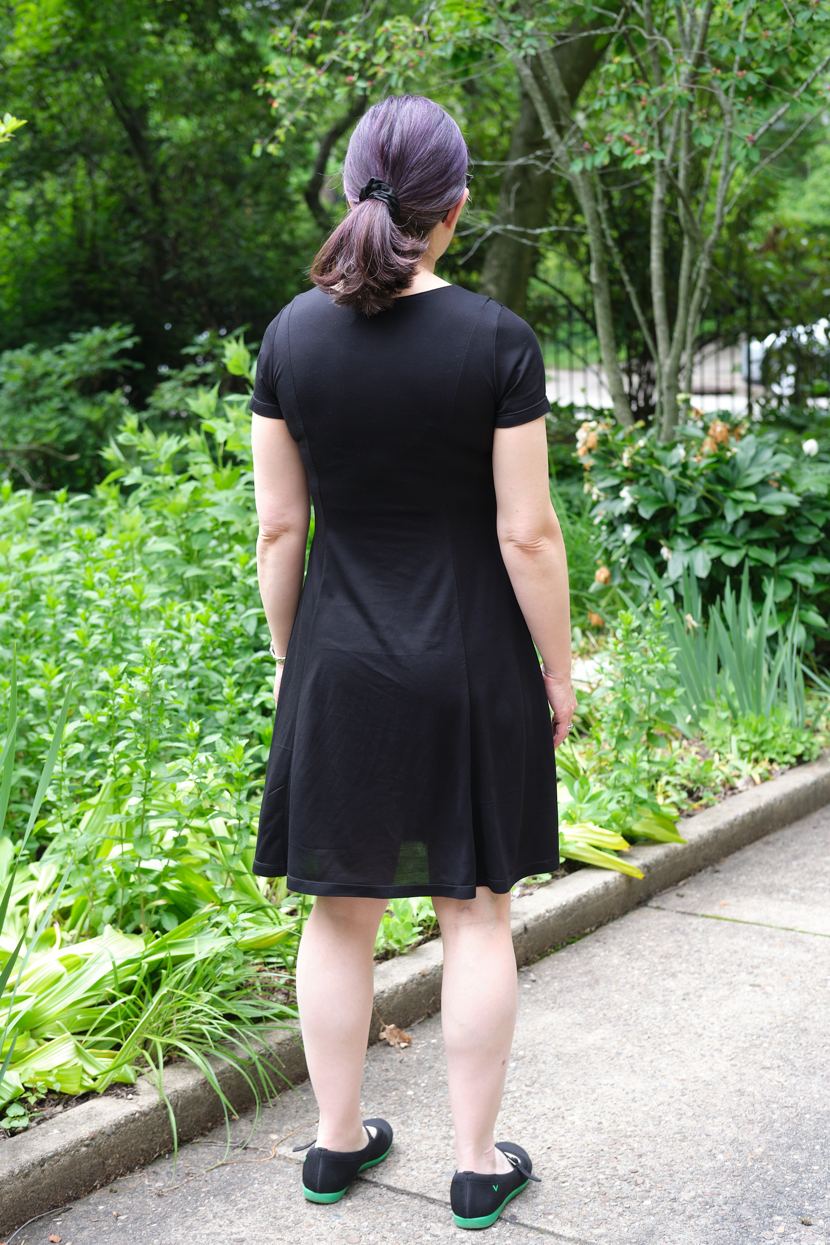
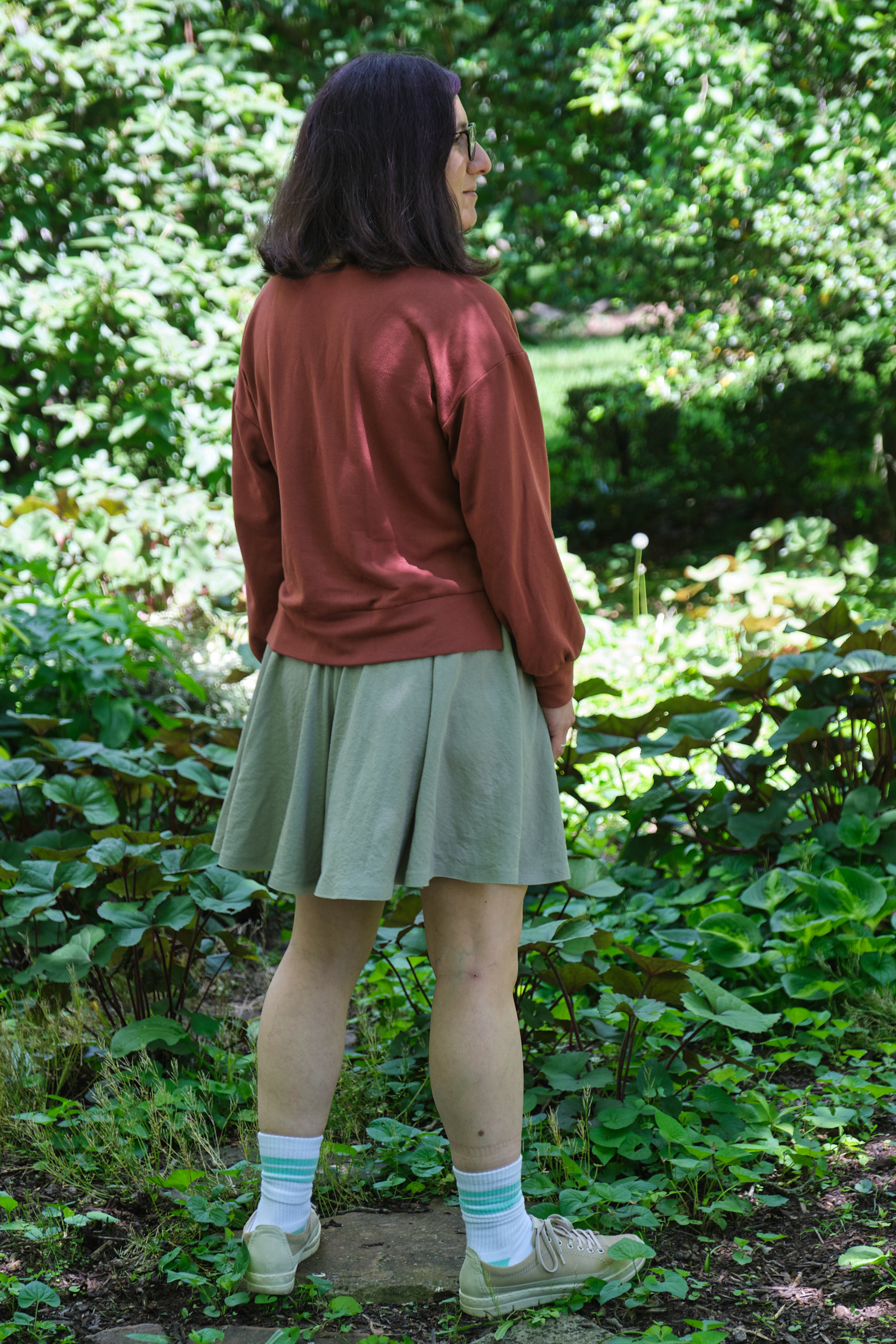
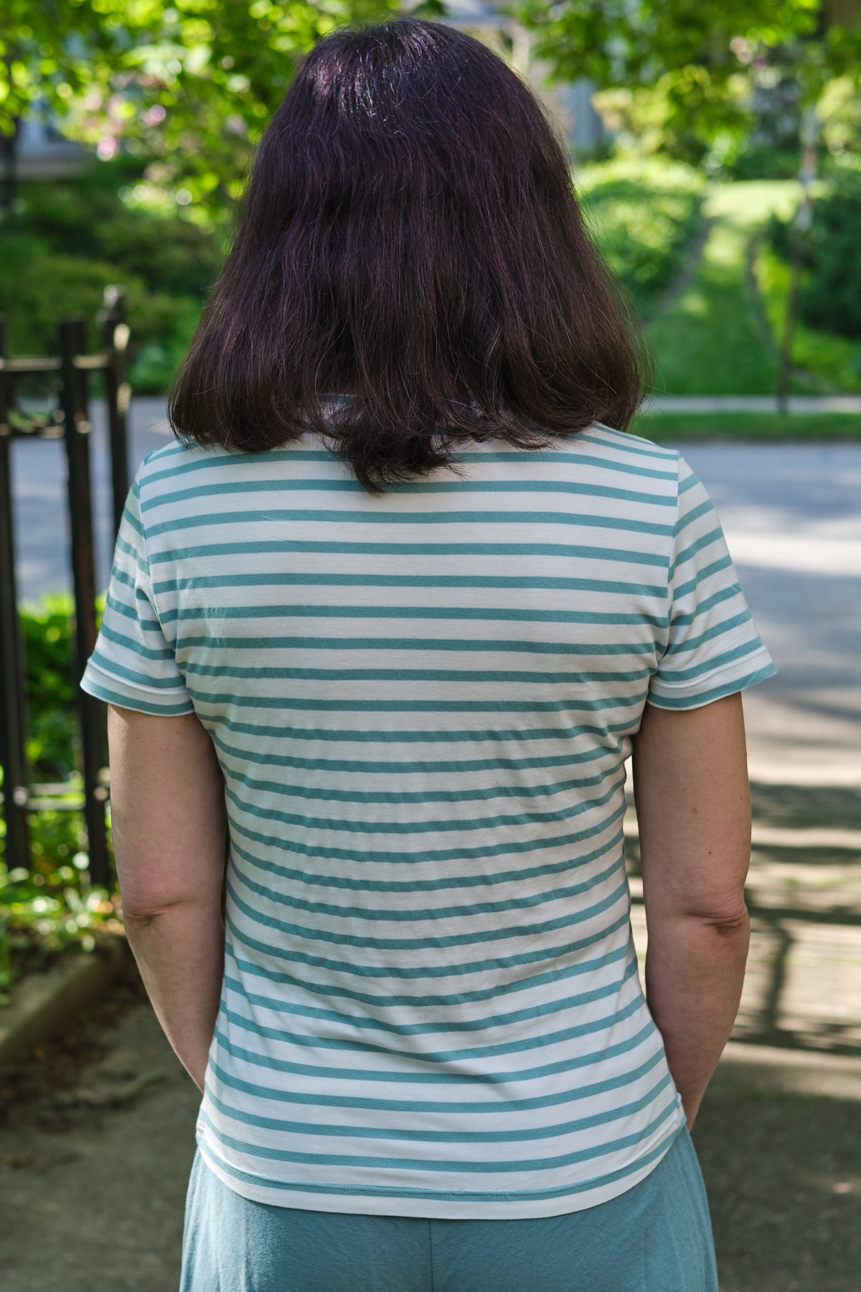
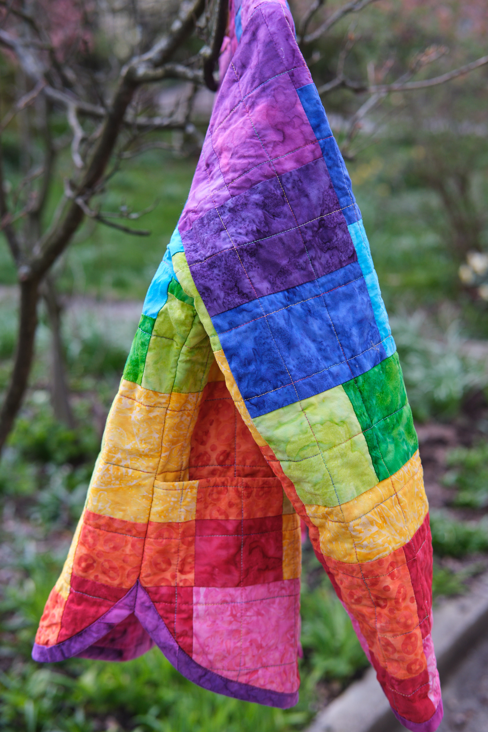
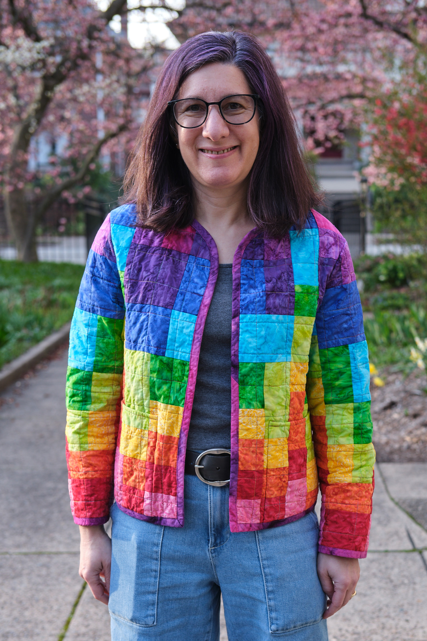
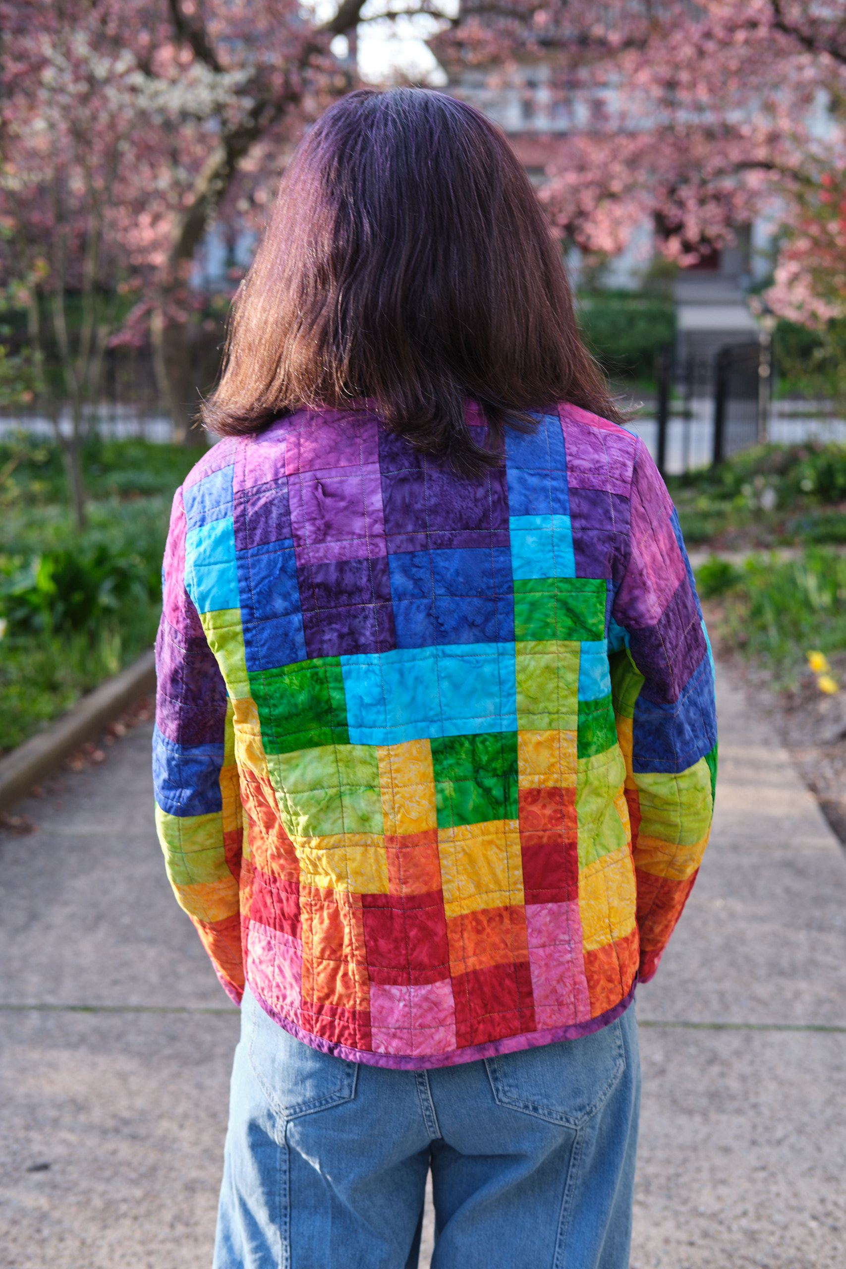
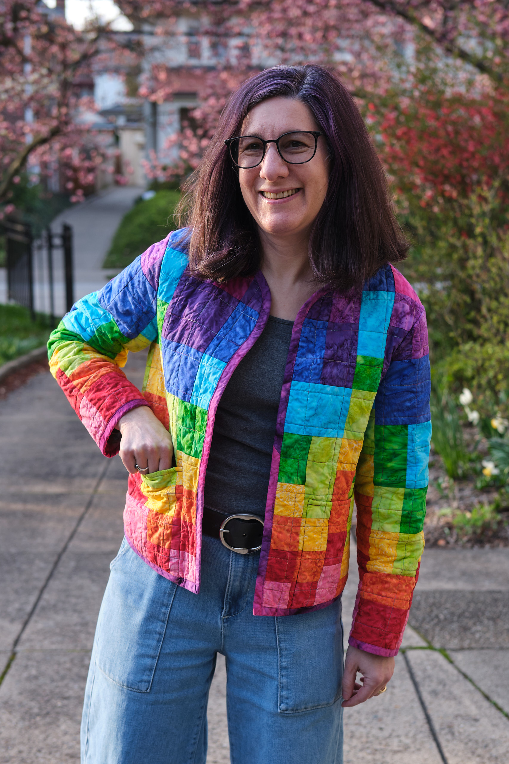
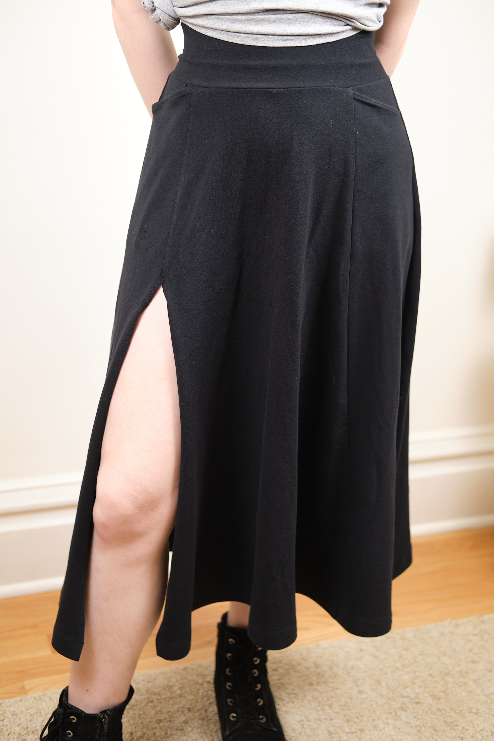
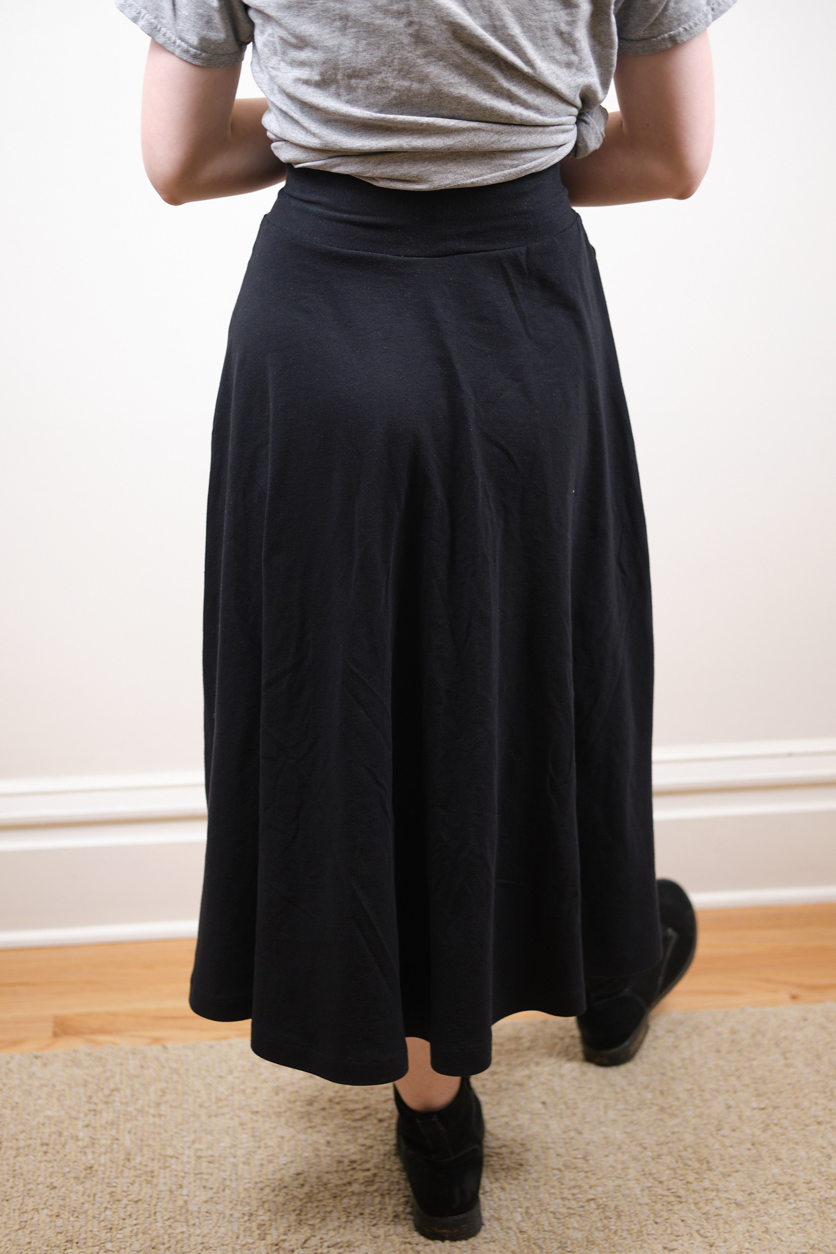
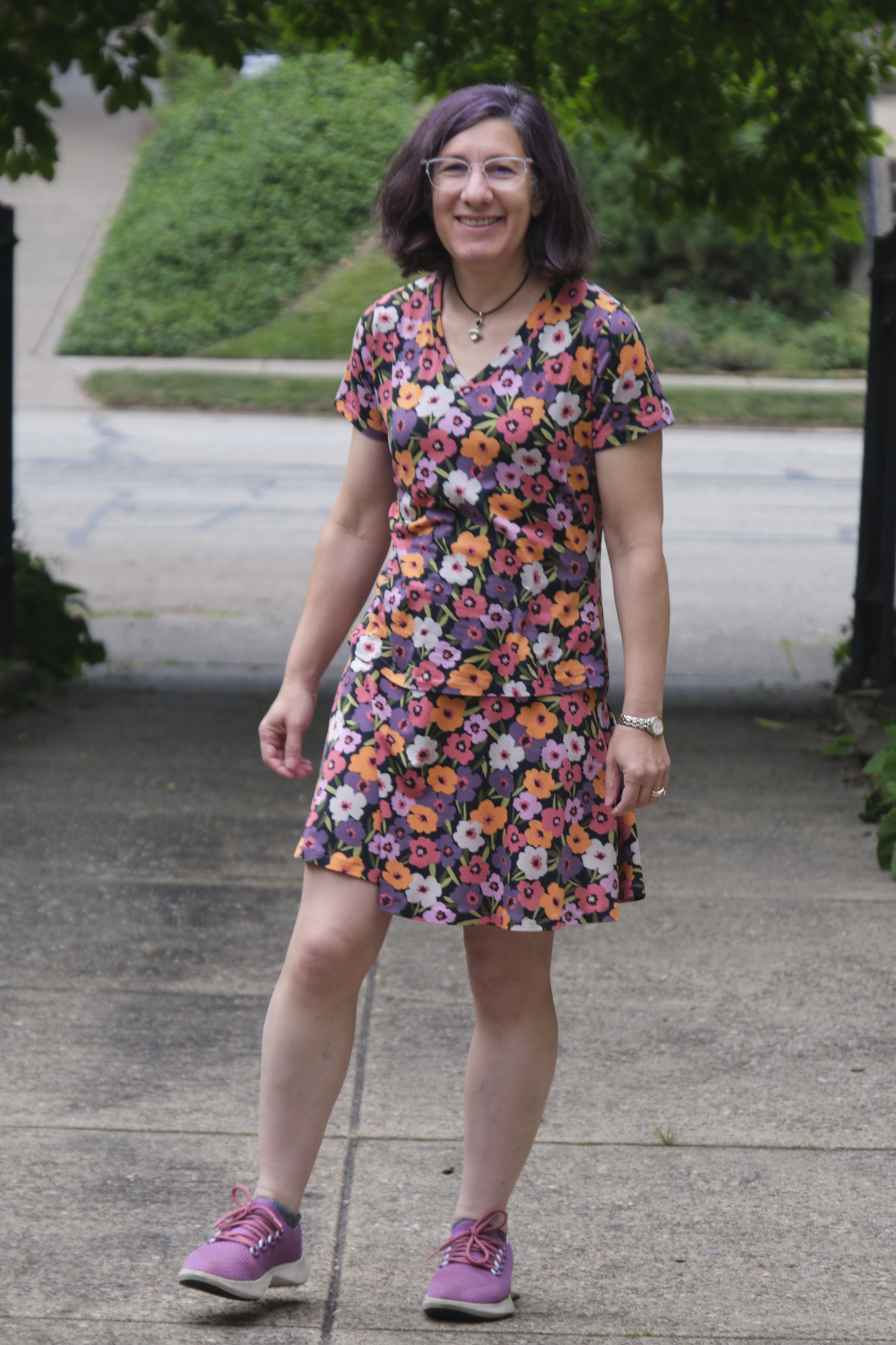
Sinclair Cassie V1 made of 43” of 52” wide dark sage cotton double gauze, size 4p, modified to remove gathers and wrap sleeve bindings.
My first time doing a pattern test for Sinclair I ended up being the pattern cover girl for the Linda pattern. I haven’t had time to sign up for a pattern test since, but when the Cassie top and dress was announced, it appeared I would have time to make it before heading out on a trip.
Cassie is a woven pattern, and I don’t have a lot of woven fabric in my stash besides the 18 yards of cotton double gauze I bought on clearance last year and a lot of quilting cotton. I was worried that the quilting cotton would be too stiff for this pattern, so I went with dark sage double gauze. But I waited for other sewists to post some initial photos of their makes before cutting. I wasn’t sure I would like the fit of the dress, which appeared to be fairly loose, so I made the top version in a size 4P.

I initially tetrised the pattern in Affinity Designer to fit in 1 yard of 58” fabric before realizing that my fabric was actually 52”. At that width it takes more than a yard of fabric, but i made it all fit in 43″.
The pattern was released for testing with only partial instructions, as the pattern designer made some last minute changes. She updated the instructions a couple of times to add the missing information, but never released the full instruction set. As I worked on my top, I periodically checked the Facebook group for the pattern test to see whether new updates had been released.
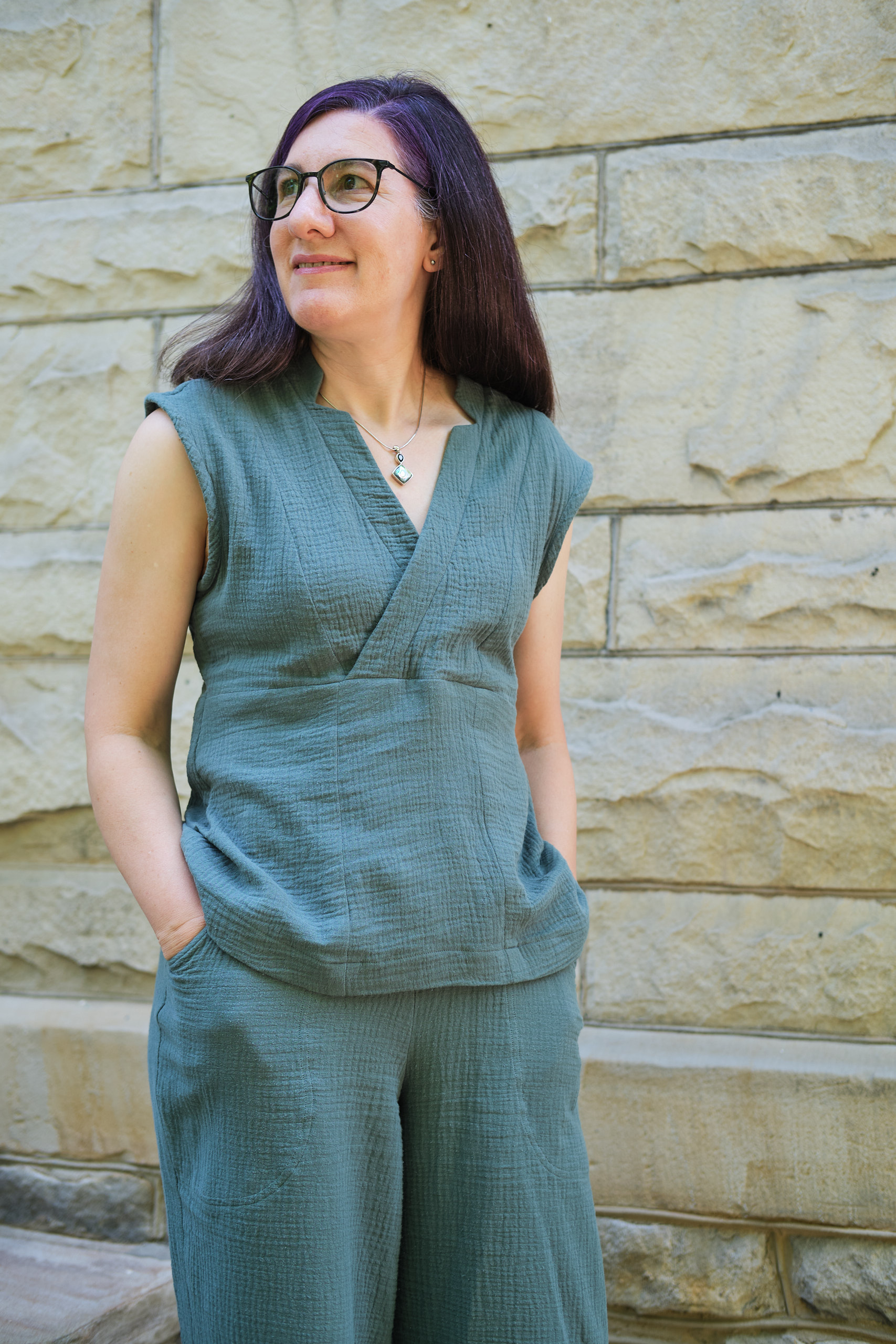
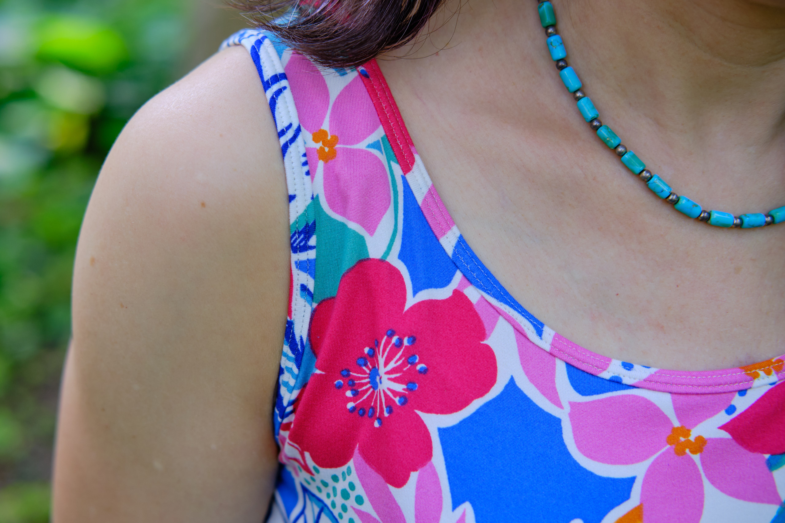
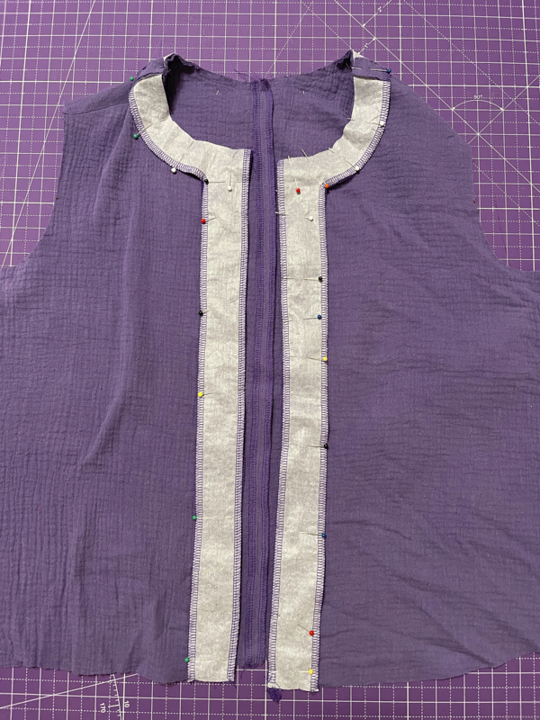
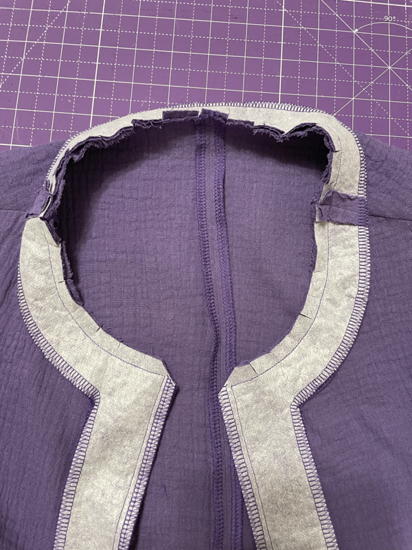
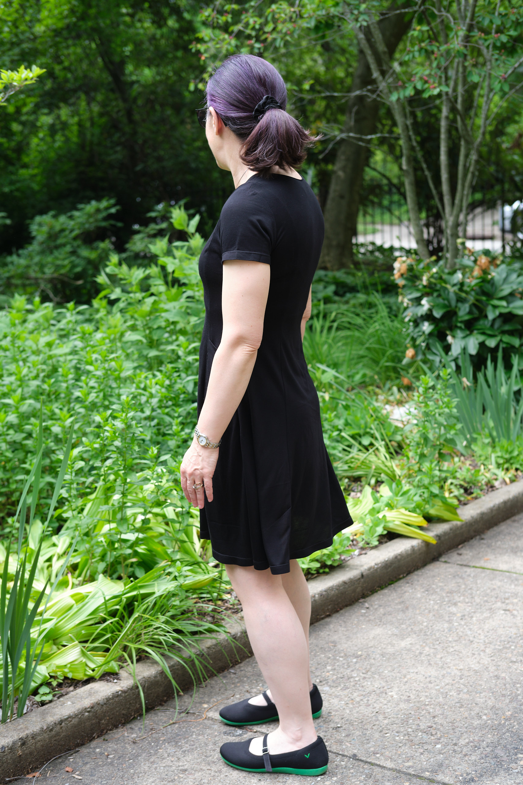
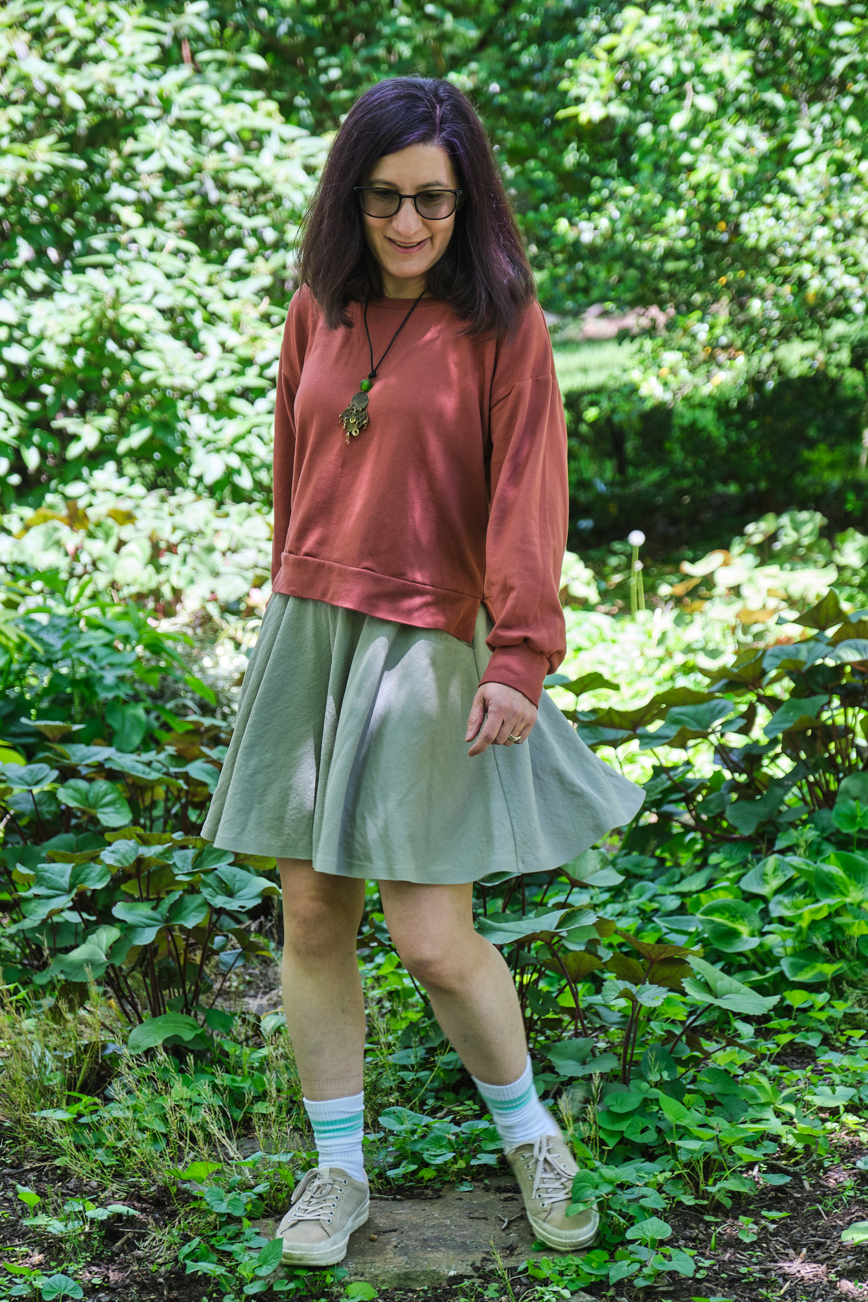
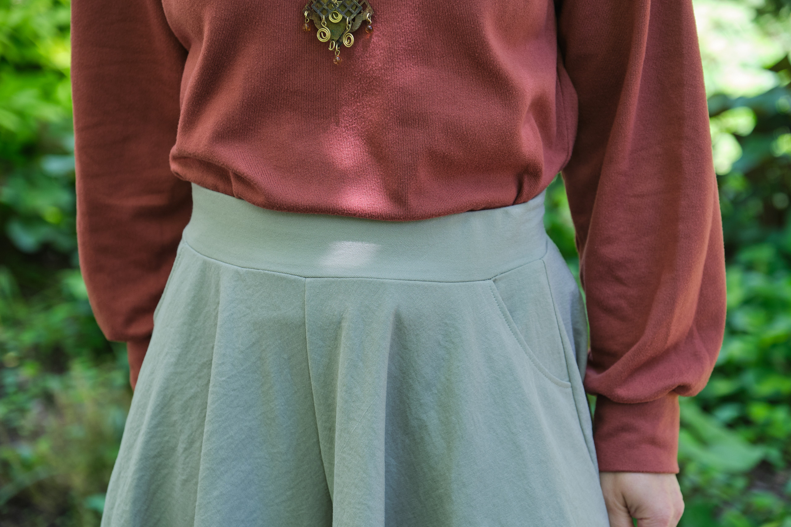
The top has a crossover V-neck with cute notches. I wasn’t sure from the line drawing that I would like the notches and was tempted to leave them out. But I’m glad I kept them as they are a really nice and unique detail. The instructions for facing the crossover pieces was pretty easy to follow. The double gauze was a bit of a challenge because it is fairly fluffy and thus hard to get nice sharp points, but I made it work. I regretted trimming the facing to 1/8 inch (as instructed), as it made understitching the gauze more difficult — next time I think I would clip the curve but not trim.
Other sewists complained that the V-neck gaps open — this seemed to be a big problem for larger sizes. Besides the gaping problem, people were complaining that the top was too loose, and some who tried adding the optional ties did not like the look. In addition, there were some complaints about the cap sleeve being too pointy. I suggested that the pattern designer offer a sleeveless option to address the cap sleeve problem, a suggestion she adopted. The pattern designer polled testers about some possible changes and a couple days later posted some new line drawings while she worked on revising the pattern.
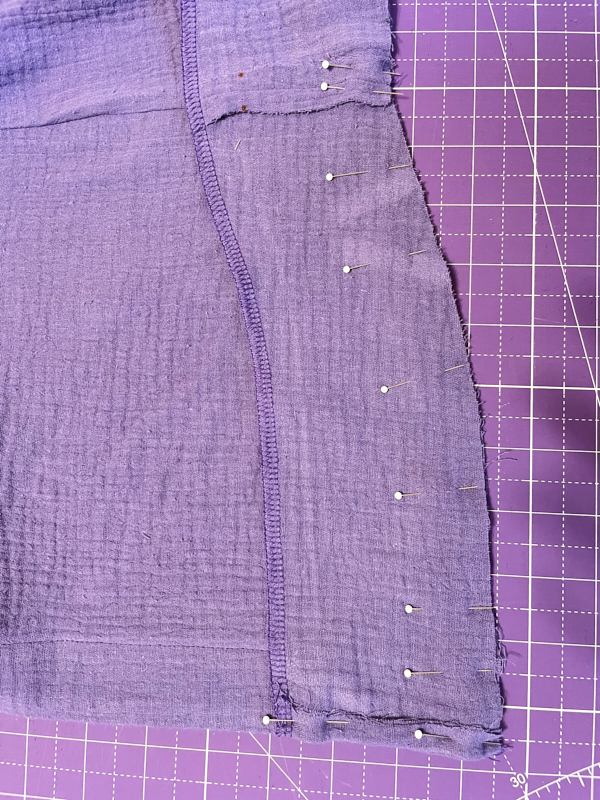
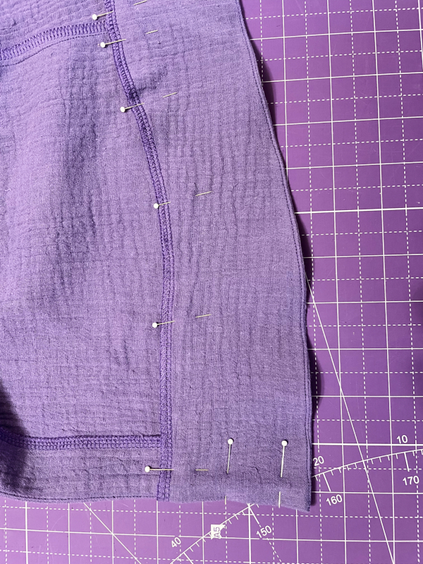
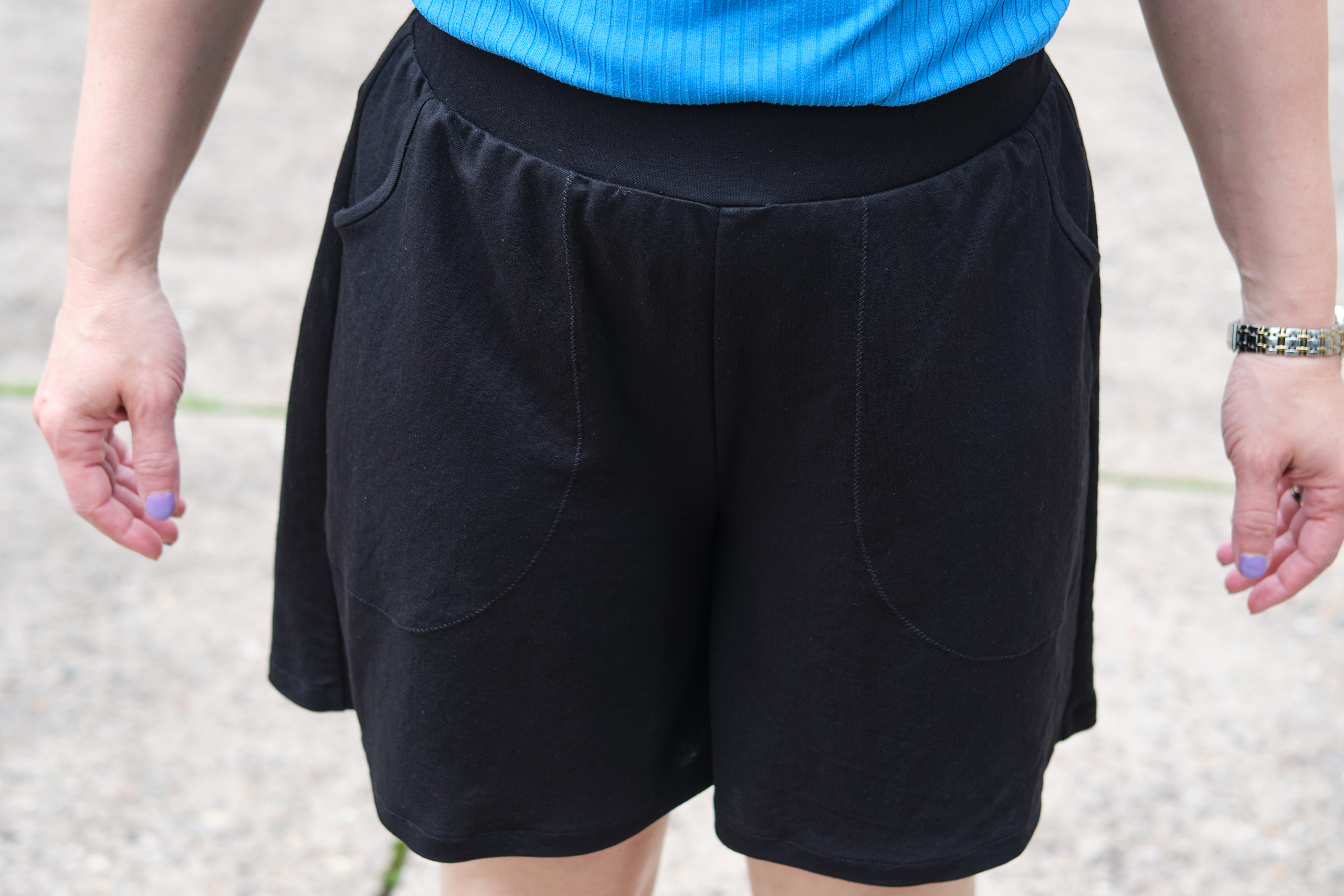
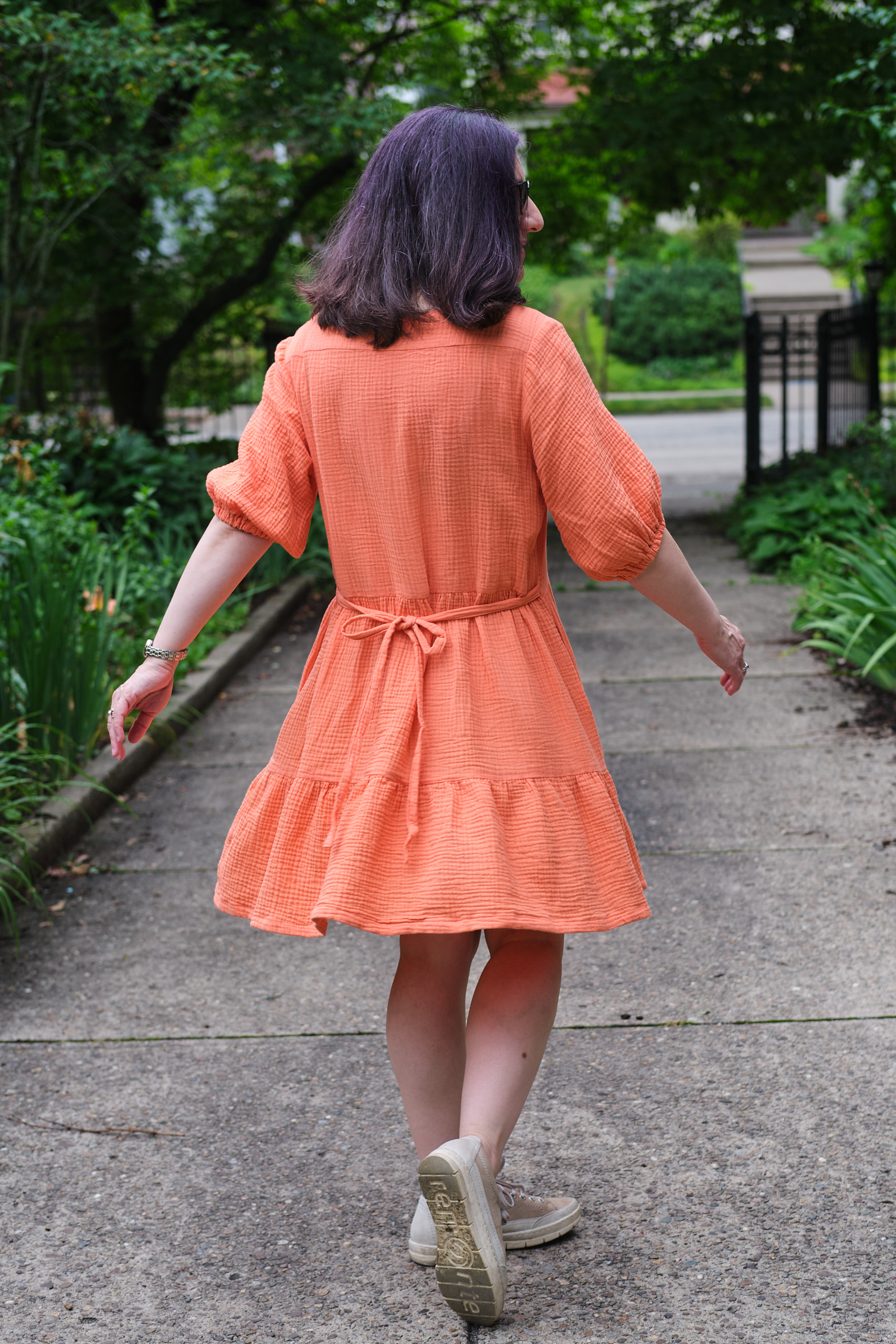
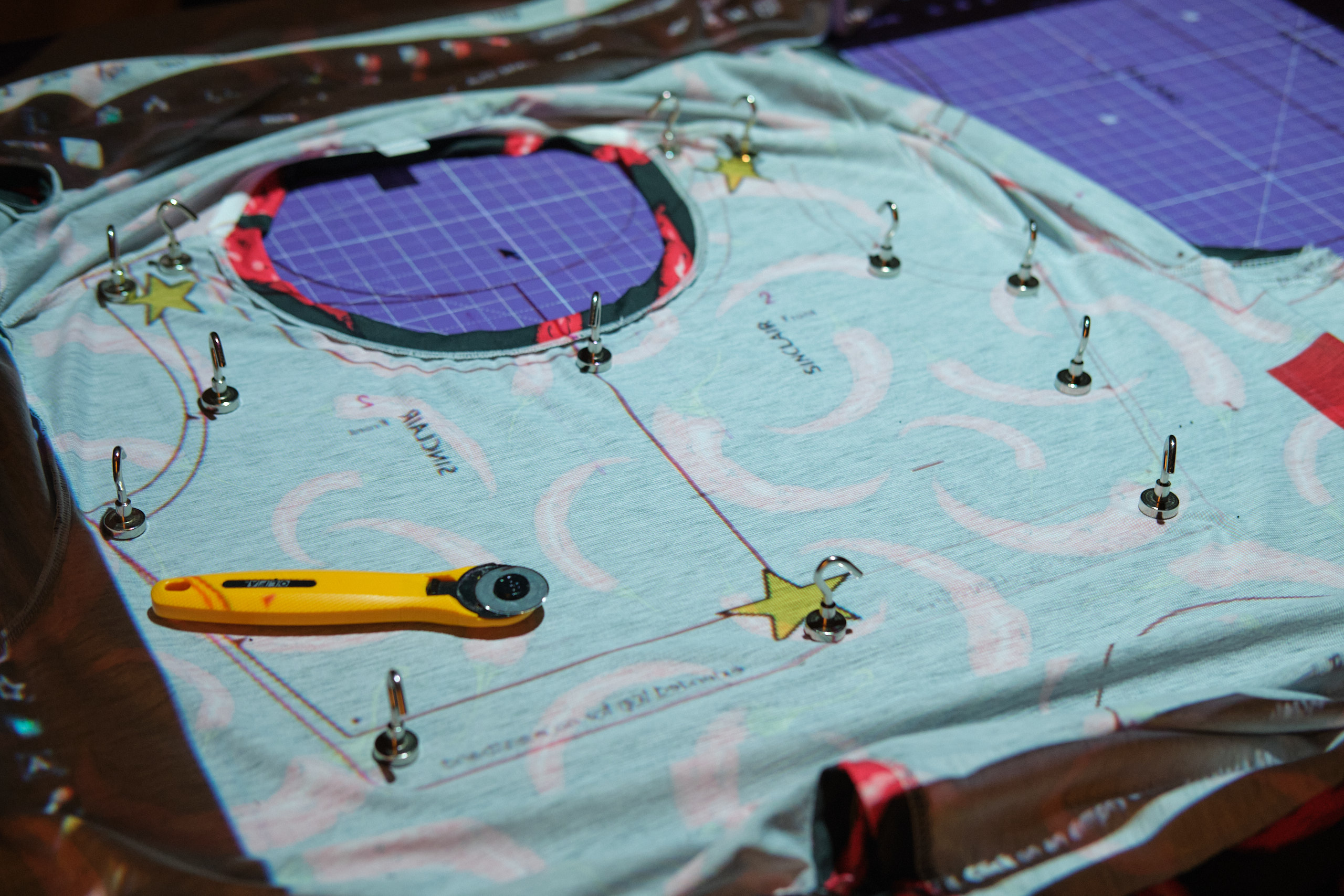
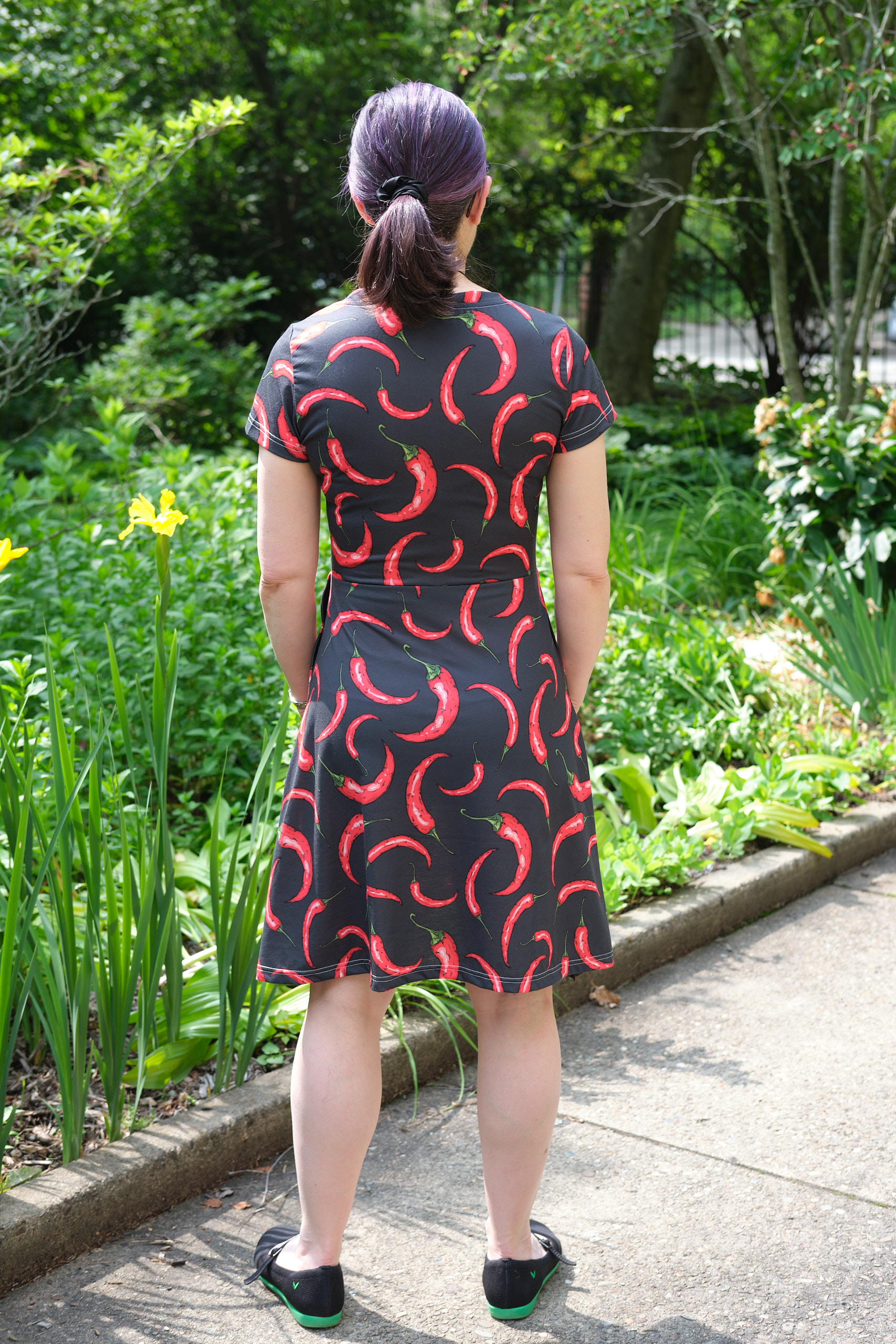
I could see from the new drawing that I would need to start over to make the revised design. So I decided to go ahead and finish the top I had started in the mean time. I sewed on the “skirt” and was not happy with the look of the gathered front and back, which looked to me like a maternity top. So I took it apart and cut the gathered pieces down so they would fit in place without gathering. I also graded in the waist a bit and trimmed the point off the cap sleeves.
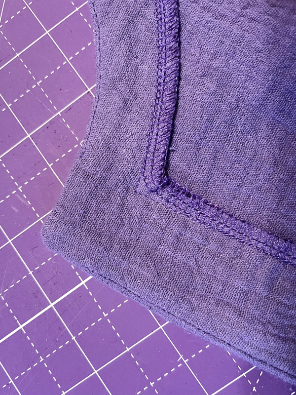
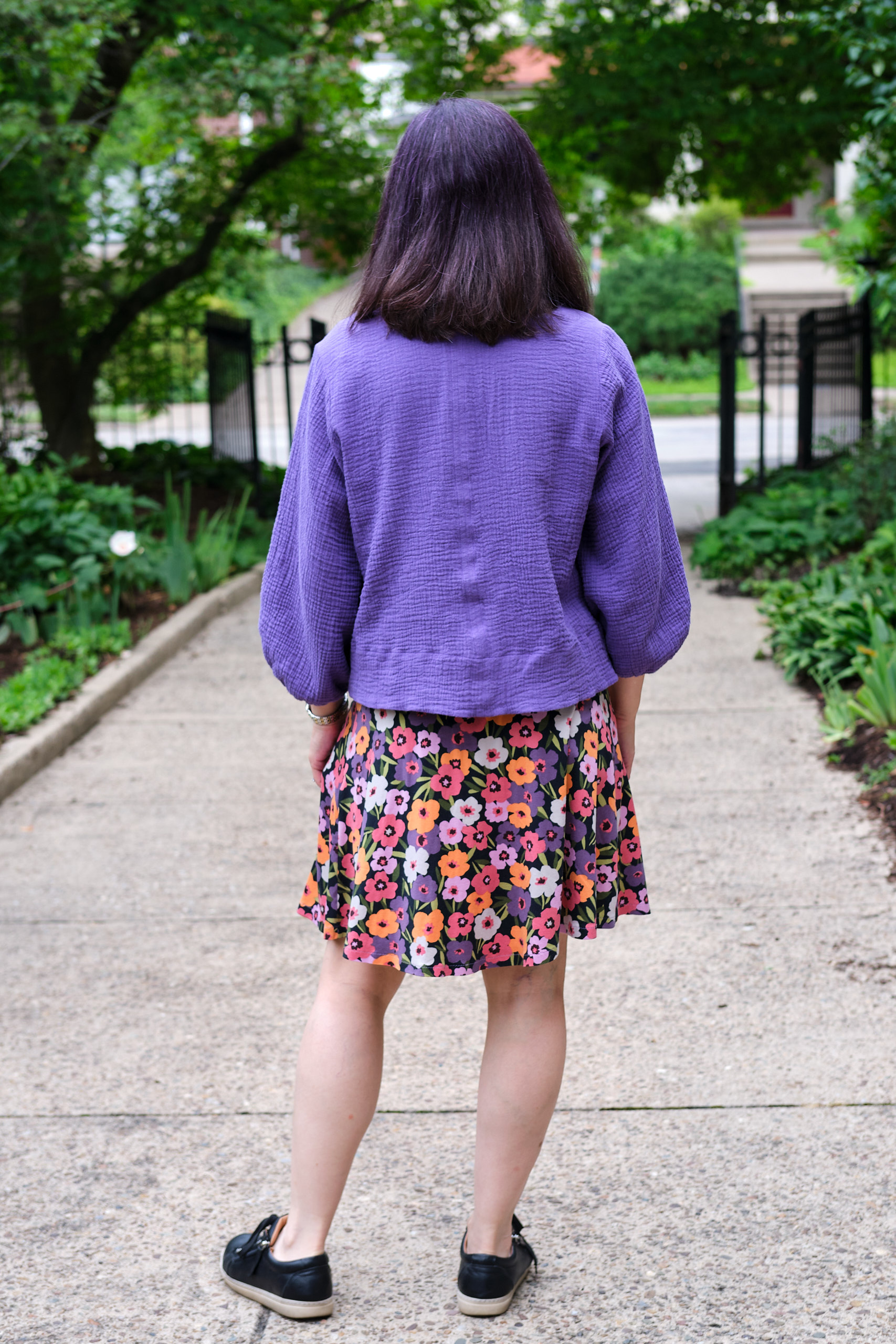
As the top stitching on the neck facing stands out in the double gauze I decided to mirror the look by making a hem of similar width. I serged the bottom of the top, folded it up .25 inch and then another 1.25 inch, and top stitched it from the front.
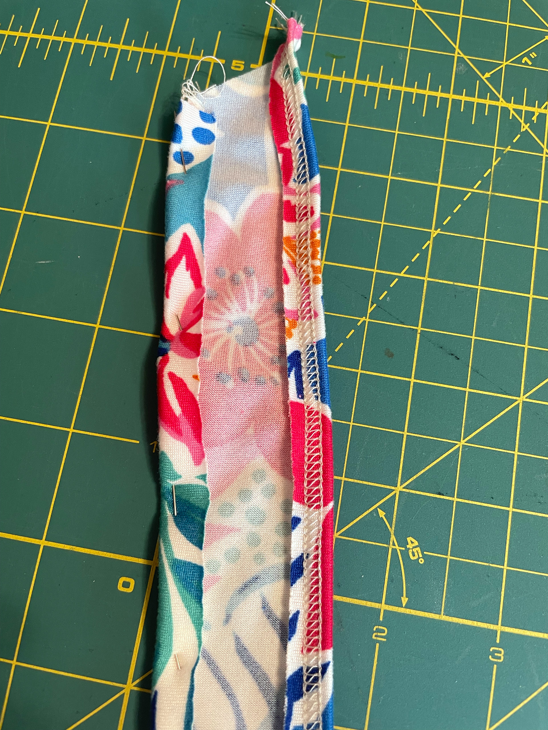
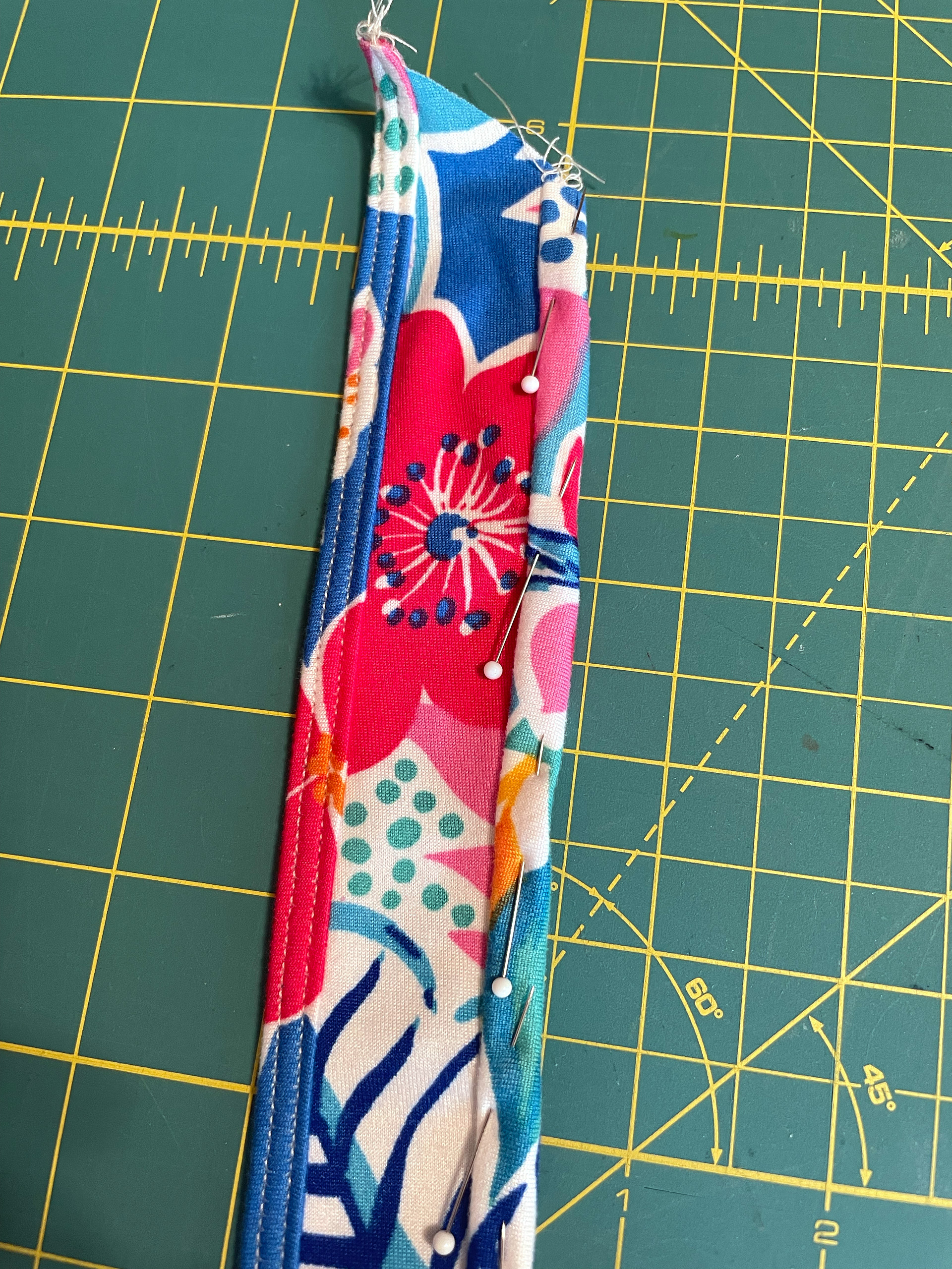
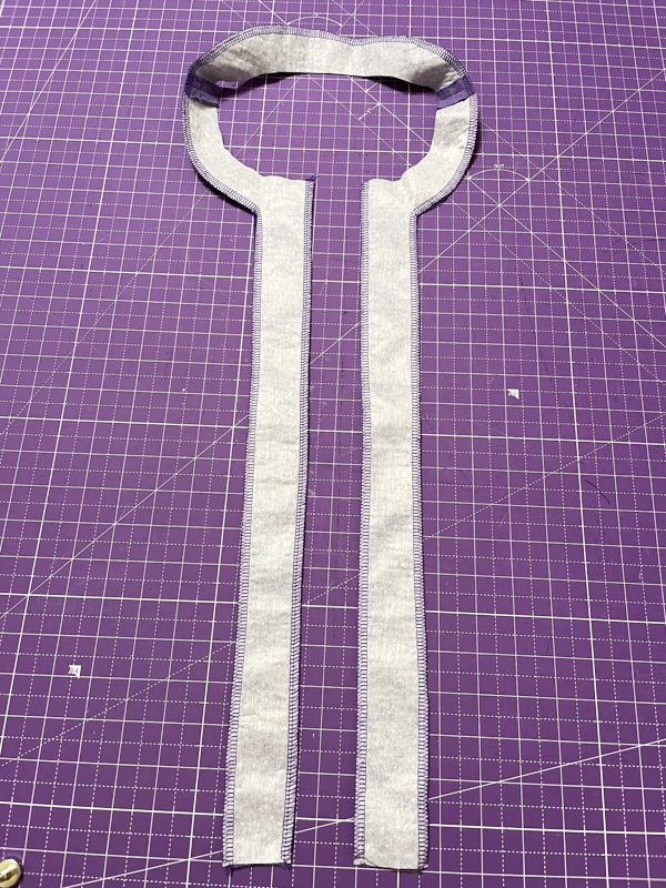
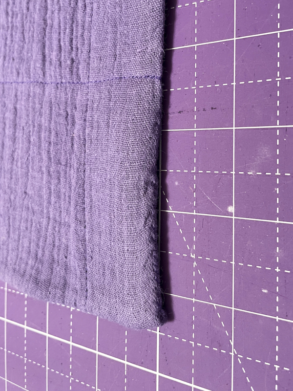
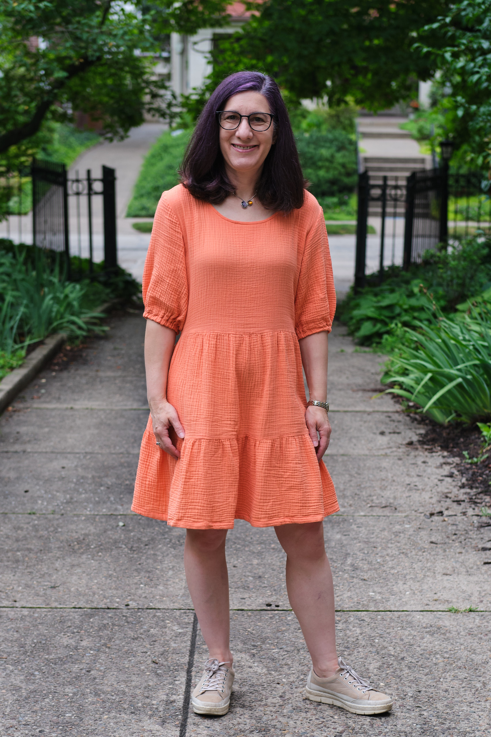
The last bit to figure out was the sleeve binding. The pattern included narrow bias binding strips, but the instructions did not detail how to attach them. Having done this sort of binding before for double gauze necklines (on my purple Alva top and my orange Meet You There dress) I had a good idea of how to do the binding and I knew it would be difficult with double gauze. Therefore i cut wider bias binding (1.75 inch) and attached it wrapped around the armscye edges.
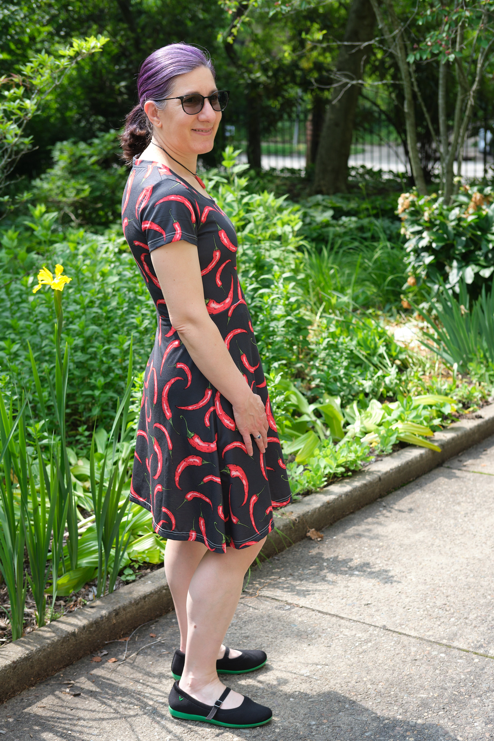
I finished my Cassie V1 top before leaving town, and even managed to do a photo shoot. It looks great with my matching PE Vacation Vibes pants, but also looks good with other pants and shorts. it was fun to try out a new pattern and be involved in the discussion of what worked well and what needed improvement. I uploaded photos to the Facebook group right before the pattern designer posted the V2 pattern, but making V2 had to wait until I got back into town a week later.
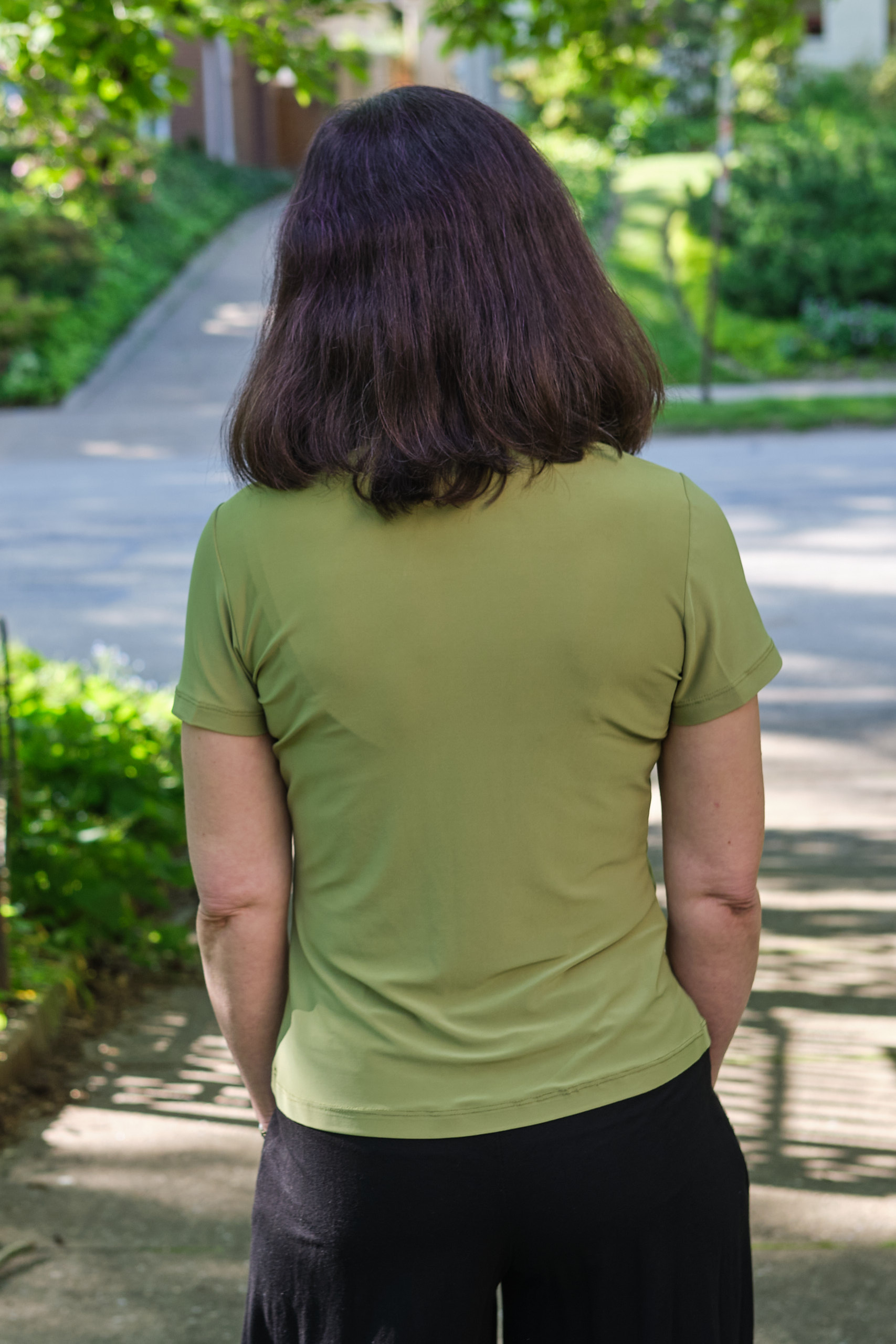
Photos below of my hacked Cassie V1. The final Sinclair Cassie pattern is now available, and as you will see, no longer includes the crossover front or the horizontal seam in the back. But it still has the cute notches on the neckline and now comes with multiple sleeve options. I’ll post the top I created with the final pattern next.


