Alana dresses

Last September I bought my first Sinclair pattern and sewed an Alana dress. I have since sewn two more (and there will probably be more) and several other Sinclair patterns. I’ve found the Sinclair patterns to be well drafted and pretty straightforward to understand. They can be downloaded as PDFs and printed on a home printer, printed in large format at a copy shop, or projected.

I chose Alana as my first pattern mostly because I liked the pockets. I continue to love the pocket style, where the pockets are anchored by two princess seams. I also liked the neckline that used a facing instead of a binding or band.

I obsessed over what fabric to use, and continuing with my privacy research related theme, I selected fabric with eyes on it — evil eye blue by Laura May. I got the same fabric in the small size for the sleeves. I had both printed on Spooflower modern jersey.

Then I printed out the PDF layer for the size 4 petite pattern on the laser printer at work and spent about an hour taping it together and cutting out all the paper pattern pieces. Then I laid all my cutting mats out on the hallway floor and laid out the fabric as shown in the pattern instructions. I quickly realized that I didn’t have enough fabric for that sort of layout. Puzzled, I looked on the Sinclair website for where to ask questions, and discovered the Sinclair Patterns Group on Facebook. This FB group is a great resource for sewing Sinclair patterns. I found you can easily search for the name of a pattern and find lots of photos of garments other people have made with that pattern, including tips on fabric selection and alterations. You can also post questions or show off your own makes. In any case I soon learned that the layout in the instructions is just a suggestion and may not work depending on the fabric width, garment size, etc. I figured out how to fold the fabric to cut it and get it all in. I also learned from the FB group about a YouTube video tutorial for making the Alana dress.

I used large washers as fabric weights and used my rotary cutter to cut out the fabric. Then I followed the instructions to sew the dress. I selected the regular neckline, long sleeves, and knee-length options. On the advice of the video tutorial I extended the length of the front facing so that it would fall below the bust line. I used a very narrow zigzag stitch for all of the seams and a medium zigzag to finish the seam edges. I finished the sleeve and bottom hems with HeatNBond Soft Stretch and zigzagged over the edges.

When I tried on the dress it looked OK, but the waist is not designed to be fitted, and it looked a little baggy on me. Indeed, the pattern explains that there is about three inches of ease at the waist. So I decided to take the dress in at the sides and the back princess seams to remove most of that ease. The dress looked much better on me without the ease.

I made my second Alana dress in December using a rich purple scuba suede fabric. The fabric is soft, stretchy, washable, and pretty easy to sew. I used a lighter ITY fabric for the front and back facings and extended both of them below the bust. I thought about using a lighter fabric for the inside of the pockets but decided to try the pockets entirely in scuba suede, and they worked out fine. A line of top stitching across the top of the pockets might have been helpful, but it is ok without. I did not bother stitching over the seam edges. Once again I ended up removing the ease. Months later the fabric is holding up pretty well after many wearings and washings, although it is showing some slight signs of pilling.

My third Alana dress was another dress in Spoonflower modern jersey. This time I removed the ease in the pattern when I cut it. Cutting out this one took a while because I obsessed over the fabric placement. This was the third version of my bad passwords dress (there’s a whole story behind it), and this time I wanted to have long sleeves and pockets.

New password dress with sleeves and pockets

And see the original passwords dress below

Lorrie wearing password dress at Privacy@Scale, photo by Adam Mason

Security Blanket

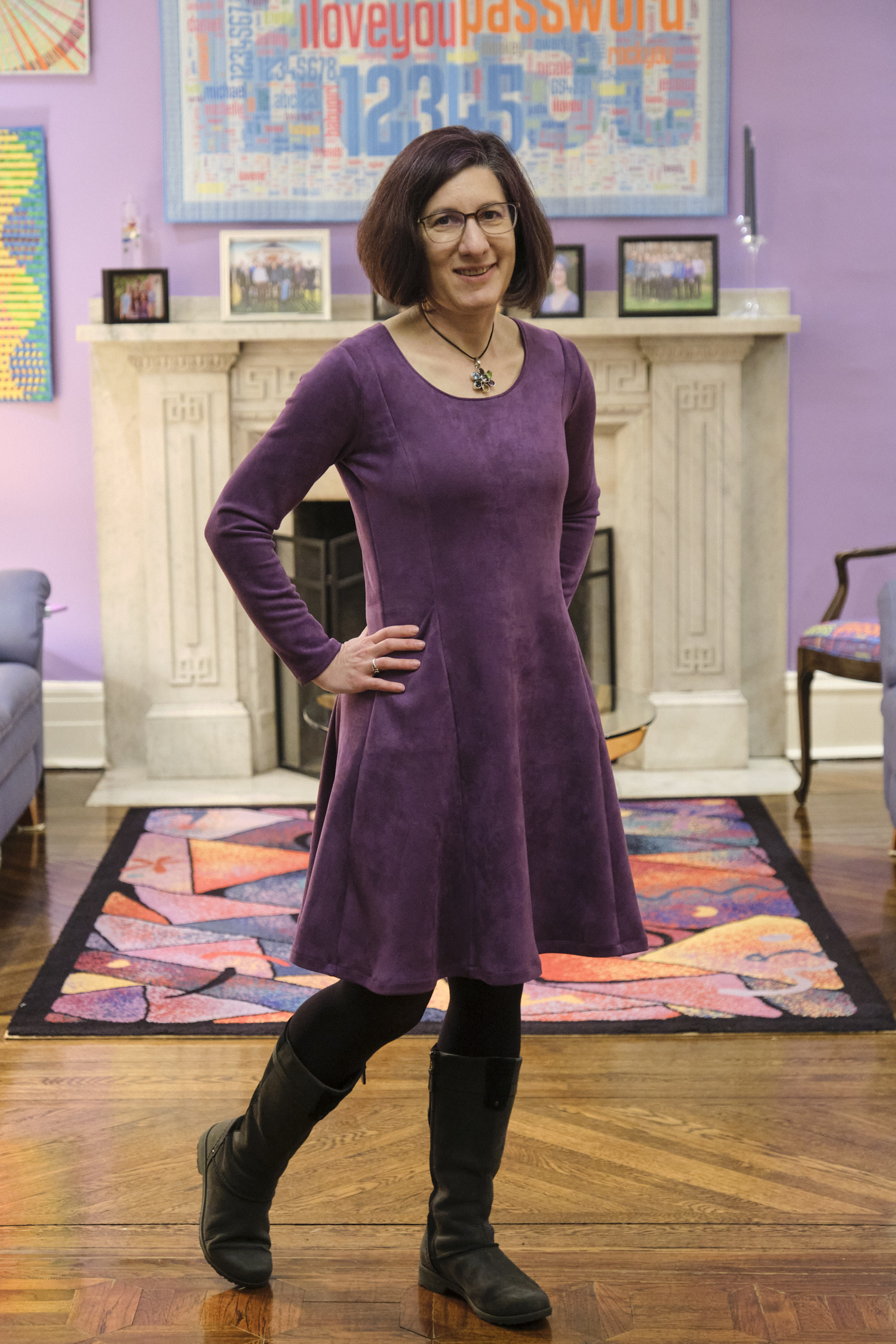
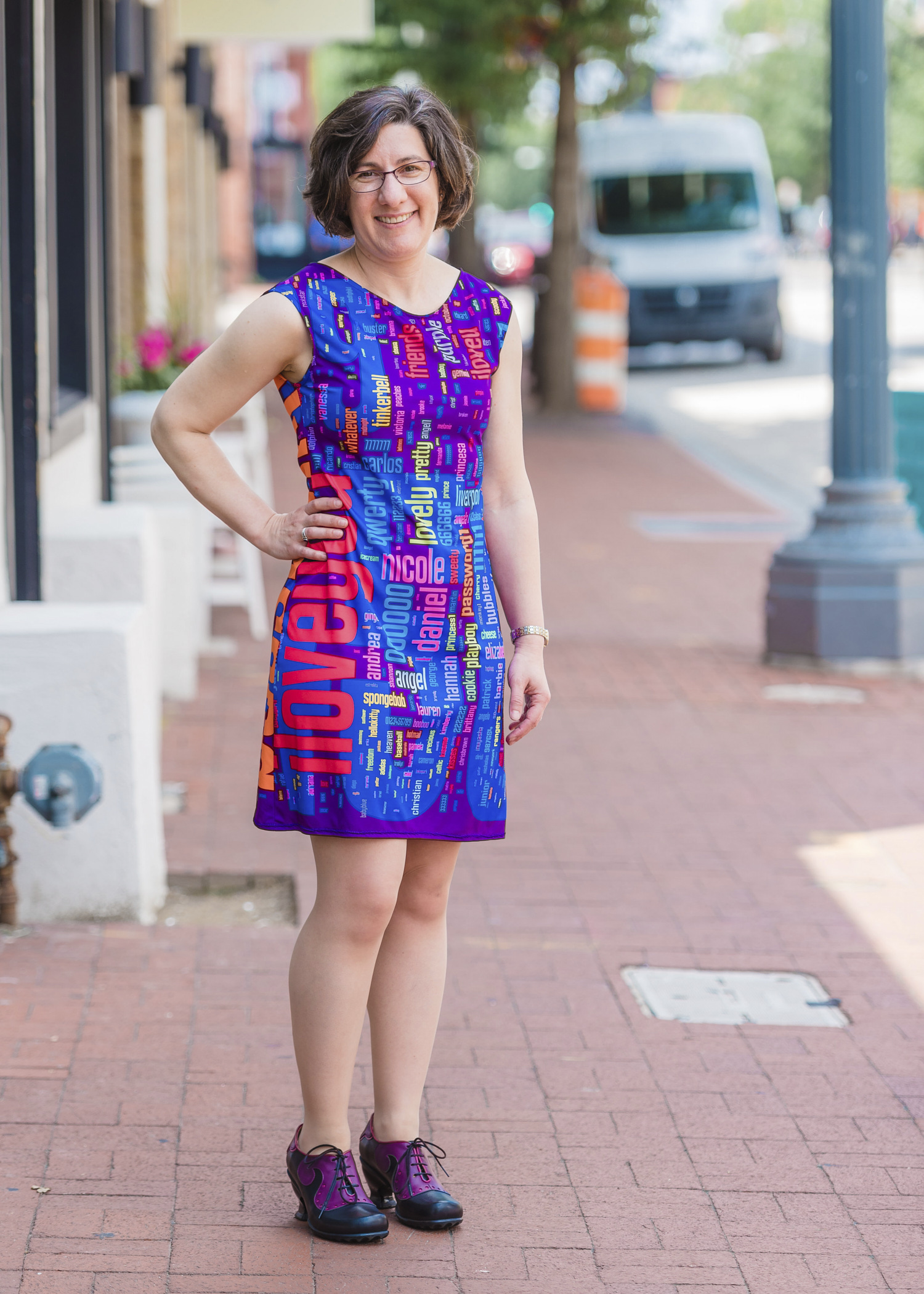
As I’ve been thinking about quilt ideas related to security and privacy during my staybatical at the STUDIO for Creative Inquiry all year, the title for this quilt was obvious: Security Blanket. Less obvious was the design of a quilt that would fit this title. Ultimately, I took inspiration from the research on the security and usability of text passwords that I’ve been working on with my students and colleagues. While this quilt started out as an art project inspired by my research, what I learned from creating it will likely influence my future password research.

Security Blanket, machine quilted, digitally printed cotton fabric, 63.5″x39″

Our research group has collected tens of thousands of passwords created under controlled conditions as part of our research. Among other things, we have compared these passwords with the archives of stolen passwords that have been made public over the past few years. Perhaps the largest such archive consists of 32 million passwords stolen from social gaming website RockYou and made public in December 2009. These passwords are notably weak, having been created without the requirement to include digits or symbols or even avoid dictionary words. Security firm Imperva published an analysis of these passwords. More recent analyses of stolen passwords have found that passwords stolen in 2012 are pretty similar to those stolen in 2009.

The media had fun publishing the most common passwords from the RockYou breach. As with other breaches, password and 123456 figured prominently. But after you get past the obvious lazy choices, I find it fascinating to see what else people choose as passwords. These stolen passwords, personal secrets, offer glimpses into the collective consciousness of Internet users.

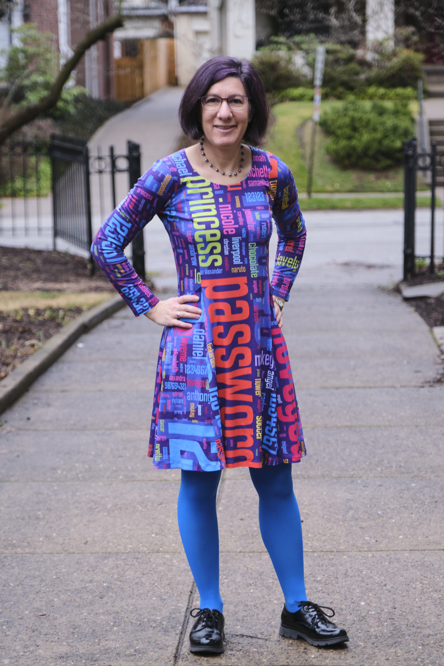
I asked my students to extract the 1000 most popular passwords from the RockYou data set and provide a list to me with frequency counts.  I then went through the list and sorted them into a number of thematic groups. I assigned a color to each group and entered the passwords with weights and colors into the Wordle online word cloud generator. I then saved the output as a PDF and edited it in Adobe Illustrator to rearrange them in a shape that I liked, with some pairs of words purposefully place in close proximity. I designed a border, and had the whole thing printed on one large sheet of fabric by Spoonflower. When the fabric arrived, I layered it with batting and quilted it. I bound it with matching fabric from Spoonflower that I designed.

Sorting 1000 passwords into thematic categories took a while. While a number of themes quickly emerged, many passwords could plausibly fall into multiple categories. I tried to put myself in the mindset of a RockYou user and imagine why they selected a password. Is justin the name of the user? Their significant other? Their son? Or are they a Justin Bieber fan? Is princess a nickname for their spouse or daughter? The name of their cat? Their dog? (It shows up frequently on lists of popular pet names and a recent surveyfound that the most common way of selecting a passord is using the name of a pet.) Is sexygirl self referential? What about daddysgirl? dreamergenius?

When I didn’t recognize a password I Googled it. Most of these unknown passwords turned out to be ways to express your love in different languages. For example, I learned that mahalkita means I love you in Tagalong. Love was a strong theme in any language; there seems to be something about creating a password that inspires people to declare their love.

Not surprisingly, the top 1000 passwords list includes a fair share of swear words, insults, and adult language. However, impolite passwords are much less prevalent than the more tender love-related words, appropriate for all audiences.

There are a couple dozen food-related words in the top 1000 passwords. The most popular is chocolate and most of the others are also sweets (and potentially nicknames for a significant other), but a few fruits and vegetables, and even chicken make their way to the top as well. Among fruits, banana appears in both singular and plural.

Animals are also popular. While felines appear on the password list in a number of forms and languages, monkey is by far the most popular animal, and the fourteenth most popular password. I can’t quite figure out why, and I don’t know whether or not this is related to the popularity of “banana.”

Fictional characters are also popular, especially cartoon characters. The twenty-fifth most popular password is tigger (which might also be on the list because it is a popular name for a cat). A number of super heroes and Disney princesses also make the list, as well as another cartoon cat, hellokitty. Real life celebrities also make the list, including several actors and singers. While at first I thought booboo might refer to the reality TV star Honey Boo Boo, I realized that the date of the password breach predates the launch of that TV show.

A number of passwords relate to the names of sports, sports teams, or athletes. Soccer-related passwords are particularly popular. There are several cities on the list that I’m guessing were selected as passwords because of their sports teams, especially soccer teams.

Besides the obvious lazy password password, and also PASSWORD, password1, and password2, some more clever (but nonetheless unoriginal) variations included secret and letmein. And I love that the 84th most popular password is whatever.

Some passwords puzzled me. Why would anyone select “lipgloss” as their password. Why not “lipstick” or “mascara”? Perhaps it refers to a 2007 song by Lil Mamma?  Why “moomoo”? Why “freedom”?

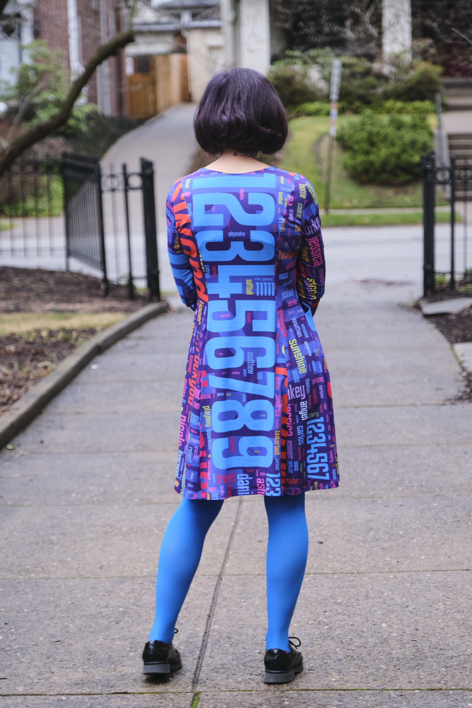
Even more popular than the word password were the numbers 123456, 12345, 123456789. Other numbers and keyboard patterns also appear frequently. When I laid out the 1000 passwords on the quilt, I scaled them all according to their popularity. The most popular number sequence was chosen by more than three times as many people as the next most common password and was so large that I decided to place it in the background behind the other passwords so that it wouldn’t overwhelm the composition.

I made a few mistakes when designing the quilt that I didn’t notice until I was quilting it (quilting this quilt provided an opportunity to reflect on all the passwords yet again as I stitched past them). One problem was that when I transferred the top 1000 password list to Microsoft Excel while categorizing the passwords, the spreadsheet program removed all the zeros at the beginning of passwords. As a result there are three passwords that are actually strings of zeros (5, 6, and 8 zeros) that are printed simply as 0. In addition there are three number strings that start with a 0 followed by other digits are printed without the leading 0. Another problem was that the color I selected for jesus, christian, angel, and a number of other religious words blended in with the background numbers when printed on fabric, making those words almost invisible (even though they showed up fine on my computer screen). I had carefully checked most of the colors I used against a Spoonflower color guide printed on fabric, but had inadvertently forgotten to check this particular color. I reprinted about half a dozen of these words in a darker color and sewed them onto the quilt like patches that one might add to repair a well-worn spot.

There are also some passwords that I colored according to one category, and upon further reflection I am convinced more likely were selected for a different reason and should be in a different category, but we’ll never know for sure. I invite viewers to discover the common themes represented by my color-coded categories and to speculate themselves about what users were thinking when they created these passwords. Zoom in on the thumbnail images above to see all of the smaller passwords in detail.

The colors, size, and format of this quilt were designed to be reminiscent of a baby quilt, which I imagine might become a security blanket. Like the passwords included in this piece, a security blanket offers comfort, but ultimately no real security.

Self Portrait

As part of my sabbatical project, I  have been continuing to contemplate ways to visualize privacy. My De-identificaiton quilt featured digitally-printed photos de-identified by their extreme magnification and by splicing them together with other fabric. Another approach to visual de-identification is pixelation. To pixelate an image, we superimpose a grid on the image and replace each cell with a color representing the average of all the pixels in that grid cell. Although pixelation has been shown to be highly vulnerable to automated re-identification, it is a widely used method of obscuring images to make them more difficult for humans to recognize.

I have long been intrigued by the Salvador Dali paintings, Lincoln in Dalivision (1977) and Gala Contemplating the Mediterranean Sea which at Twenty Meters Becomes the Portrait of Abraham Lincoln (Homage to Rothko) (1976), which in turn were inspired by Leon Harmon’s grey photomoasic of Abraham Lincoln (1973).

Recently, Ray J released the single “I Hit it First” with a pixelated photo on the album cover. The photo was quickly recognized as a 2010 photo of bikini-clad Kim Kardashian.

Original portrait

While working on my Big Bright Pixels quilt, people kept asking me whether there was a hidden picture or message. There wasn’t. But that did get me thinking about doing a pixel quilt with a hidden image. But what image should I pixelate? I had recently used a pixelated face in the logo I designed for the Privacy Engineering masters program, and a face seemed a natural choice given that faces are commonly pixelated to protect privacy in news photos. (Other body parts are also frequently pixelated, and I love the censorship towel, but I digress.) I settled on pixelating a face, and briefly considered using a face of a famous person before deciding to use my own face. I selected a blue-haired portrait, photographed by Chuck Cranor.

Pixelated portrait

Pixelated portrait

Pixelation can be done trivially with a computer using standard image processing software packages or by rolling your own. I started working on my pixelated quilt before I started programing in Processing, so I used Photoshop to pixelate a headshot of myself. The initial pixelation was nice, but I wanted something more colorful and also higher contrast so that the differences between colors would show up better when printed on fabric (digital printing on fabric tends to dull colors). I experimented with adjusting the contrast, brightness, and color settings in Photoshop until I came up with a brighter and more colorful pixelated image. This was the image I sent to Spoonflower for digital printing.

Pixelated portrait with high contrast and color manipulation

Pixelated portrait with high contrast and color manipulation

By the time the fabric arrived I had gotten busy with other quilts, and I was also a little disappointed in how the printed fabric looked, so I left the fabric sitting out on my table in the STUDIO for a while. I decided that the dulled digital print needed some more punch, so periodically I cut a fabric square to match a pixel in the fabric and pinned it in place. I cut some of these squares from translucent polyester organza, adding some vibrancy and shimmer to the pixels over which I layered them. I cut other squares from lace, commercial batiks, and printed fabrics that were more intense versions of the hues in the digital print. I ended up covering about 20% of the pixels with other fabric.

Back of quilt top with vertical lines sewed

Back of quilt top with vertical lines sewed

After a few months of staring at the pixels I finally decided to sew the quilt together. I used a shortcut technique to sew the quilt together without actually cutting apart the squares in the digital print. I folded the fabric along one of the vertical lines, catching the pinned squares in the fold, and stitched along the line with a quarter-inch seam allowance. I repeated this approach to sew all the vertical lines and pressed all the seam allowances to the side. Then I folded the fabric along one of the horizontal lines and repeated this process. The end result was a pieced quilt top that appeared to have been pieced out of 130 2.25″ squares (2.75″ with seam allowances). Theoretically this approach should have resulted in precisely pieced seams; however, some of the lines are actually slightly off and the rows and columns did not come out quite as square as I had hoped they would.

Pieced quilt top

Pieced quilt top

I layered the quilt top over batting and backing and used a spiral free-motion machine quilting pattern to quilt the whole thing free hand. I did the quilting in several sessions as I had time, doodling spirals until my hands got tired. I used several different thread colors to roughly match the color of the thread with the pixels I was quilting. I decided not to bind this quilt, and instead made an envelope and quilted all the way to the edge. There is a little bit of stippled hand quilting done with perl cotton surrounding my signature in the lower right corner.

So now the quilt is done and I’m pretty happy with this self portrait. Most people who have seen it do not recognize it as a self portrait, which is ok, and sort of the point. On the other hand, Golan said the blue and purple hair was a dead give away for him. I had not actually started out with the intention to make a self portrait, but ultimately I think the piece works better for me as a self portrait than any more accurate likeness would.


Self Portrait, machine pieced and quilted 23×30.75″


P3P is dead, long live P3P!

I didn’t attend the W3C’s Do Not Track and Beyond Workshop last week, but I heard reports from several attendees that instead of looking forward, participants spent a lot of time looking backwards at last decade’s W3C web privacy standard, the Platform for Privacy Preferences (P3P). P3P is a computer-readable language for privacy policies. The idea was that websites would post their privacy policies in P3P format and web browsers would download them automatically and compare them with each user’s privacy settings. In the event that a privacy policy did not match the user’s settings, the browser could alert the user, block cookies, or take other actions automatically. Unlike the proposals for Do Not Track being discussed by the W3C, P3P offers a rich vocabulary with which websites can describe their privacy practices. The machine-readable code can then be parsed automatically to display a privacy “nutrition label” or icons that summarize a site’s privacy practices.

Having personally spent a good part of seven years working on the P3P 1.0 specification, I can’t help but perk up my ears whenever I hear P3P mentioned. I still believe that P3P was, and still is, a really good idea. In hindsight, there are all sorts of technical details that should have been worked out differently, but the key ideas remain as compelling today as they were when first discussed in the mid 1990s. Indeed, with increasing frequency I have discussion with people who are trying to invent a new privacy solution that actually looks an awful lot like P3P.

Sadly, the P3P standard is all but dead and practically useless to end users. While P3P functionality has been built into the Microsoft Internet Explorer (IE) web browsers for the past decade, today thousands of websites, including some of the web’s most popular sites, post bogus P3P “compact policies” that circumvent the default P3P-based cookie-blocking system in Internet Explorer. For example, Google transmits the following compact policy, which tricks IE into believing that Google’s privacy policy is consistent with the default IE privacy setting and therefore its cookies should not be blocked.

P3P:CP="This is not a P3P policy! See 
http://www.google.com/support/accounts/bin/answer.py?hl=en&answer=15165 for more info."

Ceci n'est pas une pipeGoogle’s approach is both clever and (with apologies to Magritte) surreal. The website transmits the code that means, “I am about to send you a P3P compact policy.” And yet the content of the policy says “This is not a P3P policy!” Thus, to IE this is a P3P policy, and yet to a human reader it is not. As P3P is computer-readable code, not designed for human readers, I argue that it is a P3P policy, and a deceptive one at that. The issue got a flurry of media attention last February, and then was quickly forgotten. The United States Federal Trade Commission and any of the 50 state attorney generals (or even a privacy commissioner in one of the many countries that now has privacy commissioners to enforce privacy laws) could go after Google or one of the the thousands of other websites that have posted deceptive P3P policies. However, to date, no regulators have announced that they are investigating any website for a deceptive P3P policy. For their part, a number of companies and industry groups have said that circumventing IE’s privacy controls is an acceptable thing to do because they consider the P3P standard to be dead (even though Microsoft still makes active use of it in the latest version of their browser and W3C has not retired it).

The problem with self-regulatory privacy standards seems to be that the industry considers them entirely optional, and no regulator has yet stepped in to say otherwise. Perhaps because no regulators have challenged those who contend that circumventing P3P is acceptable, some companies have already announced that they are going to bypass the Do Not Track controls in IE because they do not like Microsoft’s approach to default settings (see also my blog post about why I think the industry’s position on ignoring DNT in IE is wrong).

Until we see enforcement actions to back up voluntary privacy standards such as P3P and  (perhaps someday) Do Not Track, users will not be able to rely on them. Incentives for adoption and mechanisms for enforcement are essential. We are unlikely to see widespread adoption of a privacy policy standard if we do not address the most significant barrier to adoption: lack of incentives. If a new protocol were built into web browsers, search engines, mobile application platforms, and other tools in a meaningful way such that there was an advantage to adopting the protocol, we would see wider adoption. However, in such a scenario, there would also be significant incentives for companies to game the system and misrepresent their policies, so enforcement would be critical. Incentives could also come in the form of regulations that require adoption or provide a safe harbor to companies that adopt the protocol. Before we go too far down the road of developing new machine-readable privacy notices (whether comprehensive website notices like P3P, icon sets, notices for mobile applications, Do Not Track, or other anything else), it is essential to make sure adequate incentives will be put in place for them to be adopted, and that adequate enforcement mechanisms exist.

I have a lot more to say about the design decision made in the development of P3P, where some of the problems are, why P3P is ultimately failing users, and why future privacy standards are also unlikely to succeed unless they are enforced. In fact I wrote a 35-page paper on this topic that will published soon in the Journal on Telecommunications and High Technology Law. Some of what I wrote above was excerpted from this paper. If you are contemplating a new privacy policy/label/icon/tool effort, please read some history first. Here is the abstract:

Necessary But Not Sufficient: Standardized Mechanisms for Privacy Notice and Choice

For several decades, “notice and choice” have been key principles of information privacy protection. Conceptions of privacy that involve the notion of individual control require a mechanism for individuals to understand where and under what conditions their personal information may flow and to exercise control over that flow.  Thus, the various sets of fair information practice principles and the privacy laws based on these principles include requirements for providing notice about data practices and allowing individuals to exercise control over those practices. Privacy policies and opt-out mechanisms have become the predominant tools of notice and choice. However, a consensus has emerged that privacy policies are poor mechanisms for communicating with individuals about privacy. With growing recognition that website privacy policies are failing consumers, numerous suggestions are emerging for technical mechanisms that would provide privacy notices in machine-readable form, allowing web browsers, mobile devices, and other tools to act on them automatically and distill them into simple icons for end users. Other proposals are focused on allowing users to signal to websites, through their web browsers, that they do not wish to be tracked. These proposals may at first seem like fresh ideas that allow us to move beyond impenetrable privacy policies as the primary mechanisms of notice and choice. However, in many ways, the conversations around these new proposals are reminiscent of those that took place in the 1990s that led to the development of the Platform for Privacy Preferences (“P3P”) standard and several privacy seal programs.

In this paper I first review the idea behind notice and choice and user empowerment as privacy protection mechanisms. Next I review lessons from the development and deployment of P3P as well as other efforts to empower users to protect their privacy. I begin with a brief introduction to P3P, and then discuss the privacy taxonomy associated with P3P. Next I discuss the notion of privacy nutrition labels and privacy icons and describe our demonstration of how P3P policies can be used to generate privacy nutrition labels automatically. I also discuss studies that examined the impact of salient privacy information on user behavior.  Next I look at the problem of P3P policy adoption and enforcement. Then I discuss problems with recent self-regulatory programs and privacy tools in the online behavioral advertising space.  Finally, I argue that while standardized notice mechanisms may be necessary to move beyond impenetrable privacy policies, to date they have failed users and they will continue to fail users unless they are accompanied by usable mechanisms for exercising meaningful choice and appropriate means of enforcement.

De-identification

When I applied for my sabbatical, I proposed to explore visualizing privacy concepts through art. It sounded like a plausible way to tie my research interests to my sabbatical plan, but I wasn’t entirely sure how I was going to do that. Well, I have now finished my second sabbatical quilt, and it is actually about privacy. And there is a long story to go with it.

When I was at SXSW last spring, I saw a Japanese startup at the trade show that was handing out 30x lenses you could stick on your smartphone. They wanted people to use the lenses to take close-up photos of their skin problems and upload them to a social network called Beautécam. I was somewhat horrified by the concept, but happily accepted a 30x lens and hurried off to another booth. When I got home I stuck the lens on my Android phone and started taking photos. Once I got the hang of using it (it has a very short focal length) I was amazed at the detailed photos it took. I took a bunch of photos of fabrics and flowers with very nice results.

Using the lens made me think a lot about privacy. Given my research area, I think a lot about privacy anyway, but this creepy skin-care lens seemed well suited for visualizing privacy concepts. I tried to understand why the intended use of this lens had such a high “yuck” factor for me. For one thing, 30x closeup photos of skin are actually not very attractive, even if your skin is flawless, which mine certainly is not. But most of us don’t get really close-up views of very many other peoples’ skin, because that usually requires being in uncomfortably close proximity to those people. We all learn to keep a certain distance away from people out of respect for their personal space. Just how far that distance is seems to vary somewhat by culture.

In order to be in focus, an object must be within about a millimeter of the end of the 30x lens. So using this lens to photograph skin requires pressing the lens against the skin. Taking pictures of flowers with the lens requires shoving the cone-shaped lens into the center of the flower, and in some cases, gently prodding the flower into the center of the lens. So, there is no way to use the lens without invading the personal space of the person or object you are photographing. Of course, flowers don’t care, but I like the metaphor.

The flower images and the privacy metaphor especially intrigued me, and I started thinking about how I might use them in a quilt. I assembled a panel of some of my favorite flower images in Photoshop and uploaded them to Spoonflower, a company that prints digital images on fabric. About a week later Spoonflower delivered a yard of Kona cotton fabric with my images printed on it. The images looked soft and lovely on the fabric, although the colors were not as intense as in the original. After I machine washed the fabric a little more intensity was lost. Clearly the images would need embellishment to regain some of the vibrancy of the originals.

After pondering the images on the fabric for a while I decided to take advantage of the lossy images and use the fabric for a study of visual de-identification. I selected nine of the images and set out to create a 12-inch block featuring each one. I went to my fabric stash and pulled out a large stack of fabrics (mostly batiks) that blended with the colors in the flower images. Each block has these ready-made commercial fabrics spliced together with my custom-printed fabric. On some of the blocks I overlaid polyester organza, a shimmery, translucent fabric. In some blocks, I retained large areas of the flower image, with small strips of fabrics spliced between. In other blocks the flower images are chopped into small pieces and interspersed among the commercial fabrics. I put each block together improvisationally, as a mini-quilt unto itself.

I assembled nine blocks and then sewed the blocks together into a very colorful 3×3 square. I pondered what color to use to bind the quilt, and eventually decided it would look better without binding. So I decided to try the envelope method of binding in which the front and back of the quilt are layered facing each other (with the batting layered on top), sewn around the edges, and turned right-side out through a slit in the backing fabric. The slit gets covered over in the end by the hanging sleeve. The result is a nice clean, modern-looking edge to the quilt, rather than a picture frame.

The next decision, was how to quilt the piece. I decided to use a mix of techniques — free-motion machine quilting, straight-line machine quilting, hand quilting, and embroidery –and use the quilting to both add color intensity and to further de-identify the flower images. Each block has its own quilting pattern that spills out into neighboring blocks. There are fun spirals, circles, petals, and stipples free-motion quilted in bright colors. There are yellow, red, and lavender French knots, liberally sprinkled throughout. And lots of hand and machine quilted lines.

Looking at the finished piece, I see a lot going on. There are nine separate compositions that are loosely tied together (not as well as I had hoped, actually, but perhaps that’s part of the point). There are flower images rendered difficult-to-identify by the unusual close vantage point from which they were taken. These images are further obfuscated by slicing and reassembly, overlays, and stitching. The edges of images are mixed with their neighbors so it isn’t always clear what pieces belong with which images. But if you saw the original flowers, you could probably eventually re-identify most of the images. (Perhaps I will do another quilt on “re-identification.”) It is a lot like personal data de-identification, in which data is removed and digital noise is introduced, but in the end the de-identified data might be re-identified given sufficient contextual information.