As part of my sabbatical project, I have been continuing to contemplate ways to visualize privacy. My De-identification quilt featured digitally-printed photos de-identified by their extreme magnification and by splicing them together with other fabric. Another approach to visual de-identification is pixelation. To pixelate an image, we superimpose a grid on the image and replace each cell with a color representing the average of all the pixels in that grid cell. Although pixelation has been shown to be highly vulnerable to automated re-identification, it is a widely used method of obscuring images to make them more difficult for humans to recognize.
I have long been intrigued by the Salvador Dali paintings, Lincoln in Dalivision (1977) and Gala Contemplating the Mediterranean Sea which at Twenty Meters Becomes the Portrait of Abraham Lincoln (Homage to Rothko) (1976), which in turn were inspired by Leon Harmon’s grey photomoasic of Abraham Lincoln (1973).
Recently, Ray J released the single “I Hit it First” with a pixelated photo on the album cover. The photo was quickly recognized as a 2010 photo of bikini-clad Kim Kardashian.
While working on my Big Bright Pixels quilt, people kept asking me whether there was a hidden picture or message. There wasn’t. But that did get me thinking about doing a pixel quilt with a hidden image. But what image should I pixelate? I had recently used a pixelated face in the logo I designed for the Privacy Engineering masters program, and a face seemed a natural choice given that faces are commonly pixelated to protect privacy in news photos. (Other body parts are also frequently pixelated, and I love the censorship towel, but I digress.) I settled on pixelating a face, and briefly considered using a face of a famous person before deciding to use my own face. I selected a blue-haired portrait, photographed by Chuck Cranor.
Pixelation can be done trivially with a computer using standard image processing software packages or by rolling your own. I started working on my pixelated quilt before I started programing in Processing, so I used Photoshop to pixelate a headshot of myself. The initial pixelation was nice, but I wanted something more colorful and also higher contrast so that the differences between colors would show up better when printed on fabric (digital printing on fabric tends to dull colors). I experimented with adjusting the contrast, brightness, and color settings in Photoshop until I came up with a brighter and more colorful pixelated image. This was the image I sent to Spoonflower for digital printing.
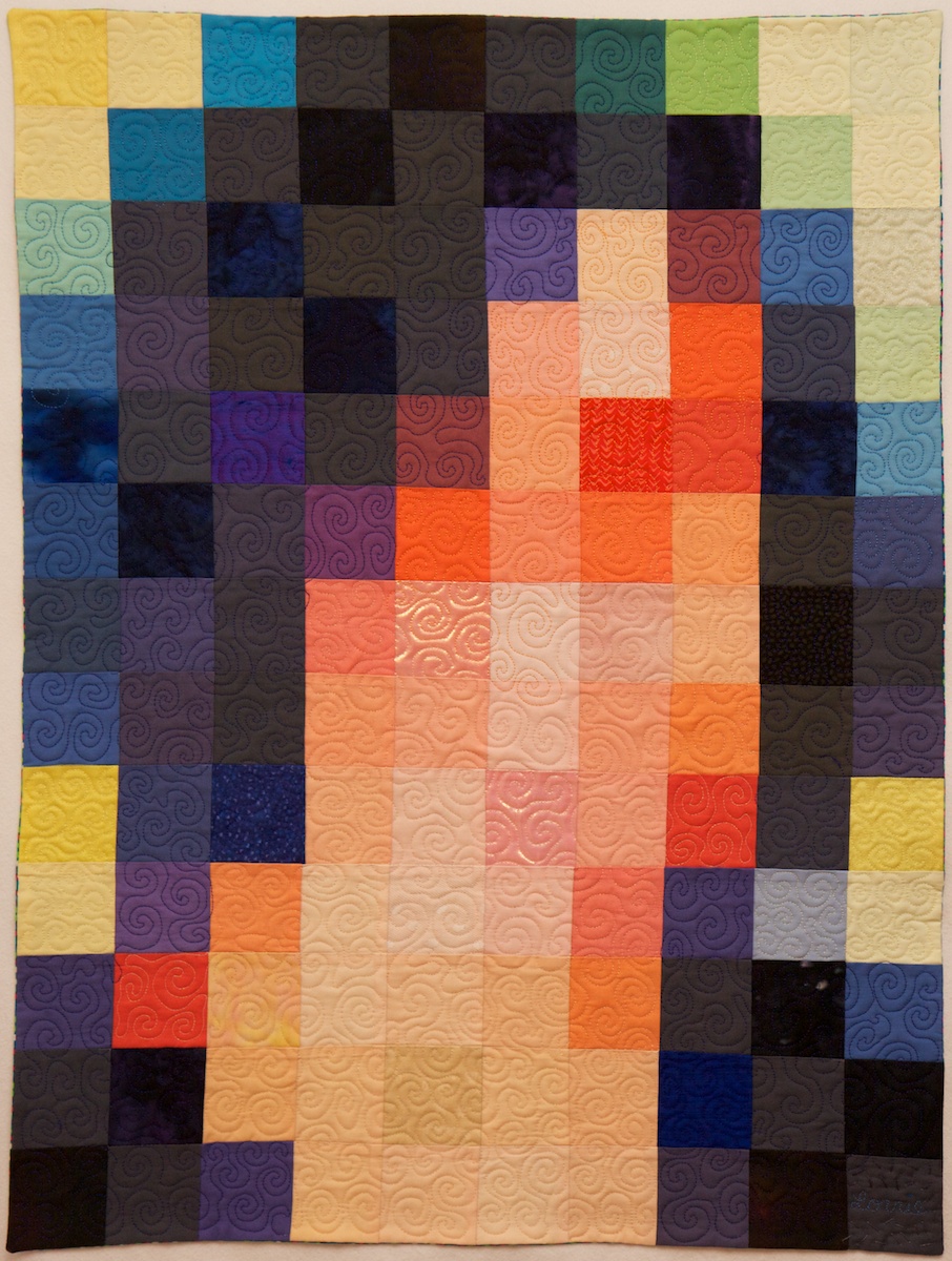
By the time the fabric arrived I had gotten busy with other quilts, and I was also a little disappointed in how the printed fabric looked, so I left the fabric sitting out on my table in the STUDIO for a while. I decided that the dulled digital print needed some more punch, so periodically I cut a fabric square to match a pixel in the fabric and pinned it in place. I cut some of these squares from translucent polyester organza, adding some vibrancy and shimmer to the pixels over which I layered them. I cut other squares from lace, commercial batiks, and printed fabrics that were more intense versions of the hues in the digital print. I ended up covering about 20% of the pixels with other fabric.
After a few months of staring at the pixels I finally decided to sew the quilt together. I used a shortcut technique to sew the quilt together without actually cutting apart the squares in the digital print. I folded the fabric along one of the vertical lines, catching the pinned squares in the fold, and stitched along the line with a quarter-inch seam allowance. I repeated this approach to sew all the vertical lines and pressed all the seam allowances to the side. Then I folded the fabric along one of the horizontal lines and repeated this process. The end result was a pieced quilt top that appeared to have been pieced out of 130 2.25″ squares (2.75″ with seam allowances). Theoretically this approach should have resulted in precisely pieced seams; however, some of the lines are actually slightly off and the rows and columns did not come out quite as square as I had hoped they would.
I layered the quilt top over batting and backing and used a spiral free-motion machine quilting pattern to quilt the whole thing free hand. I did the quilting in several sessions as I had time, doodling spirals until my hands got tired. I used several different thread colors to roughly match the color of the thread with the pixels I was quilting. I decided not to bind this quilt, and instead made an envelope and quilted all the way to the edge. There is a little bit of stippled hand quilting done with perl cotton surrounding my signature in the lower right corner.
So now the quilt is done and I’m pretty happy with this self portrait. Most people who have seen it do not recognize it as a self portrait, which is ok, and sort of the point. On the other hand, Golan said the blue and purple hair was a dead give away for him. I had not actually started out with the intention to make a self portrait, but ultimately I think the piece works better for me as a self portrait than any more accurate likeness would.


