In between family activities I worked on some artsy activities over winter break. My mother taught me how to crochet (but I haven’t made anything other than practice pieces), and I worked on some Spoonflower fabric for a couple of future projects (stay tuned!). I spent most of my time on a small wall quilt that involved cutting fabric into lots of small pieces, sewing those pieces together, cutting them up, and sewing them back together again.
My inspiration came from some images of quilts by Kent Williams in the January 2013 issue of American Quilter. I like the way Kent creates the illusion of shape by sewing together thin strips of fabric and I wanted to try the technique. But thin strips of fabric are hard to sew precisely. I also recently read an article in the December 2012 Quilting Arts Magazine by Ann Brauer in which she explained her quilt-as-you-go approach for making quilts out of thin strips of fabric. It occurred to me that Ann’s method might simplify the construction of the quilt I envisioned. (I’m actually not entirely sure about Kent’s method. I’ve only found tiny photos of his quilts – not enough detail to reverse engineer his process. I did observe that the short edges of his strips are all butted up against the next strip at 90 degree angles, suggesting his technique for cutting the strips is different than the one I describe below.) I worked out that with 1/4 inch seam allowances, if I cut the fabric into 1-inch strips, half of each strip would be lost to seam allowances. Thus 1-inch strips from two panels of fabric could be interleaved, allowing the designs from the two panels to be superimposed without distortion. I decided to add improvisational piecing to the mix to add an extra layer of interest to the design, and because improv piecing is fun.
 This quilt was a lot of fun to make but it required some courage to keep cutting up what looked like a perfectly good composition with the expectation that when I sewed it back together according to a vision I had in my mind, the result would be even better.
The first step was to make four 26-inch single-color square panels, each improvisationally pieced from about a half-dozen fabrics. The panels were each beautiful on their own, and lovely when placed together. I hesitated to cut them up.
I did some paper prototyping to convince myself that my slicing plan was going to work, and also to experiment with some of the details. I cut up photos of the single-color panels and reassembled them into red/blue and yellow/green panels. Then I tried positioning the red/blue panel perpendicular to the yellow/green panel, and sliced them both into 24 strips. I wasn’t entirely pleased with the results – the red/blue panel didn’t show strongly because the lines separating the colors got lost between the slices (left image). I cut up another red/blue paper panel, this time rotated 90 degrees. I liked the result (center image), but now the shapes in the two panels were superimposed and didn’t interact in interesting ways. In my third attempt (right image) I shifted the red/blue strips until they created an interesting overlapping pattern (and indeed this is the effect I love in Kent Williams’ quilts).


 My next challenge was figuring out exactly where to slice the single-color panels to make the red/blue and yellow/green panels. Originally I was going to slice them at somewhat random angles, but my paper prototyping convinced me that I would get better results if I selected the angles purposefully and made the panels mirror images of each other. I figured out the ratios I wanted and actually did a bit of algebra to work out exactly where to make the cuts. I did the slicing and reassembly and had four striking bi-color panels. This time I was really hesitant to slice them up again, but I sauntered on and prepared to begin cutting up two of the bi-color panels.
 But before I started slicing, I needed one more prototype to test out the quilt-as-you go technique. I grabbed some scrap fabric and sliced it into one-inch strips. But what kind of batting to use? I decided I wanted a fairly light batting, and nothing fusible (lately I’ve been enjoying the convenience of Hobbs Heirloom Fusible Cotton/Poly Batting). I had some pieces of Fairfield Soft Touch Cotton Batting and Thermore Ultra Thin Polyester Batting, which both seemed like reasonable choices for the project. I cut a small sample of each and tried both. The results were fine either way. The Thermore (on the left of the above sample) resulted in a lighter weight quilt that felt less stiff than the cotton (on the right). But both looked about the same once they were inside the quilt.
 I decided to use the Thermore in my quilt, mostly because I had a piece already cut that was about the right size. I cut out some backing fabric for my quilt (blue fabric with primary-colored fish that I bought years ago to make baby quilts) a little bit larger than the batting and layered the batting on top of it. I had been planning to use the edge of each previous fabric strip sewed as a guide for sewing the next strip, but my prototype revealed that would likely lead to skewed lines after a few strips. So I used a fabric pen to mark guide lines along the left and right edges of the backing fabric every half inch.
 Then I setup an assembly line. I layered a red/blue panel over a yellow-green panel on my gridded cutting mat and made a one-inch slice. I then placed one fabric slice on the batting, used a straight edge to align the slice with the guide lines, and pinned it in place. For the first strip only, I did not immediately sew it, but placed the second strip in place and sewed them together. I pressed open the second strip, cut more strips, aligned the next strip, sewed, and repeated over and over again. I waited in suspense until I had sewn enough strips that the pattern started to emerge, and I could see the quilt in my mind take form in fabric. But it wasn’t until many, many hours later after all 48 strips were cut and sewn in place that I had confidence that this quilt was going to “work.”
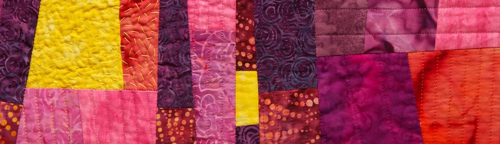
Now, the quilt is finished and bound. Overall I’m pleased with the result. I like the interweaving images. I like the third layer of images from the improv piecing. I like the fact that it looks like you are looking through Venetian blinds. Sometimes when I look at it I think the contrast between the adjacent interleaved strips is too much and creates some visual dissonance. I would like to try this technique again with lower-contrast fabrics. I wish I had cut and sewn some of the strips straighter. Would a bigger rotary cutter, longer ruler, or different batting help? I wonder how it would look with fatter strips. What if they were cut diagonally? I’m contemplating a more purposeful placement of fabrics in the single-color panels. I’m pondering doing this with curves and with photos printed on fabric. So many ideas…. But first I have to decide what to do with the other two bi-colored panels.

Interleave #1: Venetian Lines – 23.75″x23.75″ Machine pieced and quilted cotton fabric.


